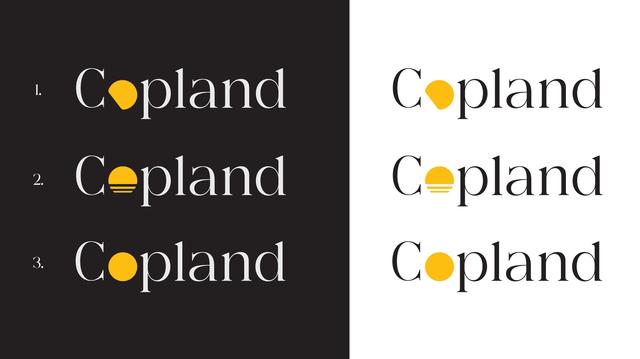
OK, so the new merch brand is called Copland Design—named after Apple’s blunder. https://en.wikipedia.org/wiki/Copland_(operating_system)

What logo do you most like? Poll to follow in next post.

Copland (operating system) - Wikipedia

Vote here!
1
13.5%
2
74.2%
3
12.3%
Poll ended at .
@snazzyq Everyone knows it’s 2 among these 3. We know you already decided Quin. Illusion of choice!
@snazzyq I thought this was random. Didn’t see your other post!
@snazzyq I’m not sure any of the options hit the money. The thin text and the filled-in O don’t visually go well together.
@jden @snazzyq this! I wasn't sure how to put in to words what bothers me about the logo, but yeah, it definitely doesn't really fit together.
@snazzyq I did not see part one of your post before choosing. Just be aware that I like the number 3
@snazzyq 3 still reads as cop-land to me (even when I already know it’s not). I have this problem the least with one, which is why I voted for it but 2 also works.

@Mister_Eel @snazzyq

Agree. Reminds me of Cop City in Atlanta.

Or some kind of law enforcement disneyland.

@snazzyq Don't ask me why, but the first and the third say Cop-land, while the second one says Cope-land.
@snazzyq These days I can only read it as Cop Land... time changes things…
@snazzyq no.2 looks the nicest but @jeremyburge will agree it really (kinda, maybe) looks like the UK Canal and River Trust brand logo identity, just in yellow 🚤
@scharf @snazzyq agree on both points. It is a nice logo, though.
@snazzyq are you sure about this? That name, it’s got a lot of baggage for anyone over 40. It’s was a hard time to be an Apple fan.
@snazzyq What would 2 look like if the yellow logo was rotated 45 degrees 🤔