A bit late, as the large amount of data was a pain to visualize. Day 17: Flow of the #30DayMapChallenge
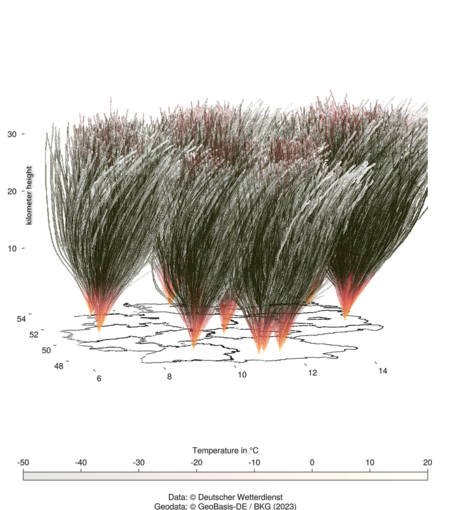
Here you can see the radiosonde ascents (@DeutscherWetterdienst) of this year in Germany. Quite good to see, that most of them drift eastwards.
Did with @makie and #julialang
Here you can see the radiosonde ascents (@DeutscherWetterdienst) of this year in Germany. Quite good to see, that most of them drift eastwards.
Did with @makie and #julialang