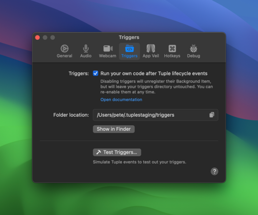
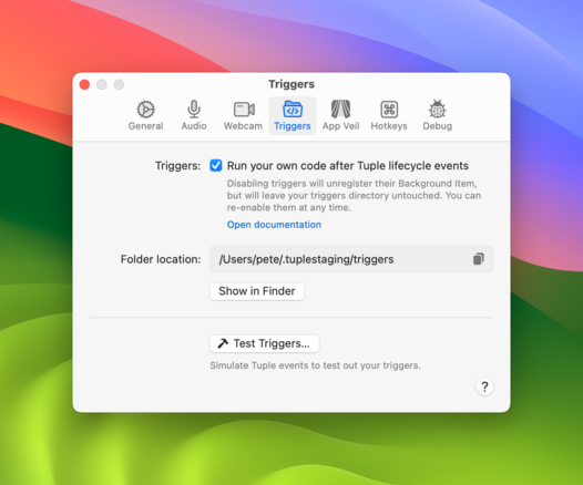
I recently started a new job at @tuple (!!) and had the pleasure of refreshing our settings pane icons. We made variants for both light and dark appearances, as often icons drawn for one end up looking odd (read like a photograph negative) in the other.
@peteschaffner Ooh, Tuple looks cool, congrats!
The icon set is looking really solid, too.
@Cykelero FYI I'm seeing an error when trying to register for the beta:

@peteschaffner Ohh yikes—you *are* in the beta, but apparently, my flaky mailing list provider marked you as spammy a while ago. Sorry about that! I cleared you, and you should get an update email soon.

I love your work—so I'm very much interested in your thoughts on the redesign! 😃

@Cykelero Oh wow, thanks so much for the quick response! I just got the email and am reading the release notes now 😃❤️

The feeling is mutual, and I will definitely let you know what I think!