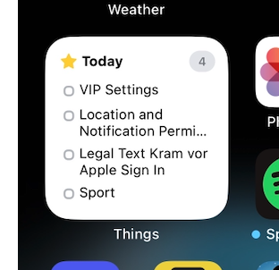
@things 👋 Is the layout of this widget broken or is it just how they look like, now that they're interactive? It feels... very spacious, compared to before.
@marcel @things for me that also feels a little bit to spacious. I also tought they fixed that with an update, but nothing changed 😔
@greenchapter @marcel @things the large widget got a little denser again, still not great. This small one just looks silly right now witch so much spacing (also really reduces its utility)
@distantnative @greenchapter @marcel @things yep, not pleased with the small widget :(
@greenchapter @marcel @things they changed it for the medium and large widgets but not the small. The medium and small should be the same in my opinion as the same height (used to fit 5 items but only 3 now)
@ben @marcel @things Ahhh ok, hopefully it will follow in one of the next updates for the small widget. 🙏

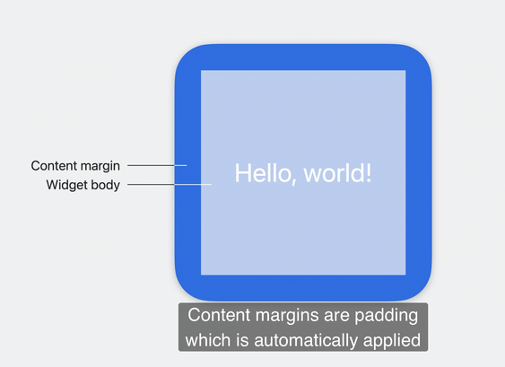
@marcel @things isn't that a problem with content margins introduced this year?

Apple Video WWDC23: https://developer.apple.com/wwdc23/10027?time=107

Bring widgets to new places - WWDC23 - Videos - Apple Developer

The widget ecosystem is expanding: Discover how you can use the latest WidgetKit APIs to make your widget look great everywhere. We'll...

Apple Developer
@alpennec @things Since I'm mostly talking about the vertical spacing, I'd be surprised if that's the case.
@marcel @things Oh ok. I thought you were also talking about margins.
@alpennec @things This is how it looked before.
@marcel Yes, they have to be spaced out more because of the tap target for fingers (around the checkbox). We're continuing to look for ways to improve it.
@things @marcel could you make this please optional then? Would prefer to have a non-interactive widget if at least it shows me more than 2 tasks
@distantnative @things I agree. Not just to see more tasks also because it's an eyesore in its current state. No offense. 🫶