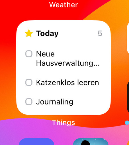
@things 👋 Is the layout of this widget broken or is it just how they look like, now that they're interactive? It feels... very spacious, compared to before.
@marcel Yes, they have to be spaced out more because of the tap target for fingers (around the checkbox). We're continuing to look for ways to improve it.