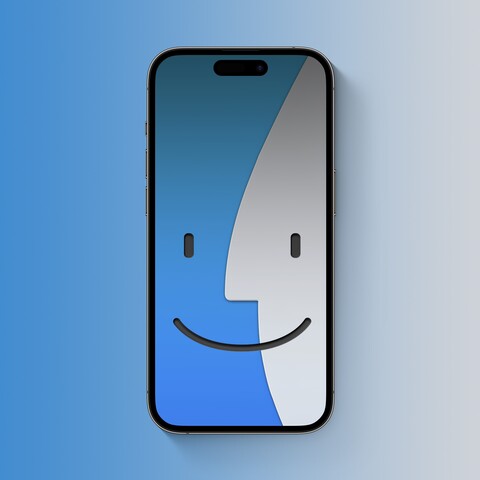
@BasicAppleGuy I love this! Might be neat to see some color variants. And as usual, possibly a dark mode one.
@BasicAppleGuy this is fantastic. Feels so Mac OS 8/9 to me. Make that page link up, please. It’s a very well designed page.
@BasicAppleGuy Macintosh System Five … head …
@BasicAppleGuy My favorite thing about this webpage is how much better the larger representations of the icon graphics look since they are given depth and texture. Would love to see these larger versions become the new smaller icons.
@BasicAppleGuy looks even better when swiping down the screen
@BasicAppleGuy @kyubikitsy I assume this is iOS 17 doing the dark thing at the top there?
@gedeonm it’s more how Apple chose to release the image on their site. Wish it hadn’t had that gradient.
@BasicAppleGuy @gedeonm I guess it’ll just need to be remade then. 😉