Edit: Thanks, no need to like or share anymore! I've made my decision, see my newest post

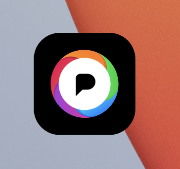
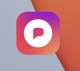
H̶e̶l̶p̶ m̶e̶ p̶i̶c̶k̶ t̶h̶e̶ n̶e̶w̶ @̶p̶i̶x̶e̶l̶f̶e̶d̶ d̶e̶f̶a̶u̶l̶t̶ a̶p̶p̶ l̶o̶g̶o̶!̶

L̶i̶k̶e̶ =̶=̶ b̶l̶a̶c̶k̶ b̶a̶c̶k̶g̶r̶o̶u̶n̶d̶
R̶e̶b̶l̶o̶g̶ =̶=̶ c̶o̶l̶o̶r̶ b̶a̶c̶k̶g̶r̶o̶u̶n̶d̶

@dansup @pixelfed Personally I prefer the 2nd one, looks a bit more appy and open as opposed to corporate and big data miner (which the first kinda looks like).
Just my opinion though so don't go based on my words XD
@tay
Added to this, most people won't pay enough attention to text over image order which is opposite of the one written on the post.
@dansup @pixelfed
@dansup @pixelfed I want to have an adaptive icon for Android, which will be more familiar to other social media icons :)

@skrybatv @dansup @pixelfed

Oh, that kind of does set out as, "not like the others." Which can be a good thing, or a bad thing.

@JigmeDatse @dansup @pixelfed it just destroys esthetic of the screen.

@skrybatv

That's my sense too, but if you want something to "pop" this could be a way to do it (though it more hides than pops).

@JigmeDatse @skrybatv @dansup @pixelfed it's not like the others in a bad way. when an app doesn't work with the theme it's usually an old app that hasn't been updated

@dansup @pixelfed

If the left one didn't have the colored ring, I would probably vote for it.

@[email protected] you know that its a really bad idea the like vs reblog... why not a poll?

#i-mean #i-couldnt-answer-polls #still-haven't-implemented-them
@gabboman @dansup probably so he can have a visibility boost 😅

@alien @gabboman @dansup I'm conflicted cos it's less commitment to vote with a like (so favoring that option), but the idea will spread faster across folks who boost (potentially favoring the other).

I will need to see some detailed modeling here.

@dansup @pixelfed ooooor make them an option like other apps do!
@dansup @pixelfed I like how the icon on the left has the rainbow shutter, the one on the right just feels like instagram
@dansup @pixelfed get rid of the white circle and make a super colorful P 🫶
@dansup @pixelfed I kinda wish it'd retain it's rainbow with the full colour background

@dansup @pixelfed

It would make more sense to do this as two posts, both of which people can like to vote for. Some people won't boost posts without meaningful alt texts (both images here say the exact same thing with no distinction between them), and some people may not feel comfortable boosting this to their audience at all.

The other alternative would be to do a post with the two images, and then reply to that with a poll that people could vote on.

@dansup @pixelfed That's flawed, because every repost causes more reactions, a simple like does not.

I take the blacker/darker one.

Black
66.7%
Colored
33.3%
Poll ended at .
@dansup @pixelfed
I think it's important to differentiate from the competition so I'm feeling black
@dansup @pixelfed Left one every single time! 🤩🤩

@dansup @pixelfed I say use both! Let people choose in the settings! Original #Twitter & @IceCubesApp lets people select their device icons.

Maybe #Pixelfed could do the same as well.

@darnell @dansup @pixelfed @IceCubesApp adding support for material you icons would be a really nice addition too, I need to use a custom shortcut to not make it stand out on my homescreen
@dansup @pixelfed Both are really cool, but my personal vote is for the black background, because it is more set-apart from other Fedi projects and mainstream alternatives. The right one has a similar vibe to the default Artemis icon and it also has heavy 'gram' vibes. The left one feels unique and very Pixelfed (in a great way). But that's just my $0.02. 😄
@dansup @pixelfed why aren't you just sticking with the current one?
@dansup @pixelfed I like the gradient better as an app icon. But, it feels a little too close to Instagram, and almost dated.
I do like the black though, makes me think of Pepsi's rebrand using black - giving it a retro feel.
If there was a way to do both a gradient and use the black, that could get the most modern result.

@dansup @pixelfed I like the rainbow circle, seems like an aperture. A nice nod to photography in general.

Though I don't necessarily disagree with the folks who say it might be a bit cluttered. Also the black+white with a letter p could be considered similar to Patreon's icon (very very loosely).

@dansup @pixelfed I feel like the color background one is too close to I.G. The black background is quite nice
@dansup @pixelfed The left, the callback to a camera aperture is nice.
@dansup @pixelfed I really like both of them.
I think it would be neat it the one with the black background was changed to multiple color gradients. Then outline the circle in black and keeping the centre/logo the way its is.
Just an idea..
Good luck!
@dansup @pixelfed the one on the right is a super blatant IG ripoff. Left stands on its own.

@dansup @pixelfed In my opinion, neither. Too much going on in the first one and the second one just looks like Instagram.

I'd amend the first one to remove the black and expand the colours in the same pattern to the edge.

@dansup @pixelfed prefiro podendo alternar dentro do app, mas prefiro a 1° opção
@dansup @pixelfed the one on the right is prettier but it looks too much like Instagram.
So I'd prefer the left. But I think it could be better.
Thank you for your work! 👍🏻
@dansup @pixelfed from a design perspective the one on the right has better readability, the rainbow roundel adds unnecessary complexity.
@dansup @pixelfed i love how this app is so community driven
@dansup @pixelfed I like the black better, but I'd also like to have more reach...
@dansup @pixelfed both look absolutely gorgeous !

@dansup @pixelfed Red/purple/orange gradient is too close to Instagram in that it feels like you just want to be something you're not.

Black one feels a little clown-y specifically with the rainbow ring around the logomark.

I'd like the gradient if you picked a different set of colors to make it feel more differentiated. I'd like the black one if it were just the white logomark on black.

@dansup @pixelfed definitely the one on the left, looks way more unique
@dansup @pixelfed not a user of pixelfed (yet…), but thought I’d give my two cents. And I’m sure you and the team thought about this, but I would be worried about getting insta-meta-book in a hissy fit with the similarity of the second icon and instagram’s icon. That said, I think it looks far more modern than the black-background-based one
@dansup @pixelfed I think it's not even an question you go with the right one the other is ugly

@dansup @pixelfed

Also for the left one
- do not use a black background
- do not make the speech bubble black, pick a better color

Then it would be better than the right imo

@dansup @pixelfed I’ll be honest, the 2nd option looks a lot like instagram to me. I like the black one better.
@dansup @pixelfed first one black background 😍

@dansup @pixelfed the right one is way too much similar to the Instagram one.

I’m pretty sure u don’t want to waste time and money by giving Meta’s legal department a bone to chew on.