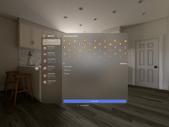
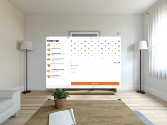
It’s amazing how much the appearance of a Vision Pro app changes depending on wheher it’s built “Designed for iPad” against the iPadOS SDK or it is built as a proper Vision Pro app against the visionOS SDK.

I think “Designed for iPad” apps stand very little chance of becoming successful at launch. Users will expect apps that make heavy use of frosted glass and all the transitions that come with the visionOS SDK.

@simonbs Seems like a lot of effort for us just to make our apps harder to read 🤨
@adam @simonbs I am curious how different it looks in the device vs a screenshot of a simulator on social media
@simonbs is there an accessibility setting to make it look like the one on the right?
@simonbs all that space with such tiny writing… are they designing this for 20-yr olds? Why so small?
@simonbs To me, this is a warning/example showing that “appearance is not design”. NOT that it's a bad design, just that the difference doesn't make it seem like it's any more suited to one environment vs the other.
@simonbs Echoing every single prior comment here: Viewing distance aside, there’s no reason to allow such terrible contrast. Basically illegible. Really disappointed in Apple for not only allowing but encouraging this, even across current iOS.
@rcbo @simonbs My suspicion is that readability will be drastically different when you're actually wearing the device. When you have the real world moving under the content, it's going to make the static content pop in a way that is impossible to convey in a screenshot. Even if those movements are imperceptibly small. Not to mention that the content will appear physically larger.