Back to work after a few days break.
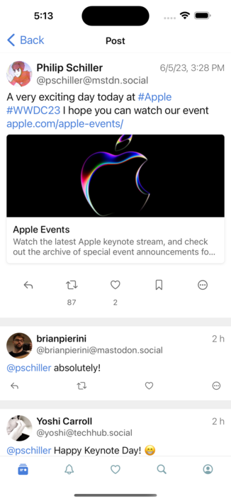
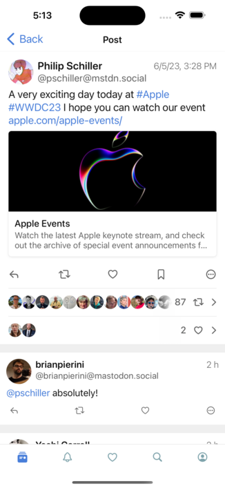
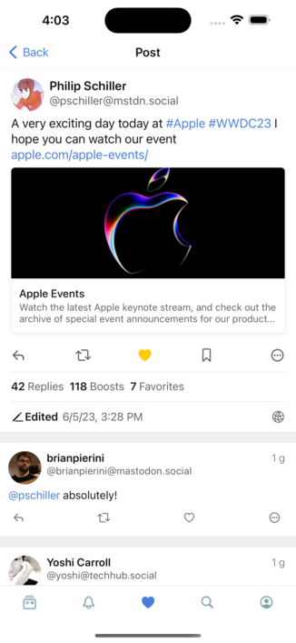
While we wait for Apple to announce Google Glass 2.0 at #wwdc, I'm experimenting with an improved post layout for @woollyapp

On the left the current layout, on the right with some additional info on boosts and favs.
What do you think?

Like many of you noted, all those avatars make the whole thing a bit too crowded.
Here's another version, borrowing some ideas from the Twitter app.

I like this approach, as I can easily group different info about the post in a single place and make it easier to navigate to the list of boosts and favs.

@mttvll Nice, appreciate the cleanliness of this version.
@mttvll That‘s way better. :)