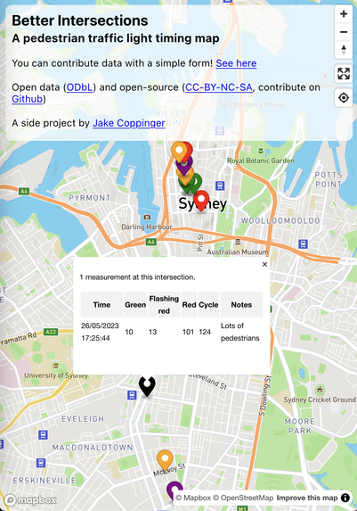
A side project I started over the weekend - a map of how long pedestrians have to wait at traffic lights in Sydney to identify problematic intersections!

https://betterintersections.jakecoppinger.com/

It's powered by a Google Sheet, which you can contribute to with a simple Google Form: https://forms.gle/3FFGD5Jk14wUS22n6

Please have a look and if you're interested, contribute some measurements! I'll add more detailed instructions in the coming days.

#sydney #australia #nsw #betterstreets #walking #maps #mapbox #openstreetmap #opendata #map #walking #cycling

Better Intersections

Better Intersections is a tool for measuring and visualising pedestrian and cycling signal timing in Sydney and NSW

@jakecoppinger

I have a vague recollection that this info is already being collected (from inside the traffic/pedestrian lights systems), and that some of it was published during early COVID lockdowns 🤔

I feel it was part of traffic volume mapping, showing the contrast between travel activity pre-COVID, and people doing the right thing when asked to stay at home.

I might be mistaken, but I my brain is tickling with something about PDP-11s 🤯 and feeding pedestrian wait times into intersection design…

@Havenite I'm not aware of TfNSW releasing any of this data - but that would be the best possible end goal! Let me know if you find any data.

Unfortunately cars tend to be prioritized extensively, especially on state roads.

@jakecoppinger Great work! Just a question, don't pedestrians just have to wait until the normal light cycle to cross? Isn't the normal light cycle for 2 minutes? Lights stay green at different time amounts depending on whether it is peak hour or not and whether the pedestrian button has been pressed - I think. Wouldn't the road authority know this information for each intersection already? I.e., the present parameters not the real experience.
PS I'm in Victoria.

@allswims Thanks!

> Isn't the normal light cycle for 2 minutes

It doesn't seem to be the case (in NSW at least).

> Lights stay green at different time amounts depending on whether it is peak hour or not and whether the pedestrian button has been pressed - I think

Yep! The only way around this is to take multiple measurements and take avg/max/min or even a graph.

> Wouldn't the road authority know this information for each intersection already?

Yep, TfNSW has this info but as far as I know they don't want to / won't / are unable to release it.

I've heard in Victoria the government does release that data!

The crowdsourced data definitely isn't perfect but is useful to identify intersections that definitely aren't friendly for pedestrians or cyclists.

Bike lane report card | Our Campaigns | Bicycle Network

The bike lane report card is our way of rating on-road bike infrastructure. Use the map to explore on-road bike lanes near you.

Bicycle Network
@jakecoppinger @sofio want to do this for Boston?

@Ofsevit @sofio It should work everywhere in the world, I just need to add a search bar and the coordinates to the url when you move.

Feel free to make submissions on the form even if not in Australia/NSW, or suggest improvements to the form!

@Ofsevit @jakecoppinger for the ones I know off the top of my head maybe! But also some signals have different cycles and it changes so idk

@jakecoppinger George Street in the CBD could be tricky - when a tram is coming, the cycles are quick, but no trams nearby, and it tends to be very slow.

State roads are awful - Parramatta Road and Canterbury Road jump immediately to mind as shockers, but I don't have the data on them.