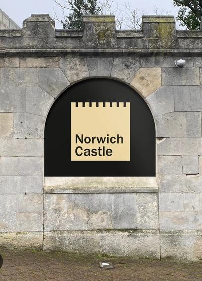
I have huge distaste for this brand that is currently being lauded in the #graphicDesign media. It's simply weak #design. The #type offers nothing. The shape suggests that #NorwichCastle holds the exclusive rights to crenellations.
No part of this in any way tells me anything about that particular castle, or why it's unique. It basically says "generic castle"
It's a perfect example of something that happens too frequently in design; the lure of something new, shiny and fashionable
No part of this in any way tells me anything about that particular castle, or why it's unique. It basically says "generic castle"
It's a perfect example of something that happens too frequently in design; the lure of something new, shiny and fashionable