Typography: it matters!
#typography #proofreading #writing #writers #writingcommunity #humor #humour #funny #emphasis #italics
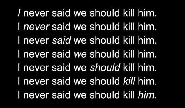
Typography: it matters!
#typography #proofreading #writing #writers #writingcommunity #humor #humour #funny #emphasis #italics
Nice example for showing this, you immediately see it would have been much more readable with a serif font with some specifically designed italics variant instead of just slanting a sans serif one ;-)