Hey pals! I’m gonna do a short little video series here on the OpenType features inside Womprat so you can learn how to use them!
Buy the font here → http://womprat.xyz/
First up— Ligatures.
Hey pals! I’m gonna do a short little video series here on the OpenType features inside Womprat so you can learn how to use them!
Buy the font here → http://womprat.xyz/
First up— Ligatures.
This is where the fun begins!
SS01: Special Edition
SS10: Youngling
...we’re now halfway through the Stylistic Sets.
Yeah man, this font is crazy.
Gonna take a little break before I do the second half. Thanks for watching and learning about Womprat (the most complicated font I’ll ever make)!
Also if you wonder *how* all of this works, @AurekFonts wrote extensive code for all these features into the font.
Okay! Back at it.
SS11: Lubalin Ligatures
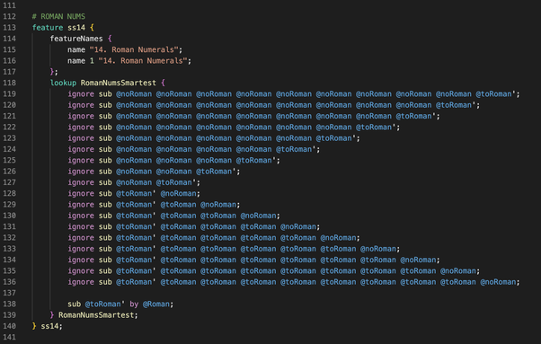
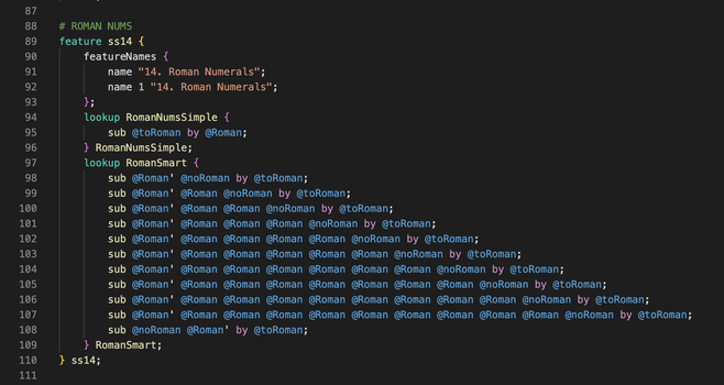
SS14: Roman Numerals
Ender (@AurekFonts) engineered all of the stuff you see in these videos, but this one is especially fun.
This is a good question! The basic principle is to use "contextual lookups"—basically, the font itself checks the context around a symbol and decides whether to replace it.
In this case, I created three groups (lists) of glyphs:
- Letters to replace with roman numerals
- Roman numerals
- & EVERY OTHER LATIN/GREEK/CYRILLIC LETTER
1/

Now the next part went through some drafts. The first looked something like this:
- Find a letter that could be a roman numeral
- Check the surrounding context (forward and backwards), to see if the current word contains any letters that cannot become roman numerals; ignore those
- If none of the "ignore" conditions are met, replace with a roman numeral
2/
The next draft (the one we actually used) might be a little less efficient, but it's less verbose.
(Also, due to a weird technical constraint, this version worked better on our font tester webpage.)
This one is similar to the last but does things in a different order, and swaps the letters twice:
- Replace every letter with the roman numeral equivalent
- Then check context to replace the roman numerals with letters again
3/
There are some limitations to this implementation, so this is something we may update in a future version:
- There is no check for the ORDER of the roman numerals, so you can type invalid sequences that still get converted
- There are a handful of words in English that only contain roman numeral candidates, which will thus be replaced with roman numerals, even though they are not.
4/

Throughout the making of Womprat, we had a lot of discussions about how "smart" to make the features.
One barrier is: OpenType features have some hard limits—you can only make these fonts so smart.
Another is philosophical: At a certain point, if a feature is too smart, you run the risk of taking agency away from the designer—designing for them, as it were.
We felt like roman nums was the perfect place to push the limits of the tech to make the designer's life easier.
5/5
@AurekFonts @louie Definitely going to need to read up on this. I'm confused at what this line does:
ignore sub @noRoman @noRoman @noRoman @noRoman @noRoman @noRoman @noRoman @noRoman @noRoman @toRoman'
That this one doesn’t:
ignore sub @noRoman @toRoman'
Doesn't one instance of @toRoman’ preceded by @noRoman ignore the same sub? At first glance, I would think you'd only want the first entry on the top half of these lines to be @noRoman, and the rest to be @toRoman until the final @toRoman’
Ah, I see. It is confusing because I wrote it incorrectly!
That was my attempt to recreate the code that I had written in my first draft, so that I had an example to show. And I wrote it very wrong.
Those should be something more along the lines of:
ignore sub @noRoman @toRoman @toRoman @toRoman @toRoman @toRoman @toRoman'
