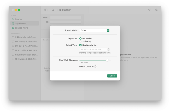
Decided against using the SwiftUI Form layout for Trip Planner options and created a more traditional macOS layout. This is the before/after. I don't care for modern layouts becoming more List-y. It's lazy design.
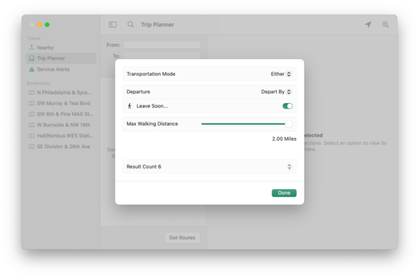
Decided against using the SwiftUI Form layout for Trip Planner options and created a more traditional macOS layout. This is the before/after. I don't care for modern layouts becoming more List-y. It's lazy design.