
Check out how land is used in the United States. Cows take up the most space!
https://www.bloomberg.com/graphics/2018-us-land-use/
First in a 🧵 of #2022TopToots

Check out how land is used in the United States. Cows take up the most space!
https://www.bloomberg.com/graphics/2018-us-land-use/
First in a 🧵 of #2022TopToots
This map shows only people. It is a beautiful illustration of where people are concentrated.
If you squint, you can see Australia and New Zealand.
Map by Alasdair Rae https://www.visualcapitalist.com/cp/3d-map
Third in a 🧵 of #2022TopToots

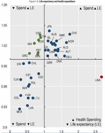
Check out this scatterplot of health spending per capita (x axis) & life expectancy (y axis) in OECD countries (lines = averages).
The United States sits alone in the bottom right quadrant due to its much higher spending and below-average life expectancy.
More info: https://oecd-ilibrary.org/sites/ae3016b9-en/1/3/1/index.html?itemId=/content/publication/ae3016b9-en&_csp_=ca413da5d44587bc56446341952c275e&itemIGO=oecd&itemContentType=book
Fourth in a 🧵of #2022TopToots


Check this out -- major cities in North America replaced by major cities across the Atlantic at the same latitude.
The Gulf Stream makes winters less severe in many European cities than it is in their U.S./Canadian counterparts.
https://www.reddit.com/r/MapPorn/comments/d8tbs5/major_cities_and_towns_in_north_america_replaced/
Ninth in a 🧵 of #2022TopToots
Can you spot the circles?
It took me a long time. Once you see them, they'll seem obvious.
This is the Coffer Illusion, by Anthony Norcia
Tenth in a 🧵 of #2022TopToots

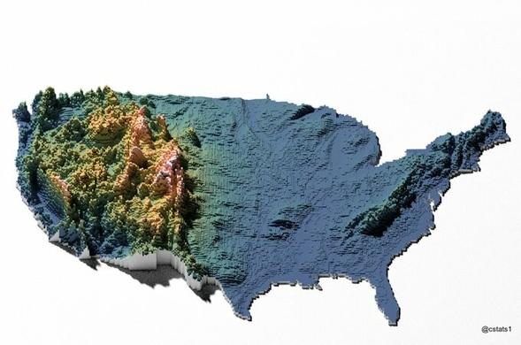
Check out this cool elevation map of the contiguous US
https://www.reddit.com/r/dataisbeautiful/comments/jslbn9/us_elevation_tiles_oc/
Fourteenth in a 🧵 of #2022TopToots


We worry about the wrong things. Exhibit A:
People killed annually by
Sharks 10
Elephants 100
Hippos 500
Snails 10,000
Dogs 25,000
Snakes 50,000
People 475,000
Mosquitoes 725,000
Eighteenth in a 🧵 of #2022TopToots

How gerrymandering can change election outcomes, in one chart
https://www.washingtonpost.com/news/wonk/wp/2015/03/01/this-is-the-best-explanation-of-gerrymandering-you-will-ever-see/
Nineteenth in a 🧵 of #2022TopToots
This is an excellent and fascinating animation of how the 10 most populous cities in the world changed from 1500 to 2018
by @jburnmurdoch
Hang in - it takes a few seconds to begin. Twentieth in a 🧵 of #2022TopToots
Animation of how the 10 most populous cities in the world changed from 1500 to 2018.
Whhoa!! Brilliant #scicomm ! And don't you just love the Fediverse that lets you download the gif as video so you can play it slower?
Intrigueing to watch…
the color coding of the gerrymandering is random and meaningless, right? 😉

@conradhackett honestly, this reason alone, is enough for me to support direct democracy.
We have the technology to do it. Why do we have “representatives” that don’t actually “represent” you?
Sounds like a bullshit job ripe for automation out of existence.
Have everyone vote on everything.


