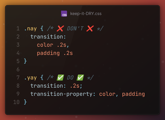
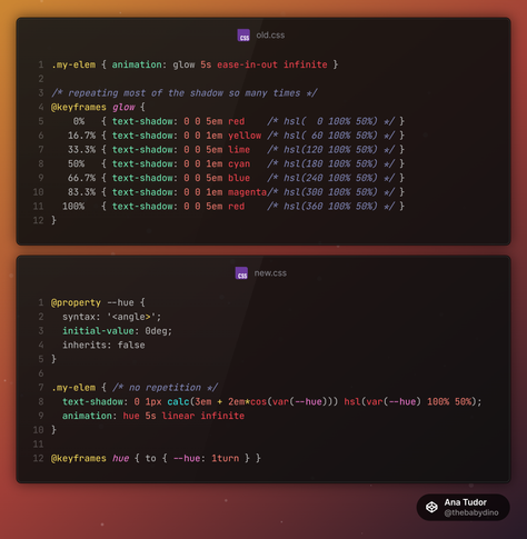
#tinyCSStip Want the same border, but only for two edges, not for the others?

Don't set borders on the two edges to the same value, set border, then override border-width. If you later need to make the border thicker or thinner or pink or green, you only need to make that change in one place.

#CSS #cssBasics #code #coding #web #dev #webDev #webDevelopment #frontend

And here's a cards demo with a cool, yet very simple trick: these left to right gradients are vibrant at the top, but then progressively get more and more desaturated going down, until fully grey.

Live on @codepen https://codepen.io/thebabydino/pen/xxzjJXL - only 2 CSS declarations necessary!

#CSS #tinyCSStip #blending #blendMode #cssGradient #code #coding #frontend #web #dev #webDev #webDevelopment

Pure CSS: vibrant to desaturated gradient backgrounds

A tiny little bit of blending magic. [The simplified base idea](https://codepen.io/thebabydino/pen/yLEjjWE). --- If the work I've been putting out s...

#tinyCSStip `clip-path` or `mask` are applied after `filter`.

This means we cannot clip/ mask, then add a `drop-shadow()` on the same element for the clipped/ masked shape.

We need to apply the `filter` on a parent of the clipped/ masked (pseudo-)element.

https://codepen.io/thebabydino/pen/BRROzw

#CSS #filter #cssFilter #clipPath #clipping #cssClipPath #cssMask #coding #frontend #web #dev #webDev #webDevelopment #code

how to: drop shadow on clipped element

Doesn't work in Edge, sorry. But you can [vote for it here](https://wpdev.uservoice.com/forums/257854-microsoft-edge-developer/suggestions/6519995-sup...

#tinyCSStip Simplifying animations with variables and mathematical functions.

Same result, just not writing almost the same `text-shadow` a bunch of times in a bunch of keyframes.

Live test on @codepen https://codepen.io/thebabydino/pen/MYWXgdZ

#CSS #Maths #code #coding #frontend #web #dev #webDev #webDevelopment
#cssMaths #trigonometry

text glow

...

#tinyCSStip
Revert animated parent transform (like a scale or skew) on child without an extra animation using registered custom properties.

https://codepen.io/thebabydino/pen/MYWXoZW

#CSS #code #coding #frontend #transform #web #dev #webDev #webDevelopment

Revert transform on child via CSS variables

...

#tinyCSStip

🚫 DON'T use layered text-shadows for text outlines just because text-stroke is broken (https://mastodon.social/@anatudor/112410224855133935), they are going to produce ugly corners, thickened roundings and angled lines.

✅ DO: use `paint-order: stroke fill` instead!

#CSS #typography #code #coding #web #dev #webDev #webDevelopment #frontend

Know how border-image & border-radius don't play nice together?

(interactive https://codepen.io/thebabydino/pen/jxZyed)

#tinyCSStip there's a workaround IF corner radius ≤ border-width: use inset() clip-path + a round value!

clip-path: inset(0 round $r)

@codepen demo: https://codepen.io/thebabydino/pen/qBELJGY?editors=1100

(and yes, this is a tip I first shared on twitter over half a decade ago https://x.com/anatudor/status/1219916121341644807 )

#CSS #clipPath #cssClipPath #coding #web #dev #webDev #webDevelopment #code #frontend #borderImage #borderRadius

border-image and border-radius don't play nice together

Sadly, setting `border-image` on an element with `border-radius` makes this `border-radius` to be ignored *for the `border` itself, though it's still r...

Also, those letters in the squares? #CSS counters!

```
.item { counter-increment: c }

.item::after { content: counter(c, upper-alpha) }
```

#tinyCSStip #cssCounter #code #coding #web #dev #webDev #webDevelopment
#frontend

#tinyCSStip Create a fancy double border with dashes in between without any pseudos and with minimal #CSS!

The relevant code is just 3 simple CSS declarations!

Live demo on @codepen

https://codepen.io/thebabydino/pen/PwYRmLN

#cssBasics #code #coding #frontend #web #dev #webDev #webDevelopment

Super simple fancy border

...