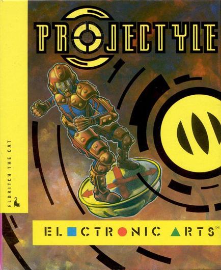
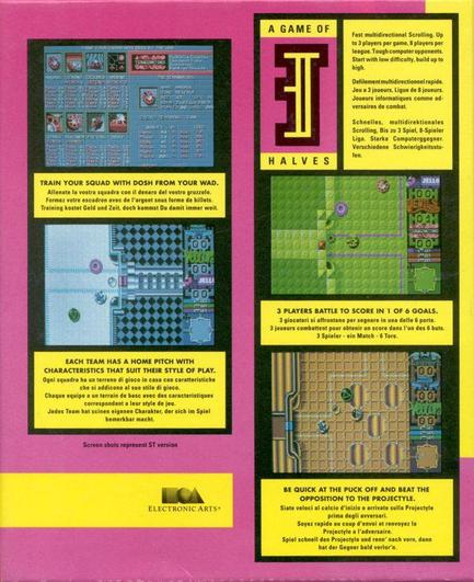
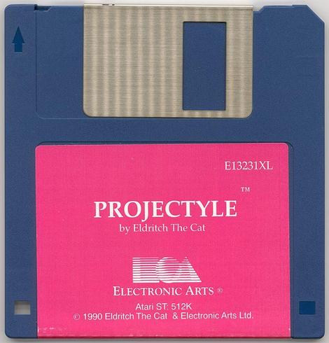
I saw an April Fools post on LinkedIn concerning Sega making their logo 3% more blue. It reminded me about an incident with the box art for the game Projectyle I developed back in 1990 and which was published by Electronic Arts. The idea was to use fluorescent colors for the box art, and for the disk label. These were supposed to be really eye-popping so that they would catch your eye on retail shelves and so on. You can probably guess what happened next, and if not let’s just say that the budget for these fancy colors was reviewed and the decision made to use regular inks. Which is why the back of the box and the disk label are, just, bright pink.
#RetroGaming #Amiga #AtariST #ElectronicArts #Projectyle #EldritchTheCat