How to use a perceptual map to better understand your users
Read the full article here 👉 https://lttr.ai/AlOf5

How to use a perceptual map to better understand your users
Read the full article here 👉 https://lttr.ai/AlOf5
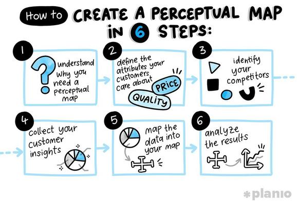
The process for perceptual mapping is pretty much always the same.
Our guide teaches you how 👉 https://lttr.ai/AizJ3
Perceptual maps are great levelers, helping both teams come together and identify ways to improve user perception together.
Read more 👉 https://lttr.ai/AfvNK

Perceptual maps help to create a richer picture of customer opinion, and how your product or brand compares against competitors.
Learn more 👉 https://lttr.ai/Aep5g

So, how do you bridge the gap between your beliefs and users’ real needs? Perceptual mapping.
Make the most out of them 👉 https://lttr.ai/Aep4m

Our guide shows you how to start creating perceptual maps for your brand or product today.
Take a look for yourself 👉 https://lttr.ai/Aep4N

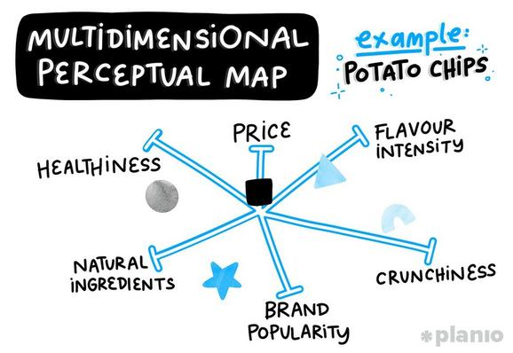
Multidimensional perceptual maps plot products or brands against several attributes.
You should use them too 👉 https://lttr.ai/Aep4V
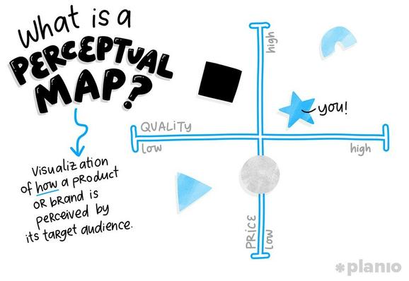
A two-axis perceptual map not only provides a rich comparison, but also creates an “at-a-glance” picture of different players in any particular industry.
Find out more 👉 https://lttr.ai/Aep4J

One of the worst things that can happen to a leader or founder is losing touch with your actual users. Unfortunately, a famous study from Bain & Co found that, while 80% of CEOs think they deliver a “superior experience” to their customers, only 8% of their real customers actually agree! While...
How to use a perceptual map to better understand your users
Read the full article here 👉 https://lttr.ai/Aep2a
One of the worst things that can happen to a leader or founder is losing touch with your actual users. Unfortunately, a famous study from Bain & Co found that, while 80% of CEOs think they deliver a “superior experience” to their customers, only 8% of their real customers actually agree! While...
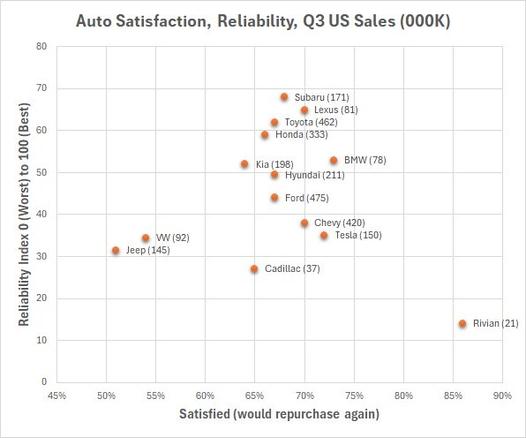
I love using plots and maps to encourage deeper thinking from managers and students.
The example below is a two dimensional plot of two typically reported measures in the auto industry. I've enhanced the map by providing most recent quarterly sales results. Even this simple map can stimulate a deeper discussion. But this is just the beginning.
Learn more about these techniques in MBTN Academy's Perceptual Mapping module.