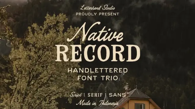
The Native Record Font Trio Brings Handcrafted Country Typography Into Contemporary Design
Typography carries cultural weight long before a single word gets read. The letterforms you choose signal something—craft, authority, warmth, or precision—before the message even registers. The Native Record font trio by Letterhend Studio operates on exactly that principle. It arrives at a moment when designers, brand builders, and creative directors are actively pushing back against sterile minimalism and reaching for something more honest and more human. Country aesthetics, Americana warmth, and handcrafted lettering are commanding serious attention across packaging, identity, and editorial design right now. This trio doesn’t simply respond to that shift. It leads it.
You can download the trio for a low budget from the following:
Creative Market MyFonts YouWorkForThemThree coordinated styles—a sans, a serif, and a script—built to function as a single, expressive system. That’s the structural promise of the Native Record font trio, and Letterhend Studio delivers on it with real typographic intelligence. So let’s talk about what makes this release genuinely worth your attention, how to put it to work, and why it represents something meaningful about where typography is heading.
The Native Record Font Trio by Letterhend Studio.You can download the trio for a low budget from the following:
Creative Market MyFonts YouWorkForThemWhat Makes the Native Record Font Trio Stand Out Among Vintage Typefaces?
Most retro font families give you one style and leave you to figure out the pairing problem yourself. The Native Record font trio takes a completely different position. It bundles a sans, a serif, and a script into one cohesive system. Each style carries its own character. Each style also shares an unmistakable aesthetic identity with the other two. That combination is rarer than it sounds in the vintage typography category.
Think about how much time you currently spend hunting for fonts that actually work together. Hours searching for typefaces that complement each other without competing or clashing. With the Native Record font trio, Letterhend Studio eliminates that entire step. The pairing decisions are built in—and built well.
Furthermore, the trio gives you range without visual chaos. You get genuine contrast between the three styles without any inconsistency in feeling or tone. That’s a meaningful advantage when you’re working under deadline pressure or producing multiple deliverables from a single visual system.
The Three Styles and What Each One Contributes
The sans brings structural clarity and visual restraint. It handles headlines, labels, and supporting text with clean letterforms that stay legible at small sizes. The serif adds authority and editorial weight—that old-time credibility that makes a layout feel considered and substantive. Then comes the script, and that’s where the emotional core of this system lives.
Handcrafted lettering with natural variation gives the script its power. It makes a design feel touched by human hands rather than assembled by software. Together, these three styles form what I’d call a Tonal Triad System—a typography framework where each style occupies a distinct emotional register while sharing the same visual DNA. The sans speaks plainly. The serif speaks with authority. The script speaks personally. That division of communicative labor is what makes the Native Record font trio so versatile and so effective across different design contexts.
How to Use the Native Record Font Trio Across Your Design Projects
Knowing a typeface is strong is one thing. Knowing how to deploy it is another matter entirely. The Native Record font trio rewards intentional use. Start by thinking in terms of hierarchy and emotional register rather than simply picking the style that looks best in isolation. The sans handles structure. The serif handles substance. The script handles soul.
That division keeps layouts organized without draining them of personality. Moreover, because all three styles share the same handcrafted country aesthetic, combining them never feels forced or visually contradictory.
Branding and Identity Design
Country-style and artisan branding represent the strongest use case for this handcrafted vintage font trio. Whether you’re building an identity for a craft brewery, a farm-to-table restaurant, an independent record label, or a rustic apparel brand, this system delivers exactly the right typographic character. Use the serif for the wordmark. Use the script for the tagline or secondary mark. Drop the sans into supporting copy, labeling, and secondary hierarchy elements.
The result feels cohesive, considered, and unmistakably handmade. Achieving that quality with a single typeface is nearly impossible. The trio makes it straightforward. Additionally, the visual consistency across all three styles means your brand identity holds together whether you’re designing a business card, a storefront sign, or a social media template.
Packaging and Print Design
Vintage-style packaging is one of the fastest-growing design categories in the premium consumer market right now. Consumers actively respond to authenticity signals, and typography communicates authenticity faster than almost any other design element. The Native Record font trio fits this space with real precision.
The alternates and ligatures are particularly valuable in packaging work. They allow you to customize individual letterforms, avoid mechanical repetition, and keep text looking naturally hand-lettered rather than digitally stamped. For products that want to communicate craft and provenance, that visual nuance carries significant weight with buyers.
Consider how the three styles layer on a product label. The serif anchors the product name with authority. The script adds a personal touch in a descriptor line or founding-date callout. The sans keeps ingredient lists and legal text clean and readable. That kind of typographic layering is exactly what separates distinguished packaging from generic design.
Editorial, Social Media, and Digital Applications
Editorial use is another strong territory for this retro typeface trio. The script excels in pull quotes, display headlines, and featured callouts. The serif holds its own in subheadings and body-weight text blocks. The sans keeps navigation, labels, and UI elements crisp and immediately readable.
Social media graphics benefit enormously from a trio system like this. You can build consistent visual templates that feel warm and editorial without requiring new creative decisions every single time you produce a post. The Native Record font trio gives you a complete visual vocabulary to draw from, which means your content library can grow while staying visually coherent.
The Technical Features That Make Native Record Font Trio a Professional Tool
Strong aesthetics without technical completeness is a frustration waiting to happen in a real production environment. The Native Record font trio comes fully equipped for professional work. All three styles include uppercase and lowercase characters, numbers, and punctuation across the board. That completeness matters—missing glyphs mid-project are a workflow disruption no designer needs.
Alternates and Ligatures—The Details That Elevate Typography
The alternates and ligatures deserve specific attention here. Alternates provide multiple versions of individual letterforms, so you can swap characters for visual variety and avoid the mechanical repetition that makes digital type look generic or mass-produced. Ligatures combine specific letter pairs into single, more refined glyphs—a feature that contributes directly to the handcrafted quality of the finished typeset text.
Together, these features give the Native Record font trio a level of typographic refinement that clearly elevates it above standard vintage fonts. You’re not simply buying a stylistic aesthetic. You’re getting a professional toolset that gives you meaningful control over how your text finally reads and feels.
In my experience reviewing typeface systems, alternates and ligatures are frequently listed as features but rarely implemented with real depth. Letterhend Studio clearly put serious thought into this aspect of the release. The handcrafted quality of the script in particular benefits substantially from these features, since natural variation is exactly what makes hand lettering feel alive.
Multilingual Support and PUA Encoding
Multilingual support extends the Native Record font trio’s usefulness well beyond English-language projects. Diacritics and special characters for a wide range of languages mean designers working across international markets can rely on this country typography system without restriction. That kind of language coverage is increasingly non-negotiable in a global design market.
PUA encoding is the professional finishing touch that many designers overlook until they actually need it. It ensures that all special characters, alternates, and ligatures remain accessible in virtually any software environment—including applications that don’t support OpenType features natively. For designers working in specific print production workflows or using older tools, PUA encoding removes a significant and otherwise invisible barrier.
Why the Native Record Font Trio Fits the Current Design Landscape Perfectly
There’s a clear and measurable shift happening across design right now. The ultra-clean, hyper-minimal aesthetic that dominated the past decade is losing cultural traction. Warmth is returning to visual communication. Texture is returning. Handmade quality is returning. The Native Record font trio sits precisely at the center of that shift—not as nostalgia for its own sake, but as a deliberate and culturally resonant design position.
This isn’t about sentimentality for old typography techniques. It’s about what warm, earned, human-feeling letterforms communicate in contrast to perfectly geometric type systems. When a brand chooses type that looks like it emerged from a letterpress or a hand-painted sign, it makes a claim about its values. That claim connects with audiences in ways that pristine geometric sans-serifs increasingly fail to achieve.
Consequently, the market demand for typeface systems like the Native Record font trio will only grow stronger as brands continue competing for authenticity in the eyes of increasingly skeptical consumers.
Letterhend Studio’s Approach to Type Design
Letterhend Studio consistently demonstrates a sharp understanding of typography as cultural communication. Their releases aren’t purely aesthetic exercises—they’re strategic type tools built for genuine real-world use. The Native Record font trio reflects that philosophy clearly. Each style solves a specific typographic problem. Together, the three styles form a system that’s more communicatively powerful than any single typeface could offer independently.
Letterhend’s commitment to technical completeness—multilingual support, PUA encoding, extensive alternates, and ligatures—signals clearly that they build for working professionals rather than casual users. That distinction matters when you’re investing in a typeface for serious client work with real deliverable standards.
The Three-Voice Typography Principle—A Framework for Evaluating Trio Font Systems
I want to introduce a conceptual framework here because it clarifies precisely why font trio systems like the Native Record font trio work so effectively: the Three-Voice Typography Principle. This framework proposes that a typography system achieves its maximum expressive range when it contains three distinct tonal registers—structural, authoritative, and personal.
The structural voice (sans) organizes information and directs the reader’s eye efficiently. The authoritative voice (serif) establishes credibility, tradition, and intellectual weight. The personal voice (script) creates emotional connection, warmth, and a sense of human presence. When all three voices operate together within a unified aesthetic identity, the result is a typography system with genuine communicative depth and real expressive range.
The Native Record font trio is one of the clearest contemporary examples of this principle executed at a high level. Letterhend Studio didn’t simply design three compatible styles and bundle them together. They designed three complementary communicative instruments that each serve a distinct function within a shared visual story. That’s the distinction that elevates this release above comparable vintage typefaces available on the market today.
What the Native Record Font Trio Tells Us About the Future of Typography
Here’s a prediction worth making: trio-based font systems are becoming a standard expectation in the premium type market. Buyers increasingly need typeface families that solve multiple design problems without demanding deep expertise in font pairing. Single-style fonts require pairing knowledge that many designers—particularly generalists handling diverse client briefs—simply don’t have the time to develop consistently well.
Therefore, trio systems like the Native Record font trio lower the barrier to sophisticated typography without compromising on quality, range, or expressive depth. They democratize strong type decisions. And as the market for handcrafted vintage typography continues its current growth trajectory, complete trio systems will attract increasing attention and command increasing value from buyers who understand what they’re getting.
Letterhend Studio is already ahead of that curve. The Native Record font trio isn’t simply a strong release for the current moment—it’s a model for what thoughtful, complete, professionally executed type design looks like going forward.
You can download the trio for a low budget from the following:
Creative Market MyFonts YouWorkForThemFrequently Asked Questions About the Native Record Font Trio
What is the Native Record font trio?
The Native Record font trio is a typeface system by Letterhend Studio that includes three coordinated styles: a sans, a serif, and a script. All three styles share a handcrafted country aesthetic and work together as a cohesive typography system for a wide range of design projects, from branding and packaging to editorial and digital applications.
Who designed the Native Record font trio?
Letterhend Studio designed the Native Record font trio. Letterhend Studio is a type foundry recognized for handcrafted, character-driven typeface releases that balance strong aesthetic quality with professional technical standards, including multilingual support and PUA encoding.
Where can I purchase the Native Record font trio?
The Native Record font trio is available on Creative Market. It is sold as a complete trio package, giving designers immediate access to all three styles—sans, serif, and script—in a single purchase.
What technical features does the Native Record font trio include?
The Native Record font trio includes uppercase and lowercase characters, numbers, and punctuation across all three styles. It also features alternates, ligatures, multilingual support with diacritics and special characters, and PUA encoding for maximum software compatibility.
Is the Native Record font trio suitable for commercial use?
The Native Record font trio is available for commercial use through the licensing options offered on Creative Market. Always review the specific license terms at the point of purchase to confirm the permitted scope of use for your particular project.
What makes the Native Record font trio different from a standard font family?
A standard font family typically offers weight and width variations of a single typographic style. The Native Record font trio offers three entirely distinct styles—sans, serif, and script—each designed to occupy a different communicative register while sharing a unified aesthetic identity. That structure delivers far greater expressive range and eliminates the need for external font pairing research.
Can I use the Native Record font trio for branding and identity projects?
Yes. The Native Record font trio is particularly well suited to branding and identity work, especially in country, rustic, Americana, artisan, and craft market categories. The combination of sans, serif, and script provides all the typographic tools needed to build a complete and cohesive brand identity system from a single type family.
Does the Native Record font trio support languages other than English?
Yes. The Native Record font trio includes multilingual support, covering diacritics and special characters for a wide range of languages beyond English. This makes it suitable for international design projects and eliminates the character coverage limitations that affect many vintage-style typefaces.
What are alternates and ligatures, and how do they work in the Native Record font trio?
Alternates are additional versions of specific letterforms that you can swap in to create visual variety and avoid mechanical repetition. Ligatures are combined letter pairs that render as single, more elegant glyphs. Both features contribute directly to the handcrafted, non-repetitive quality of the Native Record font trio and give designers precise control over the final appearance of their typeset text.
What is PUA encoding and why does it matter in the Native Record font trio?
PUA encoding stands for Private Use Area encoding. It allows all special characters, alternates, and ligatures in the Native Record font trio to remain accessible in virtually any software application—including programs that don’t support OpenType features natively. For designers working in diverse software environments or specific print production workflows, PUA encoding ensures that every typographic feature in the font remains usable without technical restrictions.
Check out other trending typefaces in WE AND THE COLOR’s Fonts category.
#font #fontTrio #handmade #NativeRecord #typeface #Typefaces #vintageFont