This Adobe InDesign Book Layout Makes A4 Feel Like a Gallery Wall
The Royal Studio’s Adobe InDesign book layout for A4 is the kind of design artifact that makes you rethink what editorial structure is even capable of. It’s moody, controlled, and unapologetically confident—a 20-page template that carries the visual weight of a published art monograph without asking you to start from zero.
Abstract urban photography, warm amber tones, full-bleed spreads, and a typographic discipline that most designers spend years trying to develop. It’s all already here. So the real question becomes: what do you do with it?
This article unpacks that question thoroughly. We’ll cover the template’s design logic, its practical applications, and why it belongs in your toolkit, whether you’re designing a photography book, a brand portfolio, or an editorial series for a creative client.
You can download this template for free with an Adobe Stock trial subscription.
Download the template from Adobe Stock.Please note that this template requires Adobe InDesign installed on your computer. Whether you use Mac or PC, the latest version is available on the Adobe Creative Cloud website—take a look here.
Download a fully customizable Adobe InDesign book layout in A4 with included abstract, urban images by The Royal Studio. Download the template from Adobe Stock.What Makes a Professional A4 InDesign Book Layout Template Actually Worth Using?
Not every InDesign template earns its place on your hard drive. Most are either too generic to inspire or too rigid to adapt. The Royal Studio’s Adobe InDesign book layout breaks both traps. It gives you structure without locking you in—and that’s a harder balance to strike than it sounds.
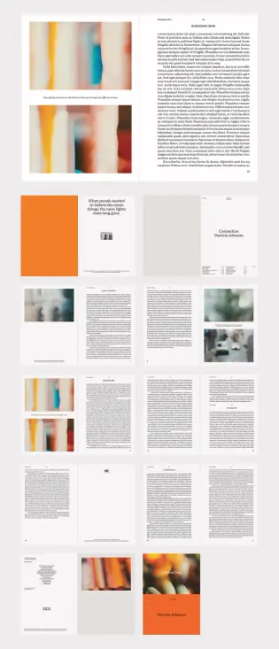
The template ships with 20 fully customizable pages and 11 included abstract urban photographs. That matters because sourcing cohesive imagery is often where book and brochure projects stall. Here, the visual direction is already established. You can swap the images entirely or build on the existing palette. Either way, you’re starting with intent.
Let’s talk about what “fully customizable” actually means in this context. Every text block, every color zone, every image frame is editable in Adobe InDesign. The CMYK color mode means the file is print-ready from day one—no color conversion headaches before sending to press. For designers working with professional printing workflows, that’s not a small detail.
The Role of Abstract Urban Imagery in Editorial Book Design
The included photographs are what elevate this template above standard InDesign fare. Abstract urban images occupy a particular visual space—they’re neither documentary nor purely decorative. They suggest place without specifying it. They communicate texture, light, and atmosphere without demanding narrative.
That ambiguity is a design asset. It means the template adapts across content categories. A photographer’s monograph, a fashion lookbook, a corporate culture document, an arts organization’s annual report—all of these live comfortably inside this visual language.
The warm orange and amber tones in the cover and accent pages create what I’d call a thermal contrast framework: a deliberate tension between warm foreground photography and neutral, typographically clean body pages. That tension keeps the spreads interesting across 20 pages without ever feeling chaotic.
Breaking Down the Adobe InDesign A4 Template Layout Structure
Structure is where editorial design either succeeds or collapses. This template’s architecture follows what designers might recognize as a Modular Anchor System—a layout principle where each spread contains one dominant visual anchor (a full-bleed image, a bold typographic block, or a color field) surrounded by structured white space and subordinate text elements.
The result is a hierarchy that reads clearly at a glance. Readers know where to look first. Then the secondary and tertiary content layers draw them deeper into the page. That reading progression doesn’t happen by accident—it’s the product of deliberate grid discipline inside the InDesign file.
How the Cover Page Sets the Visual Contract
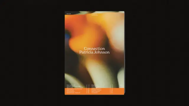
The cover features a deep, blurred urban photograph layered beneath clean white serif typography. “Connection” and “Patricia Johnson” sit low on the page, which is an intentional break from centered title conventions. Bottom-anchored headlines create ground—they feel stable, rooted, and considered.
That decision sets a visual contract with the reader: this book has personality and editorial confidence. It’s not trying to please everyone. And that’s exactly what a strong book layout should communicate from page one.
Interior Spreads and the Breathing Room Principle
Flip through the interior pages, and you notice something consistent: generous negative space. Text columns never crowd the page edges. Image frames breathe. Even the denser text-heavy spreads maintain margins that give the eye a place to rest.
I call this the Breathing Room Principle—a layout philosophy that treats white space not as emptiness but as an active structural element. The Royal Studio applies it consistently throughout this A4 InDesign book layout template, and it’s one of the primary reasons the design reads as premium rather than cluttered.
The table of contents spread deserves specific mention. It uses a two-column typographic grid with clear section numbering—functional and elegant at the same time. Page numbers align cleanly with section titles, making navigation intuitive without resorting to decorative embellishment.
Who Should Use This InDesign Book Layout Template?
The range of professionals who benefit from a template this structured is broader than you’d expect. Freelance graphic designers working on editorial projects can use it as a client-facing starting point—something that immediately communicates quality before a single custom element is added.
Photographers preparing a printed portfolio or monograph will find the image-forward layout logic directly applicable. The 11 included urban abstract photographs demonstrate the intended visual scale for imagery, making it easy to substitute your own work at the correct crop and resolution.
Publishers and self-publishing authors working on design-forward books—art, architecture, photography, and cultural commentary—will appreciate the print-ready CMYK setup and the professional typographic baseline. You’re not reinventing the wheel. You’re customizing a wheel that already rolls correctly.
Is This Template Right for Brochure Design, Too?
Yes, and this is worth addressing directly. Though marketed primarily as a book layout, this Adobe InDesign A4 template functions equally well as a high-end brochure or brand document. The 20-page count sits in the sweet spot for corporate capability documents, design studio portfolios, product catalogs, and event programs.
The CMYK color mode makes professional offset printing straightforward. The A4 format is standard across European and international print specifications. For agencies delivering printed brand collateral, this template shortens production timelines significantly.
The Design Intelligence Behind The Royal Studio’s Approach
The Royal Studio consistently produces InDesign templates that prioritize design intelligence over decoration. Their work doesn’t default to trendy gradients or over-engineered layouts. Instead, it leans on editorial fundamentals—grid discipline, typographic hierarchy, restrained color use—and then introduces one or two bold choices that make the result memorable.
In this A4 book layout, those bold choices are the warm orange accent pages and the abstract urban photography selection. Both decisions anchor the template in a specific emotional register: contemplative, urban, slightly cinematic. That specificity is what separates this template from the generic alternatives flooding stock template marketplaces.
CMYK vs. RGB: Why Print Mode Matters for Book Templates
This is a technical point that carries real professional consequences. Designing in RGB and converting to CMYK at the end of a project frequently produces color shifts—particularly in warm orange tones like those featured prominently in this template. Starting in CMYK, as this template does, eliminates that risk.
For designers preparing files for commercial printing, press operators, or print-on-demand services, CMYK source files are often a hard requirement. This template meets that requirement before you’ve placed a single element. That’s good engineering inside a design product.
How to Customize the A4 InDesign Book Layout Template Effectively
Customization works best when you understand what to preserve and what to replace. The structural grid, the margin system, and the typographic hierarchy are worth keeping largely intact. They’re doing the load-bearing work. The images, color palette, and headline text are the surfaces you should transform to match your project’s identity.
Start with the cover. Replace the abstract urban photograph with your own hero image while maintaining the bottom-anchored title placement. That compositional decision is strong enough to carry a wide range of imagery—portrait photography, architectural shots, and abstract fine art.
Typography Customization Without Losing the Layout’s Logic
The template uses a serif-and-sans pairing that balances editorial weight with functional readability. If you’re swapping typefaces, maintain that contrast logic. A heavier display serif for headlines paired with a clean sans-serif for body text preserves the visual hierarchy even if both fonts change entirely.
Avoid the common mistake of upgrading both typefaces to decorative options simultaneously. That creates typographic noise. One expressive face, one workhorse face—that’s the formula this template already follows, and it’s worth respecting.
Working with the Included Abstract Urban Images
The 11 included photographs serve as layout references as much as actual content. They establish the intended image scale, crop ratio, and tonal range for each spread. Even if you replace all 11 with your own photography, study how each image interacts with the surrounding white space and text elements before you swap it out.
That study will save you layout hours. The included images aren’t arbitrary—they’ve been chosen to demonstrate specific compositional relationships on each page.
Why InDesign Book Templates Built for A4 Print Still Matter in 2025
Print is not declining among serious designers. It’s concentrating. The market for generic printed materials has shrunk, but the demand for high-quality, design-forward printed books, monographs, and editorial pieces has held firm—particularly among photographers, artists, architects, and cultural institutions.
Those clients don’t accept mediocre design. They invest in printed objects precisely because digital screens can’t replicate the material authority of a well-made book. An A4 InDesign book layout template built to this standard gives designers the production foundation to meet that expectation.
Furthermore, the PDF export capabilities of Adobe InDesign make templates like this one doubly useful. The same file that produces a print-ready press PDF can generate a digital flipbook-ready PDF for online distribution. One template, two distribution channels, zero compromise on quality.
The Longevity of Abstract Urban Aesthetics in Editorial Design
Abstract urban photography has sustained relevance in editorial design for decades. Unlike trend-dependent visual styles, abstracted cityscapes—blurred lights, architectural fragments, and textural surfaces—carry an emotional neutrality that ages slowly. They feel current without being dated by a specific cultural moment.
The Royal Studio’s selection for this template leans heavily into that timelessness. The photographs feel like they could accompany an essay on urban memory, a poetry collection, a fashion editorial, or a photography theory text. That versatility is a deliberate curatorial choice, and it significantly extends the template’s useful lifespan.
Introducing the Spatial Narrative Index: A Framework for Evaluating Editorial Templates
When I evaluate editorial design templates professionally, I use a framework I call the Spatial Narrative Index (SNI). It measures a template across three axes: Structural Clarity (how clearly the grid organizes content), Visual Momentum (how effectively the layout moves the reader through the document), and Adaptive Range (how far the design can stretch across different content types without breaking).
The Royal Studio’s A4 InDesign book layout scores high on all three. Structural clarity is evident in the consistent margin system and typographic hierarchy. Visual momentum comes from the deliberate alternation between image-heavy and text-heavy spreads. Adaptive range is demonstrated by the template’s equal suitability for books, brochures, and portfolios.
Templates that score high on the SNI tend to justify their cost immediately. They reduce production time, raise the quality ceiling of the final output, and communicate professional credibility to clients before any content is customized. This template qualifies on all counts.
Download the template from Adobe Stock.Frequently Asked Questions About the Adobe InDesign A4 Book Layout Template
What software do I need to use this InDesign book layout template?
You need Adobe InDesign. The template is a native InDesign file, so you need an active Adobe Creative Cloud subscription with InDesign installed. It’s not compatible with Affinity Publisher or QuarkXPress without significant reformatting.
Are the abstract urban images included in the template free to use commercially?
The 11 included photographs come with the template package. Always verify the specific licensing terms provided by The Royal Studio at the point of purchase to confirm commercial usage rights for your project type.
Is the A4 format suitable for international printing?
Yes. A4 is the standard paper format across Europe, Asia, Australia, and most of the world. It’s widely supported by commercial printers and print-on-demand services internationally. North American designers working with US clients may need to consider Letter format adaptations, though many international printers accept A4 files directly.
What does CMYK color mode mean for this template?
CMYK stands for Cyan, Magenta, Yellow, and Key (Black)—the four ink colors used in commercial offset and digital printing. A CMYK file produces accurate color output when sent to a professional printer. RGB files, which are optimized for screen display, often shift in color when converted to CMYK at the production stage. Starting in CMYK, as this template does, eliminates that conversion risk.
Can I use this template for digital-only publications?
Absolutely. Adobe InDesign exports high-quality interactive and static PDFs suitable for digital distribution, screen-optimized layouts, and flipbook platforms. The CMYK color mode is a print specification, but the layout and structure work equally well for digital formats. For screen-only use, you can export with RGB color output settings in InDesign’s export dialog.
How many pages does the template include?
The template contains 20 fully customizable pages with 11 abstract urban photographs included. Every page is editable—text, images, colors, and layout elements can all be modified to match your project requirements.
Who designed this InDesign book layout template?
The Royal Studio designed this template. They produce professional-grade InDesign templates characterized by editorial discipline, restrained aesthetics, and print-ready technical specifications.
Is this template suitable for a photography book or monograph?
Yes, and it’s particularly well-suited for photography projects. The image-forward layout structure, full-bleed spread options, and abstract urban photography included in the package all point toward editorial and fine art photography applications. Swap the placeholder images with your own work, and the layout’s design logic carries your photographs cleanly.
Discover other graphic design templates for creative professionals here at WE AND THE COLOR.
#AdobeInDesign #AdobeStock #bookLayout #bruchureTemplate #design #graphicDesign #InDesignTemplate