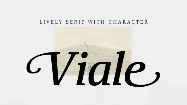
Viale Font Family by ParaType: The Serif That Breathes
The Viale font family by ParaType works quietly and confidently, with the kind of presence that earns trust before you consciously register why. Designed by Natalia Vasilyeva, Viale is a text serif with a slightly informal character that manages a difficult balance: it feels handcrafted without feeling casual and structured without feeling cold. That tension is exactly what makes it worth examining closely.
Type designers talk a lot about personality. But personality without function is decoration. What separates Viale from decorative serifs is its genuine usefulness across a range of applications—from editorial headlines to packaging design to high-end branding systems. Furthermore, its rich OpenType feature set gives designers genuine expressive control. This is not a typeface you exhaust in a single project.
Download the complete family from MyFontsSo why does Viale matter right now? Because the design industry is moving away from the cold, geometric sans-serifs that defined the last decade of brand identity. Warmth is back. Imperfection is back. The calligraphic trace—visible in a subtle entry stroke and a slightly concave stem—is back. The Viale font family sits precisely at that cultural intersection, making it one of the more timely releases in ParaType’s catalog.
Viale Font Family by ParaType Download the complete family from MyFontsWhat Makes the Viale Font Family Different From Other Display Serifs?
The honest answer is structure. Specifically, what Vasilyeva does with the vertical strokes. Most serif typefaces use straight or gently bowed stems. Viale uses gently concave vertical strokes—a detail so subtle that most readers will never consciously notice it, but one that gives each letterform a sense of internal tension. The letters feel taut. They feel alive.
I’d describe this quality using a framework I call Elastic Stem Architecture—the deliberate introduction of inward curvature along vertical strokes to generate visual energy without sacrificing legibility. Viale is an excellent case study for this principle. Additionally, the effect works because Vasilyeva pairs the concave stems with sharp, well-defined serifs. There are no rounded transitions at the serif brackets. The contrast between that soft stem curvature and those crisp terminals creates a productive visual friction—the kind that makes text feel dynamic at display sizes.
The Calligraphic Undercurrent
Viale carries what I call a Penographic Residue—a term I use for the way certain digital typefaces preserve the memory of a writing instrument without imitating one directly. You see it in Viale’s expressive entry and exit strokes. These aren’t full calligraphic swashes. They’re measured. They suggest the motion of a broad-nib pen without reproducing it literally.
This restraint is simply smart design. Fully calligraphic typefaces are hard to use. They compete with content. Viale, by contrast, lets the calligraphic flavor season the design rather than dominate it. Moreover, this approach gives the typeface a warmth that pure geometric serifs simply cannot replicate.
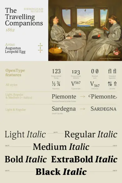
The Anatomy of the Viale Font Family: 12 Styles Explained
The Viale font family ships with 12 styles total: six upright and six italic. That’s a complete typographic system. Many display serif families stop at four or six styles, leaving designers to fake weights or mix foundries. Viale doesn’t require those compromises.
Each style carries between 725 and 1,300 glyphs, depending on the OpenType feature set in use. That range is significant. At 725 glyphs, you have a capable workhorse for Western Latin text. At 1,300, you have a typographic toolkit—one that includes contextual alternates, small caps, old-style figures, ligatures, initial and final forms, and a slashed zero.
OpenType Features That Actually Change the Typeface
Most OpenType feature sets are cosmetic. Viale’s are structural. Consider the full feature list:
- onum — Oldstyle (lowercase) figures for body text and editorial use
- calt — Contextual alternates that adjust letterforms based on surrounding characters
- c2sc — Converts lowercase to small caps, preserving the cap-height baseline
- smcp — True small capitals for a refined, editorial look
- pnum — Proportional figures for flowing numerical text
- frac — Pre-built fractions for pricing, measurements, and editorial typography
- liga — Standard ligatures for fi, fl, and similar combinations
- init / fina — Initial and final alternate forms that dramatically shift the typeface’s personality
- zero — Slashed zero for technical and financial contexts
- kern — Kerning pairs for precise optical spacing
The init and fina features deserve special attention. Activating them transforms Viale from a refined display serif into something closer to a calligraphic display face. Deactivating them gives you a cleaner, more neutral version. That’s not a minor toggle—it’s two different typefaces sharing one skeleton.
Viale Font Use Cases: Where This Typeface Performs Best
ParaType positions Viale for headlines, title pages, posters, short large-format texts, and decorative branding or packaging compositions. That description is accurate, but it undersells the typeface’s flexibility. Let me offer a more precise framework.
The Display-to-Decorative Spectrum
I think about Viale use cases along what I call the Display-to-Decorative Spectrum—a scale from purely functional headline use at one end to expressive, illustrative, typographic compositions at the other. Viale performs credibly across the entire range.
At the functional end, use Viale for editorial headlines in print or digital magazines. Its varied weights provide rhythm and hierarchy. Furthermore, the regular and medium weights work well for subheadings in larger-format layouts. At the expressive end, activate the initial and final alternates, add a ligature or two, and you have a typeface capable of anchoring luxury packaging or high-end identity systems.
Branding and Packaging Applications
Luxury branding is perhaps where the Viale font for branding earns its strongest case. The concave stems communicate refinement. The calligraphic entry strokes signal craft. And the crisp serifs provide the geometric precision that premium brand identities demand. Together, these qualities produce what I call Crafted Authority—a typographic register that feels made rather than manufactured.
Consider this for wine labels, perfume packaging, high-end hospitality identities, or editorial mastheads. The italic styles are particularly strong in these contexts. They carry genuine personality without tipping into flamboyance.
Natalia Vasilyeva and the ParaType Design Tradition
You cannot fully understand Viale without understanding its designer. Natalia Vasilyeva is a Siberian-born type designer, calligrapher, and book designer based in Russia. She has worked with ParaType across a substantial body of work—typefaces including Adventure, Hortensia, NataliScript, Liana, Mirandolina, and Nat Flight, among others.
Her practice sits at the intersection of calligraphy and type design—a combination that consistently produces letterforms with internal warmth and structural intelligence. Vasilyeva’s understanding of what she has called the “architecture of handwriting” runs through everything she produces. In Viale, that understanding manifests in the concave stems, the entry strokes, and the carefully calibrated relationship between thick and thin transitions.
ParaType itself has been designing, developing, and distributing digital typefaces since the 1980s. Its library includes widely used families such as Futura PT, DIN 2014, Circe, and PT Sans/Serif Pro. The foundry carries deep expertise in Latin, Cyrillic, and Greek scripts. Viale reflects that institutional expertise—it’s a professionally engineered typeface, not a boutique experiment.
Comparing Viale to Other Serif Typefaces in Its Category
Where does the Viale font family sit relative to its contemporaries? Designers frequently compare display serifs by asking three questions: How well does it differentiate at large sizes? How much personality does it carry? How flexible is it across weights and styles?
Viale scores strongly on all three. At large sizes, the concave stems and calligraphic strokes read clearly. The personality is present but not aggressive—you could use this typeface for a luxury hotel identity or a literary magazine without it feeling out of place in either context. And the 12-style range gives you enough variation to build complete typographic systems.
Compared to typefaces like Cormorant Garamond, Viale is more structured and less historicist. Or compared to Freight Display, it’s warmer and more calligraphically influenced. And compared to Canela, it’s more traditionally anchored. It occupies a specific position in the serif landscape—one that balances historical craft with contemporary relevance.
The Calligraphic Display Serif Category
I’d place Viale in a category I call Structured Calligraphic Display—serifs that preserve a legible connection to pen-written forms without abandoning the optical corrections and structural discipline that make type useful at scale. This is a relatively small category. Most typefaces with calligraphic references either lean fully into the script direction or suppress the calligraphic trace entirely. Viale holds the middle ground with unusual precision.
Working With the Viale Font Family: Practical Design Guidance
A typeface is only as good as the designer’s ability to use it. Here’s practical guidance for getting the most from Viale.
Size and Setting Recommendations
Viale is engineered for display use. Its optimal range begins around 24pt and extends upward without limit. Below 18pt, the concave stems and entry strokes begin to lose their definition, and the typeface loses part of what makes it distinctive. Use a different member of your type system for body copy.
For headlines in editorial layouts, try the medium-weight upright for primary heads and the light italic for secondary text or pull quotes. The contrast between those two weights and styles creates a visual hierarchy with genuine warmth. Additionally, the initial alternates on the light italic at 36 pt or above produce genuinely beautiful results.
Color, Contrast, and White Space
Viale’s personality intensifies against backgrounds with strong contrast. White on deep navy or black on warm cream both serve the typeface well. Avoid mid-tone backgrounds—they flatten the stem contrast and reduce the impact of the calligraphic details. Furthermore, give Viale generous tracking at display sizes. The letterforms breathe better with space around them. Tight tracking suppresses the entry and exit strokes and makes the typeface look cramped rather than refined.
Pairing Viale With Other Typefaces
For body text pairing, choose a neutral humanist sans—something like Aktiv Grotesk, Neue Haas Grotesk, or a well-spaced geometric such as Circular. The contrast between Viale’s warmth and a clean sans-serif’s rationality is productive. Avoid pairing Viale with another display serif in the same layout. The two typefaces will compete rather than complement.
For monospaced pairings in editorial or technical contexts, a clean mono like Söhne Mono or Courier New provides enough visual distance from Viale’s organic character to work effectively.
The Viale Font Family in the Context of Contemporary Design Trends
Typography in 2025 and 2026 is experiencing a broadly documented return to craft, warmth, and historical reference. The hyper-minimal, brand-agnostic corporate sans-serifs of the 2010s are giving way to typefaces with more specific character. Serif revival is real, and it’s not merely nostalgic—it’s a response to the visual fatigue generated by a decade of generic sans-serif identity systems.
Within that context, the Viale font family is well-timed. Its calligraphic residue signals authenticity. Its structural discipline signals competence. And its OpenType depth signals that designers are getting a professional tool, not just a stylistic moment.
I’d argue that Viale also anticipates a specific near-future trend: the use of traditional typographic craft as a counter-signal to AI-generated visual content. As AI tools produce increasingly competent but characteristically smooth and frictionless imagery, human-made design markers—including the kind of deliberate imperfection embedded in Viale’s concave stems and calligraphic strokes—will carry more communicative weight, not less. This is what I call the Craft Signal Hypothesis: the idea that as machine-generated aesthetics proliferate, visible evidence of human craft becomes a premium differentiator in visual communication.
Licensing and Availability of the Viale Font Family
The Viale font family is published by ParaType and available through MyFonts. ParaType offers standard desktop, webfont, app, and ePub licensing options. For agency or enterprise use, it’s worth contacting ParaType or MyFonts directly to ensure your licensing covers the full scope of your project.
At 12 styles, purchasing the complete family package makes sense for most projects. The full character range—up to 1,300 glyphs per style—means you’re unlikely to encounter gaps in language coverage for Western Latin projects. Cyrillic support availability should be confirmed directly with ParaType, given the foundry’s extensive Cyrillic expertise.
Final Thoughts on the Viale Font Family
The Viale font family is one of those typefaces that rewards close attention. The details that make it special—the concave stems, the calligraphic entry strokes, and the toggle between formal and expressive through OpenType alternates—aren’t obvious at first glance. But they’re exactly what separates a typeface that works from one that merely exists.
Natalia Vasilyeva has produced something genuinely useful here. It’s a typeface with a point of view—one rooted in the calligraphic tradition, sharpened by structural discipline, and delivered with enough range to support real design work rather than just inspiration boards. Moreover, it arrives at a cultural moment when its particular combination of warmth and craft is precisely what brand and editorial designers are looking for.
Download the complete family from MyFontsMy honest assessment: Viale belongs in every serious type library. It’s not a typeface you’ll reach for every day, but when the project calls for it—when you need something that feels made rather than manufactured—you’ll be glad it’s there.
Frequently Asked Questions About the Viale Font Family
What is the Viale font family?
The Viale font family is a text serif typeface designed by Natalia Vasilyeva and published by ParaType. It features 12 styles—six upright and six italic—with gently concave vertical strokes, expressive calligraphic entry and exit strokes, and a rich OpenType feature set. Viale suits display use in headlines, title pages, posters, branding, and packaging design.
Who designed the Viale font?
Natalia Vasilyeva designed Viale. Vasilyeva is a type designer, calligrapher, and book designer from Barnaul, Siberia, Russia. She has an extensive portfolio of typefaces published through ParaType, with a practice rooted in the intersection of calligraphy and structural type design.
What OpenType features does Viale include?
Viale includes the following OpenType features: onum (oldstyle figures), calt (contextual alternates), c2sc (capitals to small caps), smcp (small capitals), pnum (proportional figures), frac (fractions), liga (ligatures), init (initial forms), fina (final forms), zero (slashed zero), and kern (kerning). Activating these features can significantly transform the typeface’s visual appearance.
Is Viale suitable for body text?
Viale is optimized for display use rather than extended body text. Its concave stems and calligraphic details perform best at sizes of 24pt and above. For body copy, consider pairing Viale headlines with a separate text-optimized serif or a clean humanist sans-serif.
What typefaces pair well with Viale?
Viale pairs best with neutral humanist sans-serifs such as Aktiv Grotesk, Neue Haas Grotesk, or geometric alternatives like Circular. The contrast between Viale’s warmth and a rational sans-serif creates effective typographic hierarchy. Avoid pairing Viale with other decorative or display serifs in the same layout.
Where can I purchase the Viale font family?
Viale is available through MyFonts, where ParaType publishes its typefaces. Standard desktop, webfont, app, and ePub licensing options apply. For large-scale agency or enterprise licensing, contact MyFonts or ParaType directly.
What is the glyph count in Viale?
Each style in the Viale font family contains between 725 and 1,300 glyphs, depending on the active OpenType feature set. The higher glyph count reflects the full range of alternates, small caps, old-style figures, ligatures, and contextual forms included in the family.
How does the Viale font family compare to Cormorant Garamond?
Viale is more structurally disciplined and less historicist than Cormorant Garamond. Cormorant leans into its Renaissance-type heritage with high contrast and extreme hairlines. Viale, by contrast, introduces concave stems and calligraphic strokes within a more contemporary structural framework. The result is a typeface that feels crafted but not archival.
Take a look at WE AND THE COLOR’s Fonts category to find other amazing typefaces for different creative needs.
#font #fontFamily #ParaType #typeface #Viale