Mercator projection ON - Mercator projection OFF.
#geography #StopMercator #mercator #northernhemisphere
#geography #StopMercator #mercator #northernhemisphere
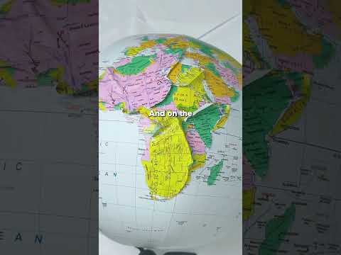
The best map on earth. #stopmercator #maps #geography #justice
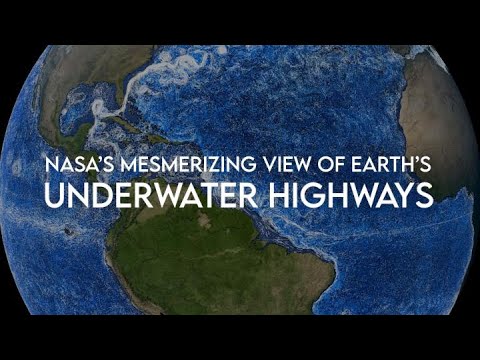
Awesome work by #NASA portraying #Ocean currents.
Imagine this with #Mercator 😆. What you see in this video is called the #PerspectiveMapProjection.
@infobeautiful Not only is this map utterly incorrect, so are all those simplistic solutions like "TrueSize".
If you wish to compare areas you need an equal-area #MapProjection
We just added a button to toggle the *revolutionary* new globe view from @maplibre and we think it’ll turn some heads.
For now, it’s only available in a special “embed” version of the map. This is same version of the map as when you Share a map from our homepage and choose “HTML”. It’s perfect for inserting a quick historical map into a blog post or other webpage.
Take it for a spin!
https://embed.openhistoricalmap.org/#map=3/16.82/130.83&projection=globe&date=1925-02-04
https://embed.openhistoricalmap.org/#map=2.87/36.74/-43&projection=globe&date=1725-02-04&layer=W
Documentation at https://github.com/OpenHistoricalMap/openhistoricalmap-embed/
Very disappointed to see Prof. Michael Clarke involved in this. A video published by #SkyNews days ago portrays distances on the #Mercator projection, misinforming the public on the real range of #Russia 's #WMDs.
This is a very obvious misuse of #cartography, that cannot possibly be a mistake.

Detailed analysis of the dramatic events in #Russia the past few days. Some observers are calling this a watershed moment, turning the tide in favour of #Ukraine. We shall see.
Note however that @[email protected] and @noelreports seem to be measuring distances on the #Mercator projection.

Now that @openstreetmap is all grown up, wouldn't it be great if it stopped using the horrendous Mercator projection once and for all?