ON EFFECTIVE COMMMNICATION…
When a sign feels more like a threat…
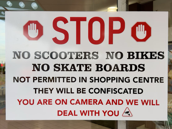
Spotted this at the entrance to the Gateway shopping centre in Sorell, Tasmania, where Woolworths is situated. It’s a great example of how tone shapes the experience of a place.
The message is clear enough but the tone is pure hostility. Words like “STOP” in huge bright red letters, “NOT PERMITTED”, “THEY WILL BE CONFISCATED”, and “WE WILL DEAL WITH YOU” set up an adversarial relationship before people even walk through the door. It doesn’t feel like a welcome; it feels like a threat even to people not riding bicycles, scooters or skateboards.
From a public‑relations perspective, this kind of messaging tends to backfire. It suggests to me that the communication skill of centre management could be improved in making the place feel inviting. Ironically, research on compliance shows that people are more likely to follow rules when the tone is respectful, clear and framed around shared safety, not punishment.
The centre may well have a problem with people riding bicycles, scooters and skateboards inside the building. Nonetheless, a more respectful and effective version could say something like: “For everyone’s safety, please do not ride scooters, bikes and skateboards inside the centre.” And if people still do, the centre management could ask them not to in a non-threatening tone more likely to gain compliance.
Same rule. Completely different vibe.
If we want community spaces to feel like community spaces, the language we choose matters. Tone isn’t decoration. It is part of the experience.
I make this comment as someone with a background in advocacy and communications.
#communication #signs #publicrelations #Sorell #shoppingcentres