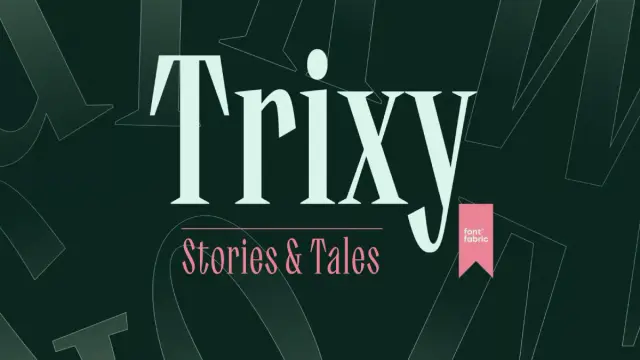
The Trixy Font Family by Fontfabric Is a Condensed Serif Typeface That Reinvents Retro Display Typography
Soviet book covers from the 1950s and 60s were not supposed to be beautiful. They were functional. Yet the designers working under ideological and material constraints produced some of the most daring typographic experiments of the 20th century — condensed letterforms with razor-sharp serifs, extreme vertical stress, and a restless energy that still feels urgent today. The Trixy font family by Fontfabric reaches back into that archive and pulls something genuinely new out of it.
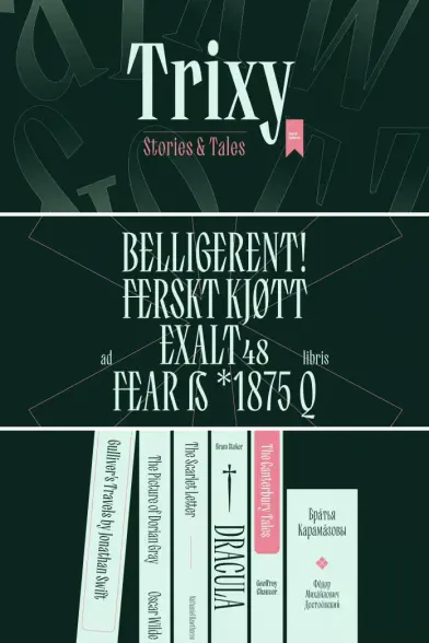
Released in October 2025 and designed by Vika Usmanova and Ivelina Martinova, Trixy is a condensed serif typeface built for expressive display typography. It is not a revival. It is not nostalgia dressed up in OpenType. Trixy is a systematic reinterpretation of experimental mid-20th-century Cyrillic lettering — one that functions as a fully modern, multilingual type system for editorial, packaging, branding, and digital design.
The typeface is available on MyFontsSo why does this matter right now? Because the design industry has been simultaneously hungry for two things that seem to contradict each other: historical depth and contemporary precision. Trixy delivers both. And it does so with a structural clarity that makes it as useful as it is visually arresting.
Trixy Font Family by Fontfabric The typeface is available on MyFontsWhat Makes the Trixy Condensed Serif Different from Every Other Retro-Inspired Typeface?
The retro typography trend is, frankly, exhausted. Scores of foundries have released “vintage-inspired” condensed serifs over the past decade. Most of them follow the same formula — add a few rough edges, choose a warm color palette for the specimen, call it “nostalgic.” Trixy does not do this.
The difference starts with the source material. Type Director Vika Usmanova spent years collecting book covers from Eastern Europe’s mid-20th-century publishing output. She was drawn to a specific typographic sensibility — one where designers made genuinely bold structural decisions rather than decorative ones. Sharp, small horizontal serifs. Massive vertical serifs. Narrow proportions under high contrast. These were not stylistic flourishes. They were solutions to real constraints, and they produced letterforms with a tectonic clarity that typical revival typefaces rarely capture.
Crucially, Usmanova began the design process in Cyrillic, not Latin. This is rare. Most typefaces start in Latin and adapt into Cyrillic as an afterthought. Starting in Cyrillic fundamentally shaped the letterform logic — the proportional decisions, the serif behavior, the rhythm across a line of type. The Latin expansion came later, informed by those Cyrillic bones.
The result is a typeface where the Cyrillic and Latin scripts share a genuine structural DNA. They feel like siblings, not translations. That coherence is one of Trixy’s most underappreciated qualities.
The Two Personalities: Trixy Stories vs. Trixy Tales
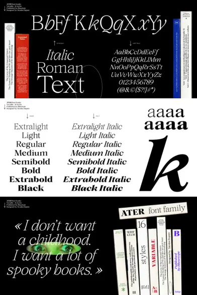
The Trixy font family divides into two distinct subfamilies, each with five weights from Light to Bold. Understanding the difference between them is essential for using the family effectively.
Trixy Stories is the more refined of the two. It carries the full weight of Trixy’s condensed serif character but delivers it with a certain editorial composure. Stories includes a rich set of ligatures and stylistic alternates — tools that allow designers to tune the expressiveness of their headlines precisely. When you need Trixy’s personality at a slightly lower volume, Stories is your starting point.
Trixy Tales, meanwhile, pushes further. The details are sharper. The legs on certain characters become elongated, almost swash-like in their gesture. Tales has more eccentricity built into its default forms — more swing, more visual tension, more of that experimental Soviet-era energy that inspired the typeface in the first place.
Think of Stories and Tales not as a light and dark mode, but as two editorial voices within the same authorial tradition. One speaks with precision. The other speaks with theatre.
Trixy Font Weights and the Architecture of a 10-Style System
Ten upright styles across two subfamilies give Trixy a focused, purposeful weight range. This is not a family trying to serve every design scenario. It is a display-focused system with clear typographic intent.
Each subfamily — Stories and Tales — offers Light, Regular, Medium, SemiBold, and Bold. The weight progression feels deliberately calibrated. The lightweights carry Trixy’s condensed proportions with surprising elegance, particularly in editorial contexts where large-scale headlines need to breathe. The Bold weights are, predictably, where the typeface becomes most dramatic — the vertical serifs gain mass, the contrast between thick and thin strokes sharpens, and the overall silhouette becomes almost architectural.
Medium and SemiBold occupy an interesting middle ground. They are versatile enough for subheadings and secondary display text without losing the family’s expressive character. For designers building multi-level typographic hierarchies within a single layout, these intermediate weights do a great deal of structural work.
OpenType Features That Actually Matter
Trixy ships with extended OpenType functionality, and it is worth understanding what that means in practice. The family includes stylistic alternates, stylistic sets, localized forms, ligatures, and case-sensitive forms. These features are not decorative extras — they are tools for typographic control.
The ligatures, in particular, deserve attention. Ivelina Martinova worked specifically on Trixy’s ligature set, designing connections that complement the typeface’s visual rhythm rather than simply joining characters mechanically. In headline typography at display sizes, well-designed ligatures produce a flowing quality across letter sequences that no amount of manual kerning can replicate. Trixy’s ligatures do exactly this.
The stylistic alternates allow designers to toggle between Trixy’s more expressive forms and slightly more contained versions of the same characters. Specifically, the aperture on certain letterforms can shift between open and closed variants, giving nuanced control over how open or compact the overall texture of a typeset headline feels. That level of fine control in a display serif is genuinely useful.
The Soviet Typographic Heritage Behind the Trixy Serif Typeface
It is worth taking the historical inspiration seriously because it shapes everything about how Trixy behaves visually. Mid-20th century Eastern European Cyrillic lettering operated in a design culture that was simultaneously constrained and experimental. Type designers working in the Soviet sphere did not have access to the commercial typographic traditions of Western Europe. They built their own systems — often with limited technology, under ideological pressure, and with remarkable formal invention.
The specific quality that Usmanova identified in those book covers — and that Trixy captures — is what I call Constrained Dynamism: the typographic phenomenon where extreme formal restriction (narrow proportions, vertical stress, limited tooling) paradoxically generates high visual energy rather than suppressing it. When every letterform decision is optimized within a tight system, the cumulative effect across a word or headline is kinetic, almost architectural.
This concept of Constrained Dynamism explains why Trixy feels simultaneously tight and alive. The narrow proportions are genuinely condensed — not artificially compressed via horizontal scaling, but drawn that way from the outset. The high contrast is structural, not applied. And the sharp serifs are load-bearing elements of each letterform, not ornamental finishing touches.
Understanding this history makes you a better user of the typeface. You set Trixy differently when you understand that its formal logic comes from a design tradition where each character had to earn its place on the page.
Cyrillic-First Design: A Structural Advantage
Starting from Cyrillic rather than Latin gave the Trixy font family an unusual structural advantage. Cyrillic letterforms, particularly in condensed high-contrast designs, demand a specific approach to vertical stroke distribution and serif behavior that differs meaningfully from Latin conventions.
When Usmanova built Trixy’s Latin from the Cyrillic foundation, the Latin inherited that structural logic. This is why Trixy’s Latin characters feel more architecturally cohesive than most revival-inspired condensed serifs. The lowercase g, the ear of the r, the leg of the capital R — these details are informed by a design sensibility that originated in Cyrillic decision-making, and that origin gives them a specificity and confidence that purely Latin-derived approaches rarely achieve.
For designers working in multilingual contexts — particularly those combining Latin and Cyrillic scripts — this coherence is practically valuable. Both scripts feel like they belong to the same typographic voice, which is not something you can take for granted in display typography.
Where Does the Trixy Display Font Work Best?
Trixy is a display typeface. This is not a limitation — it is a precision. The family is optimized for large-scale applications where visual impact, typographic personality, and formal clarity all need to operate simultaneously. Using it at text sizes is technically possible in some weights, but it is not where the family’s strengths live.
Here are the use cases where Trixy performs at its highest level.
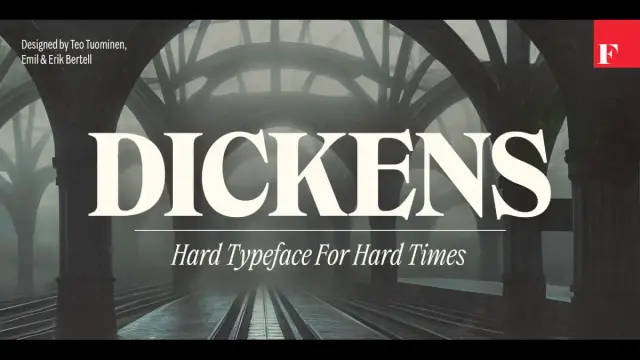
Editorial Headlines and Magazine Typography
This is Trixy’s most natural environment. At headline scale, the condensed proportions allow more characters per line without sacrificing visual weight. The contrast structure creates an immediate visual hierarchy. And the ligatures produce the flowing rhythm that makes a typeset headline feel designed rather than merely set.
For editorial designers working on long-form publications, literary magazines, or culture-focused media, Trixy Stories in Medium or SemiBold is particularly effective. It carries personality without overwhelming the content.
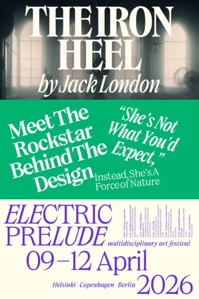
Book Cover Design and Publishing Layouts
Given that Trixy’s inspiration comes from book covers, it should surprise no one that it excels in this context. The typeface has an inherent bibliographic quality — a sense that it belongs to a tradition of considered, editorially intentional typography. It reads as literary without being precious.
Trixy Tales Bold, especially with its elongated leg details, produces stunning results on book cover treatments where the title needs to carry the visual weight of the entire composition.
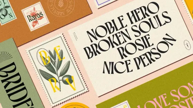
Packaging Design and Brand Identity
Trixy’s condensed proportions make it exceptionally useful in packaging contexts where vertical space is at a premium — bottle labels, narrow panel copy, vertical type treatments. The high contrast ensures legibility even at small display sizes. And the personality of the typeface — that retro-contemporary energy — translates well to food and beverage branding, particularly premium, artisanal, or culturally positioned products.
For brand identities that need a visual voice of considered authority with a historical register, Trixy provides it without resorting to the generic retromania that plagues much of current branding typography.
Poster Design and Digital Graphics
At a large scale, Trixy Tales Bold is one of the most visually powerful condensed serifs released in recent years. The combination of extreme condensation, high contrast, and those distinctive leg details creates compositions that command attention. For poster work, cultural event graphics, or social media title cards, it performs with rare conviction.
The Design Process: What Vika Usmanova and Ivelina Martinova Built
Understanding a typeface’s design process often illuminates why it behaves the way it does. Trixy was not a quick project. Usmanova began collecting the Eastern European Cyrillic book covers that would inspire the typeface over several years before the design work began. That period of collecting and analyzing shaped the formal vocabulary she eventually brought to the drawing stage.
One challenge Usmanova identified explicitly: knowing when to stop experimenting. Trixy’s condensed proportions and sharp serifs open up a wide range of possible letterform variations. The discipline required was in maintaining system cohesion while still allowing expressive details to emerge. That tension — between systematic thinking and individual letterform eccentricity — is visible in the final typeface, and it is one of Trixy’s most compelling qualities.
Martinova joined the project at a later stage, focusing on extended Latin coverage, Cyrillic expansion, symbols, and the ligature set. Her work on the ligatures — designing connections that complemented Trixy’s visual rhythm rather than merely joining characters — reflects a deep understanding of how display typography actually functions at headline scale. The collaboration between the two designers produced something neither might have built alone: a typeface with both systematic rigor and genuine formal surprise.
Spacing presented the greatest technical challenge. Condensed proportions and sharp serifed shapes require extreme precision to produce a rhythm that feels both dynamic and harmonious. Trixy achieves this. The spacing decisions make the typeface perform beautifully in continuous headline settings — words flow, letters relate to each other, and the overall texture of a typeset headline feels intentional rather than mechanical.
Trixy Font Multilingual Support and Technical Specifications
Trixy ships in OTF, TTF, and Webfont formats (WOFF and WOFF2). The multilingual support covers extended Latin and extended Cyrillic character sets — a natural consequence of the typeface’s dual-script origin story.
The OpenType feature set includes alternates, stylistic sets, localized forms, ligatures, and case-sensitive forms. These features are supported across standard professional design applications, including Adobe Illustrator, InDesign, Photoshop, and Figma.
The family is available through MyFonts. Ten styles are available across the two subfamilies, with individual style licensing and full family packages depending on the platform.
For web typography applications, the WOFF2 files ensure efficient loading. The condensed proportions actually offer a secondary technical advantage in web contexts: less horizontal space per character means more content per viewport width, which is a genuinely useful property in responsive design scenarios where vertical space is limited.
The Constrained Dynamism Framework: A Typographic Evaluation Method
The concept of Constrained Dynamism — introduced earlier in this article — offers a useful framework for evaluating display typefaces more broadly, not just Trixy. The premise is this: the most visually energetic display typefaces are rarely those with the most formal freedom. They are the ones where tight formal constraints generate kinetic formal energy across the type system.
Under this framework, four properties define a typeface’s Constrained Dynamism score: proportional compression (how condensed), stroke contrast ratio (how high), serif behavior (how structurally integrated versus ornamental), and letterform eccentricity (how many character-level departures from convention exist within a coherent system).
Trixy scores exceptionally high across all four. Its proportional compression is genuine, not simulated. Furthermore, its stroke contrast is structural, and its serifs are load-bearing formal elements. And its character-level eccentricities — those elongated legs in Tales, the ligature connections, the alternate aperture forms — exist within a system coherent enough to contain them.
This is why Trixy does not feel like a collection of interesting characters. It feels like a coherent typographic voice. That distinction matters enormously in practice.
My Take: Why Trixy Deserves a Place in Every Serious Designer’s Type Library
I have been evaluating display typefaces professionally for years, and Trixy represents something genuinely rare: a historically informed display serif that earns its visual confidence through structural thinking rather than surface decoration.
The Soviet Cyrillic inspiration could easily have produced something gimmicky — a typeface that leans on its reference image and delivers little beyond aesthetic nostalgia. Instead, Usmanova and Martinova used that historical inspiration as a starting point for systematic design thinking. The result is a typeface that looks like it belongs to the history of experimental Eastern European typography while functioning with the precision of a contemporary professional type system.
The Stories/Tales bifurcation is a smart editorial decision. It gives the family a genuine range — from refined to theatrical — without fragmenting its identity. You know immediately that both subfamilies are Trixy. And the OpenType features, particularly the ligatures, elevate the practical value of the family well beyond what the specimen images alone can demonstrate.
If you work in editorial design, publishing, premium packaging, or brand identity — and especially if you regularly need to set both Latin and Cyrillic — Trixy should be at the top of your licensing list. It is, quite simply, one of the most distinctive and typographically intelligent condensed serif releases of 2025.
The typeface is available on MyFontsMy prediction: within the next two years, Trixy will become one of Fontfabric’s most recognized display families. The visual identity landscape is moving toward typefaces with historical depth and contemporary precision simultaneously. Trixy sits exactly at that intersection.
Frequently Asked Questions About the Trixy Font Family
What is the Trixy font family?
Trixy is a condensed serif typeface family designed by Vika Usmanova and Ivelina Martinova and published by Fontfabric. It draws inspiration from bold, experimental Cyrillic lettering on Soviet-era book covers from the mid-20th century. The family includes 10 upright styles across two subfamilies — Trixy Stories and Trixy Tales — each offering five weights from Light to Bold.
What is the difference between Trixy Stories and Trixy Tales?
Trixy Stories delivers a refined, expressive tone with a rich set of ligatures and stylistic alternates, making it ideal for editorial typography where control and composure are needed. Trixy Tales pushes further with sharper details and elongated, swash-like character legs, producing more visual drama and eccentricity. Think of Stories as precise and Tales as theatrical — both within the same typographic voice.
What are the best use cases for the Trixy font?
Trixy is optimized for display typography at a large scale. Its strongest applications include editorial headlines, magazine covers, book cover design, packaging labels, poster design, branding, and digital graphics. It performs particularly well in contexts that call for strong visual personality combined with historical character — premium food and beverage packaging, literary publishing, and culture-focused media.
Does Trixy support Cyrillic script?
Yes. In fact, Trixy was designed starting from Cyrillic — an unusual approach that gives the family exceptional structural coherence between its Cyrillic and Latin character sets. The family offers extended Latin and extended Cyrillic coverage, making it well-suited for multilingual design projects.
What OpenType features does the Trixy font include?
Trixy includes stylistic alternates, stylistic sets, localized forms, ligatures, and case-sensitive forms. The ligature set is particularly well-developed, with connections designed to complement the typeface’s visual rhythm in headline settings. Alternate aperture forms allow designers to shift between more open and more closed character variants.
What formats does the Trixy font family come in?
Trixy is available in OTF, TTF, WOFF, and WOFF2 formats, covering desktop, print, and web typography applications.
Who designed the Trixy font?
Trixy was designed by Vika Usmanova, Type Director at Fontfabric, who initiated the project and led the design of the core letterforms, and Ivelina Martinova, who worked on the extended Latin, Cyrillic, symbols, and ligature set. The typeface was released by Fontfabric in October 2025.
Is the Trixy font suitable for web design?
Trixy is primarily a display typeface optimized for large-scale headline use. However, it is available in WOFF and WOFF2 webfont formats, making it suitable for web typography in headline and display contexts. Its condensed proportions also offer a practical advantage in responsive design: more characters per line width without sacrificing visual weight.
Where can I purchase or license the Trixy font family?
Trixy is available on MyFonts. Desktop, webfont, and digital advertising license types are available depending on your use case.
How does the Trixy font compare to other condensed serif typefaces?
Trixy distinguishes itself from other condensed serif typefaces through its Cyrillic-first design origin, its dual-subfamily structure (Stories and Tales), and its genuine structural coherence — the condensed proportions, high contrast, and serif behavior are all drawn from the outset rather than applied or compressed mechanically. The historical Cyrillic inspiration gives it a typographic specificity and formal confidence that most revival-inspired condensed serifs lack.
Check out other trending typefaces here at WE AND THE COLOR.
#font #fontFamily #fontfabric #fonts #serif #serifFont #Trixy