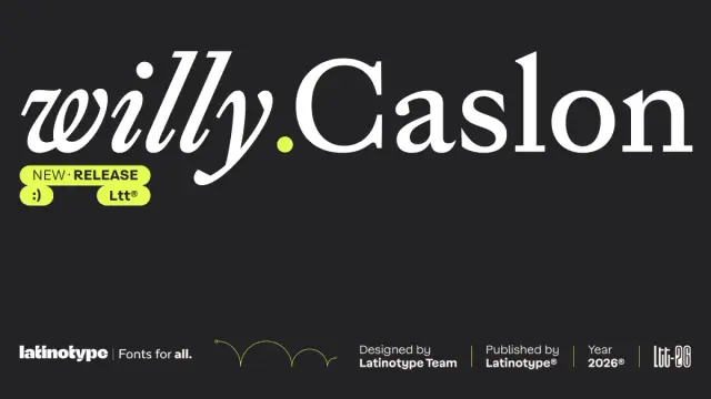
Willy Caslon Font Family by Latinotype
Serif typography has a problem. Too many contemporary revivals either freeze a historical model in amber or strip it so clean that it loses all character. Neither approach serves editorial design right now — and both leave art directors settling for something that almost works.
The Willy Caslon font family breaks that pattern decisively. Designed by Juan Bruce and the Latinotype team, this typeface reinterprets the English typographic tradition associated with William Caslon and recalibrates it for modern reading rhythms. Importantly, it doesn’t ask you to choose between tradition and relevance. It makes that choice obsolete.
Think about what editorial typography actually needs to do. It must carry voice, sustain reading across long columns, hold visual weight on a screen, and still feel like a deliberate design decision. Most transitional serifs handle two or three of those demands competently. The Willy Caslon font family handles all four — and that distinction matters more than it might initially seem.
The typeface is available on MyFontsWhat Makes the Willy Caslon Font Family Different From Standard Caslon Revivals?
That question cuts straight to the real typographic conversation. Standard Caslon revivals typically work from the same reference points: moderate modulation, a slightly oblique axis, and open counters. Those qualities define the historical model accurately. However, Willy Caslon uses those same starting points and then pushes deliberately further.
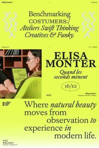
Juan Bruce introduces greater formal control into the system as a foundational design decision. Sharp terminals appear throughout the character set — not just in the serifs, but specifically in characters like a, c, and r. Those sharp endings concentrate optical energy at precisely the moments when a reader’s eye needs the clearest directional signal.
Furthermore, the curves narrow and tighten in strategic locations: the counterstrokes of a and g, and the shoulder of the n. This creates what I call Active Rhythmic Architecture — a design system where tension is engineered at the individual stroke level to produce a livelier text color without disrupting reading flow. It’s not decorative contrast. It’s structural pacing built into the typeface’s DNA.
Willy Caslon Font Family by Latinotype The typeface is available on MyFontsSharp Terminals as a Structural Design Decision
Sharp terminals are easy to misread as purely stylistic. Actually, they function as visual anchors within the reading field. They pull the reader’s eye along the baseline with more precision than rounded or bracketed alternatives typically achieve. In editorial settings — particularly long-form digital content — that precision actively reduces fatigue.
The Willy Caslon font family deploys those terminals consistently across the entire character set. That consistency matters as much as the sharpness itself. A typeface that introduces tension inconsistently feels nervous. Willy Caslon, by contrast, feels controlled and intentional throughout.
How the Willy Caslon Font Family Sits Within the Transitional Serif Category
Transitional serifs occupy the space between humanist and rational models historically. They carry the warmth of Renaissance letterforms while reaching toward the geometric logic of the Enlightenment era. William Caslon himself occupied that middle space — and so does this contemporary typeface.
But the Willy Caslon font family adds a third dimension to that historical positioning. Beyond the horizontal axis between humanist warmth and rational structure, it operates along what I call the Editorial Tension Axis — a scale measuring how actively a typeface engages or calms the reading experience at the stroke level.
Most transitional serifs sit low on that axis by design. They prioritize typographic neutrality and visual quiet. Willy Caslon, by contrast, sits firmly in the active zone — generating consistent visual energy while remaining entirely readable. That combination is genuinely difficult to achieve technically. Additionally, it’s rare enough in practice to make this typeface stand apart in any serious typography stack.
X-Height, Proportional Balance, and Media Flexibility
Proportions matter enormously in editorial typography, yet they rarely receive enough critical attention. The Willy Caslon font family features a balanced x-height calibrated for both print and digital editorial contexts simultaneously. This means the typeface performs across media without requiring significant optical correction between environments.
The ascender and descender ratios remain consistent throughout the family system. That consistency gives designers predictable spacing behavior — which, in turn, makes layout work faster and significantly more reliable. If you’ve ever struggled with a typeface that behaves unpredictably across sizes and contexts, you understand exactly why proportional discipline matters this much.
The Italic Construction in the Willy Caslon Font Family
Many serif typefaces treat the italic as an afterthought — essentially a sloped roman with minimal structural change. The Willy Caslon font family takes the opposite position entirely. Its italic carries its own distinct construction, not simply inclination applied to upright forms.
This distinction is significant for working designers. A true italic construction creates a secondary voice within the same typeface system. Designers can therefore use the italic for emphasis, captions, pull quotes, and secondary text hierarchies without the visual disconnect that comes from a poorly integrated italic variant. Furthermore, it gives the typeface a genuine expressive range across complex editorial layouts.
Uppercase Integration and Typographic Color
The uppercase characters in the Willy Caslon font family deserve specific attention. Latinotype designed them to integrate into the overall weight and typographic color of the entire system. Uppercase letters in many revivals feel heavier or lighter than their surrounding context warrants. In Willy Caslon, they read consistently, which keeps the typographic color even across headlines, subheads, and mixed-case settings simultaneously.
Typographic color refers to the overall gray density that a block of text produces on the page or screen. The Willy Caslon font family achieves what designers sometimes call active neutral color: present enough to carry editorial authority, controlled enough to sustain long-form reading comfortably. Contrast increases toward the ends of strokes, which reinforces typographic presence without introducing the visual noise that high-contrast serifs sometimes create.
Willy Caslon Font Family in Real Editorial Practice
Where should you actually use this typeface? The Latinotype team positions it clearly for editorial identities, digital projects, and content-driven applications where a serif with typographic presence plays an active role in how content develops. That framing is precise and strategically broad at the same time.
In practice, the Willy Caslon font family suits long-form digital journalism, brand identity systems for publishers and cultural institutions, high-quality editorial print, academic publications with strong visual identities, and digital product interfaces where typographic authority matters. Moreover, it works for any design context where a serif needs to read as both historically grounded and visually contemporary without contradiction.
Why Cultural Institutions Should Take Note
Cultural institutions — museums, archives, literary journals, art publishers — operate in a visual register that demands typographic seriousness. They need serifs that carry intellectual weight without feeling academic in a pejorative or dusty sense. The Willy Caslon font family threads that needle with evident skill.
Its connection to the Caslon legacy provides historical credibility immediately. Its contemporary calibration makes it feel appropriate for today’s visual language with equal conviction. Together, those qualities position it as a natural fit for any institution that takes typography seriously as a communicative tool.
The Latinotype Editorial Vision Behind Willy Caslon
Latinotype has built a consistent reputation for typefaces that engage seriously with typographic history while developing genuine contemporary applications. The Willy Caslon font family reflects that editorial vision clearly and confidently. This typeface proposes a meeting point between the historical heritage of roman transitional type and Latinotype’s own refined design intelligence.
That framing matters critically. Willy Caslon is not a restoration. It’s not an homage. It’s a conversation — between the historical model and a modern design sensibility, between classical proportion and contemporary editorial rhythm. Juan Bruce and the Latinotype team bring specific craft knowledge to that conversation. Consequently, the result feels earned rather than assembled from borrowed parts.
A Forward-Looking Prediction: The Rise of Active Serif Typography
Here’s a prediction worth making directly. Over the next five years, editorial typography will shift away from passive, neutral serifs toward what I call Active Serif Typography — typefaces that generate visual energy at the stroke level while maintaining genuine reading comfort. The Willy Caslon font family already sits at the leading edge of that shift.
As digital editorial environments become more visually competitive, passive typography will feel invisible in the wrong way. Designers will increasingly reach for typefaces that do more work — that carry voice, generate rhythm, and hold visual authority across diverse contexts. Willy Caslon does exactly that, and does it with the formal control that separates a useful typeface from a merely interesting one.
Final Thoughts on the Willy Caslon Font Family
Typography criticism sometimes gets too comfortable with historical categories. A typeface gets placed in a lineage and then evaluated almost entirely against that lineage’s expectations. That approach consistently misses what actually makes a typeface useful in the real world.
The Willy Caslon font family earns its relevance not only because it successfully reinterprets Caslon — though it genuinely does that — but because it solves real design problems for real editorial contexts. It gives designers a serif with depth, rhythm, and formal control. It gives readers a visually active reading experience that never calls attention to its own mechanics.
The typeface is available on MyFontsUse it for editorial identities, digital long-form content, or wherever a serif needs to be more than visual furniture. You’ll understand immediately why it works — and why it matters that someone built it well.
Frequently Asked Questions (FAQ)
What is the Willy Caslon font family?
The Willy Caslon font family is a contemporary serif typeface designed by Juan Bruce and the Latinotype team. It reinterprets the English typographic tradition associated with William Caslon and adapts classical transitional serif principles for modern editorial and digital applications with greater formal control.
Who designed the Willy Caslon typeface?
Juan Bruce designed Willy Caslon in collaboration with the Latinotype team. Latinotype is a respected type foundry known for producing historically informed typefaces with strong editorial sensibilities and contemporary applicability.
How does the Willy Caslon font family differ from classic Caslon typefaces?
While the Willy Caslon font family maintains the moderate modulation and slightly oblique axis characteristic of historical Caslon, it introduces greater formal control, sharp terminals in both serifs and key characters like a, c, and r, and tighter curve construction in counterstrokes. These changes produce a more active typographic rhythm without sacrificing readability.
What is the Willy Caslon font family best used for?
Willy Caslon works well for editorial identities, long-form digital journalism, brand identity systems for publishers and cultural institutions, academic publications, and digital interfaces that require typographic authority. Its balanced x-height makes it equally effective in both print and digital environments.
Does the Willy Caslon font family include a true italic?
Yes. The italic in the Willy Caslon font family features its own distinct construction — not simply a sloped roman. This gives designers a genuine second typographic voice within the same system, useful for emphasis, captions, pull quotes, and secondary editorial hierarchies.
What does Active Rhythmic Architecture mean in the context of Willy Caslon?
Active Rhythmic Architecture is a design principle where tension is engineered at the stroke level to create a livelier text color without disrupting reading flow. In the Willy Caslon font family, this manifests through sharp terminals, tightened counterstrokes, and concentrated curve tension that generate consistent visual energy throughout the character set.
Is the Willy Caslon font family suitable for display and headline use?
Yes. Sharp terminals and increased contrast toward stroke endings give Willy Caslon a strong visual presence at display sizes. Its consistent uppercase integration and proportional balance make it highly effective for headlines and large-scale typographic applications.
Where can I license the Willy Caslon font family?
The Willy Caslon font family is available through Latinotype, the originating type foundry. Visit the Latinotype website directly to access licensing options for personal, commercial, and extended editorial use.
Check out other trending typefaces here at WE AND THE COLOR.
#font #fonts #Latinotype #serifFont #typeface #Typefaces #WillyCaslon