I played a bit with the data kindly provided by @charlvdwalt (thank you!).
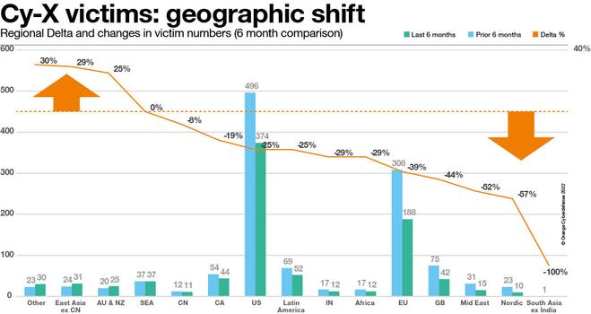
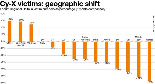
I reordered by the delta, so you see the regions/countries with the highest increase in victim counts on the left and the ones with the highest decrease on the right. The second chart shows only the delta as a bar chart. Note that the change is given as a percentage relative to the previous 6 months vs. the last 6 months. These are not total numbers, and some of the regions didn't have a particularly high count of victims to start with. Still there are interesting observations to be made. #SecurityNavigator #securitynews
I reordered by the delta, so you see the regions/countries with the highest increase in victim counts on the left and the ones with the highest decrease on the right. The second chart shows only the delta as a bar chart. Note that the change is given as a percentage relative to the previous 6 months vs. the last 6 months. These are not total numbers, and some of the regions didn't have a particularly high count of victims to start with. Still there are interesting observations to be made. #SecurityNavigator #securitynews