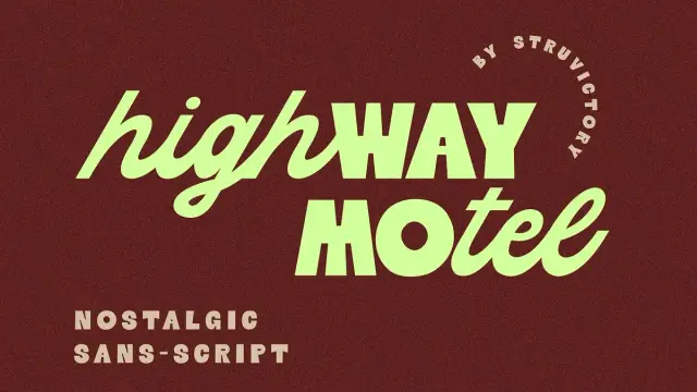
Belvare Font Family by Creative Corner
Typography shapes how people feel before they even read a word. The Belvare font family understands that truth completely. Created by Creative Corner, this retro serif typeface arrived quietly — but it carries the kind of visual weight that makes designers stop scrolling. Rounded, condensed, elegant, and just a little unpredictable, Belvare speaks the language of vintage craft while thinking entirely in the present tense.
You can get the typeface from these platforms:
Creative Market MyFonts YouWorkForThemBelvare is not just another serif revival. Instead, it represents something rarer: a typeface with genuine personality. Its three weights — Light, Regular, and Bold — give designers a real range. Furthermore, its stylistic alternates and ligatures add rhythmic depth that few fonts at this level can match. Whether the project calls for a film poster, a luxury brand wordmark, or an editorial headline, the Belvare font family earns its place.
Belvare Font Family by Creative CornerYou can get the typeface from these platforms:
Creative Market MyFonts YouWorkForThemWhat Makes the Belvare Font Family Different from Every Other Retro Serif Typeface?
That question deserves a real answer — not a list of adjectives. Most vintage-inspired serifs try to mimic the past by leaning into obvious clichés: slab forms, exaggerated contrast, or distressed textures. Belvare takes a different path. It draws from the visual vocabulary of early 20th-century letterpress and phototype design, but refines those references through a distinctly contemporary lens.
The result is a typeface that feels familiar without feeling recycled.
The Condensed Proportion Principle
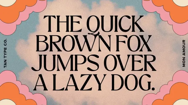
One of Belvare’s most distinctive structural decisions is its condensed glyph proportions. Condensed typefaces have historically served display and headline contexts because they allow designers to pack meaning into tight horizontal spaces. Belvare, however, softens that compression with rounded counters and friendly curves.
This combination — what could be called compressed warmth — is relatively rare in the serif category. Most condensed serifs feel rigid or editorial. Belvare, by contrast, invites the reader in. The rounded O and C characters are particularly notable. Their large, open apertures create visual breathing room even within a compressed structure, which is a genuinely clever design contradiction.
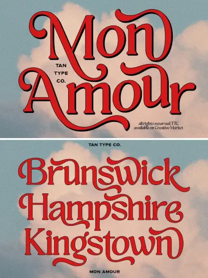
The Rhythmic Alternate System
Typography critics often overlook rhythm when evaluating typefaces. Rhythm — the visual cadence created by repeating forms — determines whether a headline feels alive or flat. Belvare addresses this through a carefully curated set of stylistic alternates and ligatures. These alternate characters shift the texture of a word just enough to create movement without sacrificing legibility.
This is what separates a functional typeface from an expressive one. Belvare gives designers the tools to tune that rhythm manually, character by character.
How the Belvare Font Family Fits the Current Design Moment
Culture cycles. Right now, design culture is cycling hard toward the analog, the tactile, and the historically grounded. Brands are rejecting the sterile minimalism of the 2010s in favor of textures, warmth, and visual storytelling. Consequently, typefaces like Belvare are arriving at exactly the right cultural moment.
The term neo-vintage typography — a framework this article introduces to describe typefaces that synthesize historical aesthetics with contemporary design logic — applies precisely here. Neo-vintage typography is not nostalgia for nostalgia’s sake. Instead, it is the deliberate recontextualization of pre-digital visual culture within modern digital workflows.
Belvare is a strong example of neo-vintage typography in practice. It carries genuine historical references without requiring historical context to work. A 22-year-old packaging designer and a 55-year-old art director can both reach for Belvare and make it speak their language.
Why Branding Designers Keep Reaching for Vintage Serifs
Serif typefaces communicate trust, expertise, and legacy. Those associations are deeply embedded in visual culture. However, plain-vanilla serifs like Times New Roman or Garamond carry too much baggage. They signal documents, not brands.
Therefore, designers increasingly seek vintage serifs that feel curated rather than inherited. The Belvare font family sits in that sweet spot. It signals craft, intention, and character without triggering the visual associations of academic or bureaucratic contexts.
Additionally, Belvare’s multilingual support makes it commercially viable across European and global markets — a practical consideration that often gets buried beneath aesthetic discussion.
A Closer Look at Belvare’s Three Weights
Weight is not just about thickness. Weight determines the emotional register of a typeface in context. Creative Corner made deliberate choices with each of Belvare’s three weights, and each one serves a distinct design function.
Belvare Light: Confidence Without Volume
Belvare Light is the weight designers underestimate. It works quietly. In editorial layouts, it creates space and elegance without competing with imagery. In branding applications, it signals restraint — a quality increasingly associated with premium positioning. Furthermore, Light pairs exceptionally well with Bold in hierarchical headline systems, creating visual contrast through weight rather than size alone.
Belvare Regular: The Workhorse with Personality
Regular is where a typeface proves itself. Belvare Regular holds up beautifully across a range of sizes. It reads cleanly at display scales and maintains its character at smaller body-text applications. The rounded proportions, in particular, prevent the stroke thinning that makes many vintage serifs collapse at smaller sizes. This is a technically sound typeface — not just a pretty one.
Belvare Bold: Built for Headlines
Belvare Bold knows what it is. It commands attention without shouting. The condensed structure means that even at large display sizes, Bold headlines feel composed rather than aggressive. This weight excels in poster design, packaging hierarchies, and brand identity marks where legibility and visual impact must coexist.
How to Unlock Belvare’s Full Potential: Stylistic Alternates and Ligatures
Many designers download a font, use the Regular weight in its default setting, and call it a day. Belvare rewards the designers who go further. Its stylistic alternates and ligatures are not decorative afterthoughts — they are structural tools for shaping visual rhythm and character expression.
Accessing Alternates in Adobe Illustrator
To access Belvare’s alternate characters in Adobe Illustrator, go to Type → Glyphs. This opens the full glyph panel, where every alternate and ligature lives—double-clicking any alternate inserts it directly into an active text frame. Designers can also set specific alternates as the default for entire text blocks through OpenType features.
Accessing Alternates in Adobe Photoshop
In Adobe Photoshop, go to Window → Glyphs. The panel functions similarly. Select the relevant character, browse the available alternates in the panel, and double-click to apply. This workflow applies across Creative Cloud applications that support OpenType features.
Why Alternates Matter More Than Most Designers Think
Alternates create micro-level variation in letterforms. That variation interrupts visual monotony in the same way a good author varies sentence length. When two identical characters appear consecutively — double O, for example — alternates prevent the eye from reading the word as mechanically repeated. Instead, the word breathes. That is the difference between a headline that holds attention and one that loses it.
The Belvare Font Family in Practice: Ideal Use Cases
The Belvare font family is specifically suited to design contexts where character, legibility, and historical resonance matter simultaneously.
Headlines and Display Typography — Belvare’s condensed proportions and distinctive letterforms make it a natural fit for editorial headlines, magazine covers, and digital display contexts where the typeface carries the primary communicative burden.
Brand Identity and Wordmarks — Its distinctive O and C characters give wordmarks immediate visual differentiation. Furthermore, Belvare’s three-weight system supports full brand typographic systems without needing supplementary typefaces.
Packaging Design — The retro serif aesthetic communicates craft and authenticity, which align with consumer expectations in food, beverage, beauty, and artisan product categories.
Poster and Event Design — Belvare Bold’s command of space at display sizes makes it a reliable poster typeface. Its personality reads well even at viewing distances.
Editorial and Magazine Layouts — Light and Regular weights support sophisticated, layered typographic hierarchies across multi-page editorial contexts.
A Critical Perspective: What Belvare Does Exceptionally Well — and Where It Has Limits
No typeface does everything. Belvare, despite its strengths, is purpose-built for display and branding contexts. It is not a long-form reading typeface. Its condensed proportions and distinctive character shapes, while assets in headlines, create cognitive friction in extended body text. Designers should pair Belvare with a neutral, open-countered sans-serif or transitional serif for body copy.
Additionally, Belvare’s personality is strong enough that it can dominate a layout if used without restraint. Its visual character is a feature, not a flaw — but that character demands compositional discipline. The typeface works best when designers let it lead without letting it overwhelm.
That said, within its intended contexts, Belvare performs at a genuinely high level. The alternate system alone elevates it above most vintage-inspired serifs in its category. Creative Corner made a typeface with real depth — and that deserves acknowledgment.
The Future of Neo-Vintage Typography: A Forward-Looking Thesis
This article proposes the following thesis: neo-vintage typography will become the dominant display typographic aesthetic of the late 2020s, as design culture continues to react against digital genericness and seek visual differentiation through historical craft.
Typefaces like the Belvare font family are early indicators of that shift. Moreover, as AI-generated visual content floods digital platforms with algorithmically smooth aesthetics, human-crafted typefaces with genuine historical grounding will carry increasing premium value. The irregularity, the warmth, and the personality that Belvare offers will, therefore, function as signals of authenticity in an increasingly synthetic visual landscape.
Designers who build familiarity with neo-vintage typography now will have a significant competitive advantage within the next three to five years. Belvare is a strong starting point.
You can get the typeface from these platforms:
Creative Market MyFonts YouWorkForThemFAQ: Everything You Need to Know About the Belvare Font Family
What is the Belvare font family? The Belvare font family is a vintage-inspired retro serif typeface created by Creative Corner. It is available in three weights — Light, Regular, and Bold — and includes stylistic alternates, ligatures, and multilingual support.
Who designed the Belvare font family? Creative Corner designed the Belvare font family. Creative Corner is a type and graphic design studio focused on producing character-driven typefaces for creative professionals.
What makes Belvare different from other retro serif typefaces? Belvare combines condensed letterform proportions with rounded counters and a curated alternate system. This combination — compressed warmth — is rare in the vintage serif category and gives Belvare a distinctive visual personality.
What design projects suit the Belvare font family best? Belvare excels in headlines, brand identity, packaging, poster design, and editorial typography. It is a display typeface built for contexts where visual character and legibility must coexist.
How do I access Belvare’s stylistic alternates in Adobe Illustrator? In Adobe Illustrator, go to Type → Glyphs to open the glyph panel. From there, you can browse and insert alternate characters and ligatures directly into any text frame.
How do I access Belvare’s alternates in Adobe Photoshop? In Adobe Photoshop, go to Window → Glyphs. Select a character in your text, browse the alternates shown in the panel, and double-click any alternate to apply it.
Does the Belvare font family support multiple languages? Yes. Belvare includes multilingual support, making it suitable for use across European and international design projects.
Is Belvare suitable for body text? Belvare is primarily a display typeface. Its condensed proportions and strong personality make it best suited for headlines, titles, and short display copy rather than extended body text.
What weights are included in the Belvare font family? The Belvare font family includes three weights: Light, Regular, and Bold.
Where can designers download the Belvare font family? The Belvare font family is available for download through Creative Corner’s official distribution channels and major font marketplaces.
Check out other popular typefaces here at WE AND THE COLOR.
#Belvare #CreativeCorner #retro #retroFont #serifFont #vintage #vintageFont