Dzisiaj świętujemy urodziny László Moholy-Nagy’a (1895-1946), artysty, fotografa i pedagoga związanego z Bauhausem. Jego fotogramy, eksperymenty ze światłem i wizjonerska edukacja zmieniły sposób myślenia o sztuce w XX wieku. (fot. Wikipedia) #MoholyNagy #fotografia #Bauhaus

"From Experimetal Art to Contructivism" is one of the latest user-created micro-museum spaces on the topic of the #Bauhaus movement, with
László Moholy-Nagy in focus. Are you interested to contribute with own spaces and adding more content to this category of design style? We are looking for creators to join MagnificentH and create unique narratives using our platform's repository for rights-cleared images and provide feedback so we can continue building and improving!
#Bauhaus #MoholyNagy #MicroMuseum #DesignCommunity #FediverseArt

🕸glané sur le net🕸 Moholy-Nagy, un film, un poème. Patrick Beurard-Valdoye, atelier du regard #13: L'une des dernières œuvres de Moholy-Nagy, avant son exil contraint de Berlin, est un court film tourné en 1932.
-- file.png, ICI,… #MoholyNagy #Film #Poème #PatrickBeurardValdoye #AtelierDuRegard
Moholy-Nagy, un film, un poème...
Moholy-Nagy, un film, un poème...
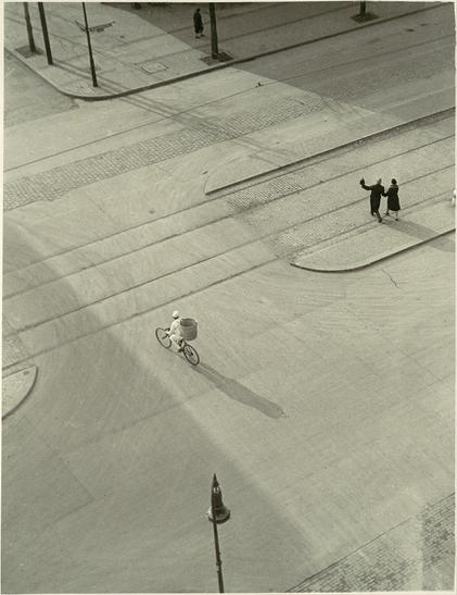
I love this photo by Moholy-Nagy so much. It is minimalistic, monochrome and has something really captivating. I wish I had this talent.
I have to confess that I had to zoom in first because I wasn't sure whether it was a painting or a photo LOL
7 A.M. (New Year’s Morning) (circa 1930) by László Moholy-Nagy
#art #photography #MoholyNagy
I have to confess that I had to zoom in first because I wasn't sure whether it was a painting or a photo LOL
7 A.M. (New Year’s Morning) (circa 1930) by László Moholy-Nagy
#art #photography #MoholyNagy
@typeoff A footnote to your nice article on the under-appreciated Lapidar https://www.typeoff.de/2021/02/lapidar-typeface-from-genzsch-und-heyse-born-in-1874/: Moholy-Nagy mentions it in an Offset (1926) essay as one of the two typefaces “without distortions and flourishes” he can recommend for contemporary typography. (The other is Venus. Dunno why he omits Schelter & Giesecke’s Breite Grotesk, which he also used often and is shown in Bayer’s poster design on the same page.)
#Bauhaus #Typography #GraphicDesign #MoholyNagy #LapidarTypeface #VenusTypeface


The poor man’s Moholy-Nagy

Speaking of Moholy, as the Illinois Institute of Technology was about to incorporate his School of Design here in #chicago, he met a promising student named Robert Brownjohn, who went onto a career in commercial art.
He did the cover for #therollingstones "Let It Bleed."

