Cattivo Font Family by Identity Letters

What Defines the Cattivo Font Family by Identity Letters?

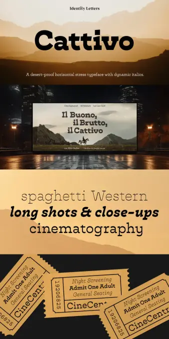
Typography demands personality. The Cattivo font family delivers this character in spades. Moritz Kleinsorge designed this system to disrupt standard serif norms. Identity Letters published this collection for bold designers. The font draws inspiration from the “Italienne” genre. However, it avoids the trap of pure nostalgia. This typeface creates a bridge between the Wild West and modern editorial design.

Designers often search for versatile yet distinct typefaces. The Cattivo font family offers a “border-resistant” slab-serif aesthetic. It feels at home on a wanted poster or a sleek website. Consequently, this duality makes it a fascinating case study in contemporary type design. I call this phenomenon “Nostalgic Functionalism.” This term describes typefaces that evoke a specific genre while maintaining rigorous utility.

You can purchase the complete family from:

Identity Letters MyFonts

The Cattivo font family utilizes horizontal emphasis. It features slim curves and modern proportions. Therefore, it reads well in short text blocks. You might expect such a stylized font to fail at small sizes. Yet, Cattivo defies this expectation. It utilizes reduced contrast to ensure legibility. This article analyzes the typeface through a critical lens. We explore its technical specs, aesthetic value, and practical application.

Cattivo Font Family by Identity Letters

You can purchase the complete family from:

Identity Letters MyFonts

The Aesthetic Framework: Deconstructing the Spaghetti Western Vibe

The Cattivo font family acts as a typographic time machine. It immediately triggers associations with Spaghetti Westerns. Think of steam trains and gold rushes. However, Identity Letters refined these raw influences. The designer smoothed the rough edges. As a result, the font feels contemporary rather than antiquated.

Type designer Moritz Kleinsorge balances eccentricity with grid-based logic. The family exemplifies this balance perfectly. The horizontal stress anchors the eye. Meanwhile, the vertical strokes provide necessary stability.

Furthermore, the family includes nearly 700 glyphs. This extensive character set allows for complex typesetting. Designers rarely find such depth in display-oriented fonts. The Cattivo font family does not compromise on features. It supports advanced typographic needs. Thus, it serves professional agencies and independent creators alike.

Why Does the Cattivo Font Family Excel in Modern Branding?

Brands today require distinct voices. Generic sans-serifs flood the market. Therefore, the Cattivo font family provides a necessary counter-movement. It speaks with a “wink” to the viewer. It is playful yet serious. This is the “Irony-Utility Paradox” of modern type.

Specifically, the Cattivo font family works exceptionally well in advertising. Headlines gain immediate traction. The slab-serif structure commands attention. Moreover, the reduced contrast aids readability on screens. Digital billboards benefit from this sturdy construction.

Identity Letters optimized Cattivo for both print and digital use. This versatility is crucial. A brand might use the Heavy weight for a logo. Then, they use the Light version for social media captions. The family ensures consistency across all touchpoints.

  • Distinctiveness: It stands out in a sea of geometric sans.
  • Legibility: Reduced contrast aids reading at moderate sizes.
  • Versatility: Nine weights cover everything from hairline to massive distinctiveness.

Mastering the Italics: A Dynamic Counterpoint

Most slab serifs merely slant their Roman counterparts. This typeface takes a different approach. The designer drew the italics independently. They possess a unique dynamism. We see handwriting inspiration in these forms.

Consequently, the italics change the text’s texture. They add speed and urgency. The Cattivo font family uses these italics to highlight information effectively. They are not just “slanted” letters; they are “running” letters. This adds a layer of sophistication to the family.

Designers should note the specific curvature. The italics break the rigid horizontal stress slightly. This introduces a humanist element. Therefore, the font feels organic despite its mechanical structure.

Technical Specifications and Usage Scenarios

Identity Letters packed the Cattivo font family with features. It includes nine distinct weights. It also includes nine matching italics. This results in 18 total styles.

Furthermore, the glyph coverage is impressive. The font family supports extensive languages. It handles complex punctuation and symbols. This makes it a global tool. You can use it for multi-language campaigns without fear.

Recommended Use Cases:

  • Editorial Design: Magazine headers and pull quotes.
  • Packaging: Craft beer labels or artisanal food products.
  • Digital UI: Call-to-action buttons or hero sections.
  • Event Branding: Posters for festivals or music events.
  • Cattivo invites you to explore “uncharted territories.” It creates an adventurous mood. Yet, it never sacrifices professional standards.

    The Future of the Slab Serif

    The popularity of typefaces like Cattivo signals a shift. Designers are moving away from sterility. They want warmth and narrative. Cattivo provides a narrative framework. It tells a story before the reader even processes the words.

    We predict a rise in “Narrative Slab Dynamics.” This trend involves fonts that carry specific cultural baggage but modernize it. The Cattivo font family leads this charge. It proves that “retro” does not mean “old.”

    Identity Letters has positioned this font cleverly. It appeals to the “Gold Rush” mentality of modern startups. Everyone wants to strike gold. This typeface provides the visual shovel. It is a tool for those who build and explore.

    Detailed Breakdown of the Cattivo Weights

    The Cattivo font family spans a wide spectrum.

    • The Light weights feel elegant and sharp. They work for fashion or critique.
    • The Regular weights serve short texts well. They balance the horizontal stress perfectly.
    • The Bold and Heavy weights shout. They act as the visual anchor of a layout.

    Each weight in the family retains the core DNA. The horizontal emphasis remains visible. However, the thicker weights exaggerate this feature. This creates a graphic rhythm.

    Designers should experiment with tight leading. The Cattivo font family handles vertical stacking well. The slab serifs create natural lines. This guides the eye horizontally.

    A Critical Perspective on Cattivo

    Why choose the Cattivo font family over a classic Clarendon? The answer lies in the “modern proportions.” Classics often feel dusty. Cattivo feels sharp. It has a digital crispness.

    The designer, Moritz Kleinsorge, avoided lazy revivals. He deconstructed the genre. Then, he rebuilt it for the 21st century. The Cattivo font family represents a successful evolution. It honors the past but lives in the present.

    I believe this font invites creativity. It asks the designer to be bold. You cannot hide behind the Cattivo font family. It makes a statement. Therefore, it requires a confident hand.

    Conclusion: Embracing the Gold Rush

    The Cattivo font family is more than a typeface. It is a design attitude. It combines the grit of the Spaghetti Western with the precision of Swiss design. Identity Letters has delivered a future classic.

    Designers who use the Cattivo font family signal their intent. They value character. They value history. But mostly, they value functionality. This font family proves that “cattivo” (bad/naughty in Italian) can be very, very good.

    You can purchase the complete family from:

    Identity Letters MyFonts

    So, book your ride on the steam train. Explore the unknown territories of your layout. The Cattivo font family is your companion. It is ready for the next Gold Rush. Are you?

    Frequently Asked Questions (FAQ)

    What is the Cattivo font family?

    It’s a modern slab-serif typeface designed by Moritz Kleinsorge and published by Identity Letters. It features a “border-resistant” design with horizontal emphasis, inspired by the Italienne genre and Spaghetti Western aesthetics, but modernized for contemporary use.

    Who designed the Cattivo font family?

    Moritz Kleinsorge designed the Cattivo font family. He is the founder of the Identity Letters foundry. He created the font to balance retro western vibes with modern typographic functionality.

    How many styles are in the Cattivo font family?

    The Cattivo font family consists of 18 styles in total. This includes 9 distinct weights ranging from Light to Heavy, and 9 corresponding independent italics.

    Is the Cattivo font family suitable for body text?

    Yes, but with specific considerations. The Cattivo font family works best for short text sections, intro paragraphs, and advertising copy. Its reduced contrast and modern proportions ensure legibility, but it is primarily a display-forward family.

    What makes the italics in the Cattivo font family unique?

    The italics in the Cattivo font family are drawn independently from the roman weights. They are dynamic and inspired by handwriting, offering a distinct visual texture that adds versatility to the font family.

    Where can I buy the Cattivo font family?

    You can license the Cattivo font family directly from the Identity Letters foundry website or through authorized font distributors like MyFonts. It is available for both print and digital licensing.

    Feel free to find other trending typefaces in the Fonts category here at WE AND THE COLOR.

    Subscribe to our newsletter!

    [newsletter_form type=”minimal”]

    #Cattivo #font #fontFamily #IdentityLetters #MoritzKleinsorge #typeface

    Flink Slab Font Family by Identity Letters

    Typography rarely stands still. Every generation redefines how form and function meet on the page and screen. Flink Slab by Identity Letters does exactly that — it brings geometry to life with a tactile, industrial edge that feels unmistakably modern yet deeply rooted in design tradition. Created by Moritz Kleinsorge, this slab serif family isn’t just another addition to the geometric genre. It’s a type system built for designers who demand precision, emotion, and adaptability in one cohesive toolkit.

    You can purchase the entire superfamily from:

    Identity Letters MyFonts Fontspring

    What Makes Flink Slab Distinct

    At its core, Flink Slab is a clean geometric superfamily with unbracketed slab serifs that exude confidence. Its design shares a structural DNA with Flink Neue, Identity Letters’ geometric sans counterpart. The result? A pair of type families that align perfectly in proportions, vertical metrics, and rhythm.

    Flink Slab Font Family by Identity Letters

    You can purchase the entire superfamily from:

    Identity Letters MyFonts Fontspring

    This harmony makes it easy for designers to combine the two — think editorial layouts, corporate identities, packaging, or web interfaces that need hierarchy without visual tension. Each Flink Slab font comes with over 1,300 glyphs, supporting extensive multilingual typesetting and detailed typographic refinement.

    But the real spark lies in its “Voltage” alternates — high-energy letterforms that amplify the display character of the typeface. These electrifying variations turn the clean geometry into something almost kinetic, channeling the spirit of Futurism with a raw, industrial flavor.

    The Character and Philosophy Behind Flink Slab

    Flink Slab feels engineered rather than simply drawn. Every curve, corner, and serif suggests control — yet it never feels sterile. It balances precision with personality. The subtle tension between its mechanical construction and human rhythm gives the typeface a unique texture that sets it apart from other slabs.

    This is a typeface designed for designers who value intentionality. Whether used in branding, editorial work, or UI, Flink Slab adapts without losing its identity. It’s strong but not loud, bold yet legible, assertive without being aggressive.

    It’s worth asking: What does modern typography need most today — character or consistency? Flink Slab quietly argues for both. It proves that structure and soul can coexist.

    The Vision of Moritz Kleinsorge and Identity Letters

    Designer Moritz Kleinsorge has built a distinct voice in contemporary type design. His work for Identity Letters often explores how geometric rigor can coexist with expressive flair. Flink Slab extends this philosophy. It’s not just a slab-serif version of Flink Neue; it’s a statement about modularity, versatility, and timeless design logic.

    The type family’s 108 individual styles offer both range and reliability. From ultra-thin to heavy weights, from text-optimized cuts to display-driven “Voltage” versions — the system feels meticulously engineered for the realities of modern design workflows.

    This flexibility gives designers freedom without friction. Typography becomes less about compromise and more about orchestration — every element working in sync across mediums.

    Flink Slab in Use: Practical Design Scenarios

    The geometric structure of Flink Slab makes it ideal for projects that demand order and clarity — from editorial design and corporate branding to digital interfaces and signage. Yet, the Voltage alternates introduce expressive dynamism perfect for poster design, album artwork, or motion graphics.

    Imagine a magazine headline that feels engineered yet emotional. Or a brand wordmark that blends technical authority with creative confidence. Flink Slab thrives in these spaces.

    Designers pairing Flink Slab with Flink Neue unlock a harmonious system — slab and sans in perfect dialogue. The visual continuity across both families makes it easier to create unified brand ecosystems without visual noise.

    Why Flink Slab Matters Right Now

    The current design landscape leans toward clarity and adaptability. Brands seek typefaces that function across analog and digital worlds, maintaining a consistent voice from logo to interface. Flink Slab speaks to this demand with remarkable precision.

    Its geometric foundation ensures usability, while its industrial undertones connect it to broader design movements — brutalism, modularity, and raw material aesthetics. It’s typography for an era fascinated by both structure and authenticity.

    There’s also something quietly rebellious about Flink Slab. Amid a flood of overly polished fonts, it reintroduces the tactile imperfections of design — the feeling that letters can carry weight, tension, and intent.

    A Personal Perspective

    As a creative observer, one can’t ignore how Flink Slab bridges eras of design thinking. It echoes the rationalism of early modernism while embracing the energy of contemporary design culture. Its Voltage alternates bring a pulse to otherwise static geometry. It’s a font that rewards close attention — a rare quality in a market oversaturated with instant, forgettable sans-serifs.

    Flink Slab doesn’t try to be trendy. It’s built to last. That longevity is its strongest aesthetic statement.

    Final Reflection: The Geometry of Emotion

    Typography, at its best, is about connection — between form and meaning, designer and audience. Flink Slab captures that connection through geometry that feels alive. It’s not just a tool for composition; it’s a medium for expression, one that merges clarity with attitude.

    You can purchase the entire superfamily from:

    Identity Letters MyFonts Fontspring

    For designers searching for a typeface that feels engineered yet human, Flink Slab stands as one of the most relevant releases of recent years — a typographic system built not only to serve but to inspire.

    Feel free to browse WE AND THE COLOR’s Fonts category for more.

    Subscribe to our newsletter!

    [newsletter_form type=”minimal”]

    #FlinkSlab #font #fontFamily #IdentityLetters #MoritzKleinsorge

    Joie Grotesk Font Family by Moritz Kleinsorge of Identity Letters

    This post contains affiliate links. We may earn a commission if you click on them and make a purchase. It’s at no extra cost to you and helps us run this site. Thanks for your support!

    Joie Grotesk: The Optimistic Sans-Serif Typeface

    Are you looking for a typeface that’s both professional and approachable? A font family that speaks volumes without shouting? Well, say hello to Joie Grotesk, the captivating sans-serif typeface designed by Moritz Kleinsorge of Identity Letters. This font is quickly becoming a favorite among designers, and for good reason. It’s versatile, engaging, and brimming with personality. What makes Joie Grotesk so special, and why is it poised to become a design staple? Let’s explore.

    You can save 40% using coupon code “JoieSale40” at the Identity Letters shop and 30% at MyFonts (valid until April, 29th).

    Download at Identity Letters Download at MyFonts

    A Sans-Serif with Soul: What Makes Joie Grotesk Unique?

    What truly distinguishes Joie Grotesk from the countless other sans-serif fonts out there? The answer lies in its thoughtful design and subtle details. It takes inspiration from early 19th-century grotesque fonts, blending historical roots with a modern sensibility. The result? A typeface that feels both familiar and fresh.

    The key here is balance. Kleinsorge has created a clean, balanced rhythm. However, this balance is offset by little quirks. These quirks are what make the font feel so approachable. These are the elements that make it truly special. Are you looking for a typeface that has personality? If yes, then Joie Grotesk might be the right choice for you.

    Joie Grotesk Font Family by Moritz Kleinsorge of Identity Letters Download at Identity Letters Download at MyFonts

    Stylistic Sets: Unleash Your Creative Freedom with Joie Grotesk

    One of the most exciting features of Joie Grotesk is its array of stylistic sets. These sets allow you to customize the font’s appearance, injecting even more personality into your designs. Imagine adding expressive ears to the letter “r” or a distinctive hook to the letter “f.” You have the freedom to tailor the font to your specific needs and preferences.

    With over a dozen stylistic sets at your disposal, the possibilities are endless. You can simplify letterforms for a cleaner, more minimalist look, or you can add calligraphic terminals for a touch of informality. These options make it a very versatile font.

    Versatility in Weights: From Thin to Black

    Joie Grotesk offers a wide range of nine weights, from delicate Thin to bold Black, with matching italics for each. This extensive range gives you the flexibility to use the font in various design contexts, from body text to headlines.

    The bolder weights of Joie Grotesk highlight its connection to old-style Grotesque typefaces. These weights are perfect for display sizes and short bursts of text where their unique characteristics can truly shine. The regular and lighter weights, on the other hand, are optimized for extended reading, ensuring a comfortable and engaging experience for your audience.

    Beyond the Basics: OpenType Features and Glyph Count

    Joie Grotesk is not just a pretty face; it’s a workhorse. Boasting over 750 glyphs and a plethora of OpenType features, it’s a reliable companion for any design project. This is more than just a font; it’s a complete typographic toolkit.

    The font includes various circled and boxed variants for numbers and arrows. These are super handy for creating complex layouts and presentations. The comprehensive character set ensures that you have all the tools you need to communicate effectively and creatively.

    Where to Use Joie Grotesk: A Font for Every Occasion

    So, where does Joie Grotesk truly excel? The answer is simple: everywhere. It’s the perfect choice for branding, websites, print materials, and more. Its friendly and approachable nature makes it ideal for companies and campaigns that want to connect with their audience on a personal level.

    Think about using it for:

    • Company Logos: Its modern twist on a classic sans-serif gives a timeless, yet contemporary feel.
    • Website Headlines: Bold weights grab attention, while lighter weights offer excellent readability for body text.
    • Marketing Materials: The various stylistic sets allow for creative expression and brand differentiation.
    • Packaging Design: Its versatility makes it suitable for a wide range of product types.

    Ultimately, Joie Grotesk shines whenever you want a classic sans-serif typeface with a modern and individual twist.

    Why Joie Grotesk Might Go Viral

    Why the hype? Joie Grotesk is beautiful and practical. It’s the kind of font that designers love to share and discuss. Its versatility and unique features make it a natural fit for social media. Plus, its approachable nature makes it appealing to a broad audience, not just design professionals.

    Expect to see Joie Grotesk popping up in design showcases, tutorials, and discussions across social media platforms. Its friendly personality and customizable options make it a font that people want to experiment with and share their creations.

    The Legacy of Moritz Kleinsorge and Identity Letters

    Moritz Kleinsorge, the designer behind Joie Grotesk, is known for his meticulous attention to detail and his ability to create typefaces that are both functional and beautiful. Identity Letters, the type foundry he founded, is committed to producing high-quality fonts that empower designers to communicate effectively and creatively.

    By choosing Joie Grotesk, you’re not just selecting a font; you’re supporting a designer and a foundry that are passionate about typography and committed to excellence.

    Final Thoughts: Is Joie Grotesk Right for You?

    If you’re searching for a sans-serif typeface that is both classic and contemporary, friendly and professional, then Joie Grotesk is definitely worth considering. Its versatility, stylistic sets, and comprehensive character set make it a powerful tool for any designer. Will this typeface be your next favorite? Give it a try. It may become a go-to choice for a wide range of design projects.

    Download at Identity Letters Download at MyFonts

    Don’t hesitate to find other trending typefaces on WE AND THE COLOR.

    Subscribe to our newsletter!

    By continuing, you accept the privacy policy

    #font #fontFamily #fonts #IdentityLetters #JoieGrotesk #MoritzKleinsorge #sansSerif #typeface

    Werkdruck Font Family by Identity Letters

    Meet Werkdruck: A Robust Serif That’s Ready to Work

    Do you want a typeface that was built to last? That’s Werkdruck. Created by Moritz Kleinsorge, director and principal type designer at Identity Letters, it’s a serif with a real work ethic. Think of it like a trusty tool, always reliable and ready for any design challenge.

    Grab the Discount

    As an introductory offer, you can currently purchase Werkdruck as well as its Grotesk companion Werksatz with a 40% discount using the code “Werkfonts-40” at Identity Letters’ online shop. For those of you who prefer purchasing fonts from MyFonts, you can still get a 30% discount on both typefaces, Werkdruck and Werksatz.

    Werkdruck Typeface by Moritz Kleinsorge of Font Foundry Identity Letters Purchase at Identity Letters Purchase at MyFonts

    Old-School Inspiration, Modern Execution

    Werkdruck takes cues from Baroque and Neoclassical type designs. These are the fonts that were made in a time when things were built to last, with a focus on quality and craftsmanship. It’s not a simple copy though. Kleinsorge brings this tradition into the digital age. He optimizes Werkdruck for contemporary print and digital uses. The result? A typeface that’s both sturdy and refined.

    Think about what makes a font easy to read. Werkdruck’s robust design helps text flow smoothly. Its curves, perfected for digital displays, look great in large sizes too. It’s a win-win.

    More Than Just a Pretty Face

    Werkdruck has a deliberate, drawn feel, not written. It shares similarities with Didone fonts, with their vertical stress and symmetrical build. However, its moderate stroke contrast and geometric serifs set it apart. This is where it veers from the overly stylized nature of some fonts. It’s like the old saying: “Less spice, more meat.” It’s practical and honest.

    But don’t think it’s too mechanical. Werkdruck has little details, like its organic teardrops. They deviate from a purely geometric ideal and give life to the type. It has a hint of the early 20th-century “Scotch Modern” style, designed to be space-efficient for printing. Werkdruck takes those basic ideas and expands on them, making it perfect for modern digital needs. Each letterform feels confident and works well for branding. It stays readable, even at small sizes on high-resolution displays.

    A Full Toolkit for Typography

    Werkdruck is more than just a few letters. With 911 glyphs and nine weights, it has a full range of options. Each weight comes with a beautiful true italic too. Whether you’re working on print, apps, or websites, Werkdruck has you covered. It supports more than 200 languages and includes various number formats. Small caps, stylistic sets for alternative designs, and circled or framed characters also come standard. It’s like having a full workbench of tools at your fingertips.

    The Perfect Pairing

    Werkdruck isn’t meant to work alone. It pairs perfectly with Werksatz, Identity Letters’ popular sans-serif typeface. Both fonts have their unique personalities. They also share the same historical roots, a similar robust approach, and proportions. This makes them a perfect match.

    Consider how these typefaces could enhance your projects. Are you designing a brand? Working on a book? Maybe you need fonts for UI/UX design? From a museum website to a huge encyclopedia, Werkdruck and Werksatz are ready for anything. Together they can help you achieve sophisticated and unique results.

    Purchase at Identity Letters Purchase at MyFonts

    So, are you ready to get to work with Werkdruck? It’s a typeface that’s not only beautiful but also a hard worker. It could just be the tool you need for your next design project.

    All images © by Identity Letters. Check out other trending type designs in the Fonts section on WE AND THE COLOR.

    Subscribe to our newsletter!

    By continuing, you accept the privacy policy