The Brazilian Amazon Finally Has an Official Brand — and It Was Drawn from the River Itself
The Amazon has always been a brand. Not by design, but by sheer force of existence. It is the largest tropical rainforest on the planet, home to 28 million people, and the subject of more global conversation than almost any other place on Earth. Yet until now, it had never had a single, unified visual identity to anchor all of that meaning. That changes with the new Brazilian Amazon brand — developed by FutureBrand São Paulo in partnership with RAI (Integrated Amazon Routes) and Embratur, Brazil’s agency for international tourism promotion.
This is not a government logo. It is not a tourism campaign sticker. It is something far more considered: a living brand system built from the actual geography of the Amazon River basin, co-created with the people who live and work across nine Brazilian states. Furthermore, it is the first time all nine of those states — Acre, Amazonas, Amapá, Maranhão, Mato Grosso, Pará, Rondônia, Roraima, and Tocantins — share a single visual foundation while retaining their individual identities.
That is not a small thing. That is a structural shift in how the Amazon presents itself to the world.
The Brazilian Amazon finally has an official brand developed by FutureBrand in São Paulo.
Why Does the Brazilian Amazon Need an Official Brand Right Now?
The timing matters. The global bioeconomy is no longer a niche academic concept. It is a central policy framework, an investment category, and — increasingly — a competitive arena. Territories with strong, legible identities attract attention, capital, and visitors. Territories without them get talked about, but are rarely heard from.
The Brazilian Amazon has always occupied an enormous amount of symbolic real estate in the global imagination. However, that imagination has largely been shaped by others: international media, environmental organizations, and satellite images. The region’s 28 million residents, its artists, its producers, its entrepreneurs — they have rarely had a shared platform through which to speak for themselves.
Moreover, the nine states that make up the Brazilian Legal Amazon — an administrative designation covering roughly 60% of Brazil’s total territory — have historically operated with fragmented aesthetics and disconnected positioning. Each state has promoted itself independently. The cumulative effect has been noise rather than signal.
Arnaldo de Andrade Bastos, Partner and Chief Design Officer at FutureBrand São Paulo, frames the problem clearly: “Across the world, many of the most visited and desired tourist destinations have strong, well-established brands. The Amazon has always had this potential, but it had never brought together, in a structured way, all those involved to join efforts toward building it.”
That structural absence ends here. And the approach FutureBrand took to fill it is, frankly, one of the most compelling design methodologies applied to a destination brand in recent memory.
Territory as Typography: The Amazon River Becomes an Alphabet
Here is where the Amazon brand design stops being a branding story and starts being something genuinely extraordinary.
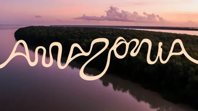
To develop the core logotype, FutureBrand’s team used real geographic coordinates from the Amazon River and its tributaries. They analyzed satellite imagery of the river basin — all 25,000 kilometers of navigable waterways — and found the entire alphabet hidden in the natural curves of the water. Every letter in the Amazon logo is derived from the actual shape of the river.
This is what I would call geographic letterform extraction — a design methodology that grounds visual identity entirely in the physical truth of a place. It is not a metaphor. It is not an illustration. The letters are the river. The river is the brand.
Think about what that means for authenticity. Most destination brands rely on illustration, abstraction, or symbolic imagery to evoke a place. This one goes further: it encodes the territory directly into its typography. Additionally, because the source material is the river itself, the identity has an irreducible specificity that cannot be replicated, borrowed, or mistaken for something else.
This approach also positions the Amazon tourism brand within a growing global conversation about place-responsive design — the idea that the most durable visual systems emerge from listening to a territory rather than imposing a concept onto it.
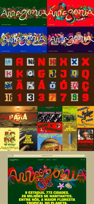
Brazilian Amazon Logo
What Makes a Brand “Living”? The Amazon System Explained
FutureBrand describes the new identity as a living brand. That phrase gets used often in branding circles, sometimes loosely. Here, it carries a specific, structural meaning.
The system is not built around a single fixed logo. Instead, it operates as a flexible visual ecosystem with a range of predefined colors and graphic elements that can respond to regional context, seasonal occasion, and specific applications. It shifts, adapts, and highlights local fauna, flora, environment, and culture, depending on where and how it is deployed.
This architecture — what I would call contextual brand elasticity — solves a real problem: how do you unify nine distinct states under one identity without flattening their differences? The answer is to design a system with enough structural integrity to remain coherent, and enough flexibility to breathe differently in each context.
Think of it like a musical key. Different instruments, different melodies, different moods — but the same underlying harmonic structure that makes everything recognizable as part of the same composition.
Community-Rooted Co-Creation: Who Actually Built This Brand
The Amazon brand was not designed in a São Paulo studio and then shipped north. The development process involved residents, workers, artists, and community representatives from across all nine states. That collaborative structure matters — both ethically and strategically.
Ethically, it ensures the brand reflects the people it represents rather than a curated version of them constructed from the outside. Strategically, it builds the kind of internal legitimacy that makes a brand adoptable at the local level — which is where brands actually live or die.
The project engaged illustrators Cristo, Winy Tapajós, Malu Menezes, and Beatriz Belo. Photographers Ori Junior and Bob Menezes contributed visual language. Instituto Letras que Flutuam, with letterer Odir Abreu, shaped the typographic direction. The audiovisual production was led by Marahu, from Pará.
This is not a credits list. It is a map of creative sovereignty. Each of these contributors brought knowledge and visual sensibility that cannot be replicated by external observers, no matter how well-intentioned. Their involvement transforms the brand from a designed artifact into a genuinely authored cultural document.
In branding practice, this approach reflects a principle I would define as embedded authorship: the deliberate integration of local creative voice into the core of an identity system, not as consultation, but as co-authorship.
The “Made of Amazon” Seal: Turning Identity into Economic Infrastructure
The new Amazon sustainable tourism brand extends well beyond tourism promotion. One of its most consequential elements is the “Feito de Amazônia” — or “Made of Amazon” — seal of origin.
The seal can be applied to a wide range of local products, certifying their Amazonian origin and creating a traceable connection between the regional brand and the economic activity of local entrepreneurs, artisans, and producers. This is brand architecture functioning as supply chain infrastructure.
Bruno Reis, Director of International Marketing at Embratur, frames the ambition clearly: “We are talking about a powerhouse in art, music, gastronomy, culture, and the production of hundreds of items for different industries. And it is precisely this richness that the world can now fully experience.”
Furthermore, the seal creates a certification ecosystem with real economic teeth. Products carrying the mark gain access to the brand’s international visibility. Producers gain a competitive differentiator. The region gains a mechanism for aligning cultural pride with commercial value — without extracting that value from the communities that generate it.
This is what distinguishes the Amazon brand from a conventional tourism campaign. Tourism campaigns attract visitors. This system aims to build lasting economic infrastructure that continues generating value long after any individual visitor has returned home.
Sustainable Tourism and the Amazon’s Strategic Position in the Global Bioeconomy
The launch of the Amazon ecotourism brand arrives at a specific geopolitical moment. Biodiversity, forest preservation, and sustainable land use have moved from environmental advocacy into mainstream economic policy. The Amazon is central to all three.
Positioning the region through a unified brand gives Brazil a sharper instrument for participating in that conversation. Initiatives like this, as Embratur notes, help place the Amazon at the center of the global bioeconomy and strengthen the internationalization of micro and small Amazonian entrepreneurs.
Gilvan Pereira, Secretary of Tourism of Rondônia, puts the invitation plainly: “The goal is to organize experiences, tourist destinations, licensing, and the seal of origin under a brand that is desired and recognized worldwide. We want to reinforce the invitation for Brazilian and international tourists to come and experience the Brazilian Amazon.”
That organizational impulse is exactly right. The Amazon does not need more awareness. It needs coherence — a structured way to translate awareness into intention, intention into travel, and travel into sustained local benefit. The brand is the mechanism that makes that translation possible.
Brazilian Amazon Brand Posters
What This Means for Destination Branding as a Design Discipline
The Brazilian Amazon brand is not just significant as a regional initiative. It is significant as a model for how destination branding can work when it is done with real rigor and genuine respect for place.
Most place branding fails for one of two reasons. Either it imposes an external concept onto a territory that locals do not recognize or embrace, or it defaults to generic visual language that could apply to almost anywhere. The Amazon project avoids both failure modes.
The geographic letterform extraction methodology gives the identity an irreducible specificity. The community co-creation process gives it internal legitimacy. The living brand architecture gives it the flexibility to scale across nine states and countless applications without losing coherence. And the “Made of Amazon” seal gives it economic utility beyond aesthetics.
Together, these elements constitute what I would call a Territorial Brand Stack — a multi-layered identity architecture that operates simultaneously as cultural expression, economic infrastructure, and international positioning tool.
This is what the best destination brands do. They do not just represent a place. They activate it.
Personal Take: Why This Project Deserves More Attention Than It’s Getting
The design world will notice the letterform methodology and rightfully celebrate it. But the deeper story here is about power and representation.
For decades, the Amazon has been narrated primarily from the outside — by international conservation organizations, by foreign media, by satellite data. The people who live there, build there, cook there, and make things there have rarely had a visual platform commensurate with the scale of what they represent.
This brand changes that. It gives 28 million people a shared symbol that was built, at least in meaningful part, from their own creative energy and geographic reality. That is not nothing. In fact, that might be the most important thing about this entire project.
The Amazon brand launched at visiteamazonia.com.br. Go look at it. Then think about what it took to make something like this actually happen.
Frequently Asked Questions About the Brazilian Amazon Brand
What is the new Brazilian Amazon brand?
The new Brazilian Amazon brand is the first official, unified visual identity for the Brazilian Legal Amazon. Developed by FutureBrand São Paulo in partnership with RAI (Integrated Amazon Routes) and Embratur, it covers all nine states of the Brazilian Legal Amazon and serves as a shared platform for tourism promotion, product certification, and international positioning.
Who created the Amazon brand design?
FutureBrand São Paulo led the design process. The project was co-created with residents, artists, photographers, illustrators, and cultural institutions from across the nine Amazonian states. Key creative contributors include illustrators Cristo, Winy Tapajós, Malu Menezes, and Beatriz Belo; photographers Ori Junior and Bob Menezes; letterer Odir Abreu of Instituto Letras que Flutuam; and audiovisual production company Marahu from Pará.
How was the Amazon logo designed?
The Amazon logotype was drawn directly from satellite imagery of the Amazon River and its tributaries. Using real geographic coordinates, the design team identified the shapes of every letter of the alphabet in the natural curves of the river basin’s 25,000 kilometers of navigable waterways. The result is a typeface that is literally extracted from the geography of the Amazon itself.
What is the “Made of Amazon” seal?
The “Feito de Amazônia” or “Made of Amazon” seal is a certification mark that can be applied to locally produced goods and products from the Amazon region. It verifies Amazonian origin and connects regional producers to the broader brand’s international visibility, helping entrepreneurs and artisans reach new markets while strengthening the region’s economic identity.
Which states are included in the Brazilian Legal Amazon brand?
The brand covers all nine states of the Brazilian Legal Amazon: Acre, Amazonas, Amapá, Maranhão, Mato Grosso, Pará, Rondônia, Roraima, and Tocantins. Together, these states account for approximately 60% of Brazil’s total territory.
What makes this a “living brand”?
The Amazon brand is described as a living brand because it is not fixed to a single static application. The system includes a range of predefined colors and graphic elements that adapt to different regional contexts, occasions, and applications — highlighting local fauna, flora, environments, and cultures depending on where and how the identity is used. This contextual flexibility allows the brand to remain visually coherent while reflecting the genuine diversity of the Amazon region.
Where can I learn more about the Brazilian Amazon brand?
The initiative is officially presented at visiteamazonia.com.br, developed by RAI and Embratur as the primary platform for the new brand’s tourism and promotional activities.
How does the Amazon brand support sustainable development?
The brand is designed as an economic tool, not just a promotional asset. By certifying local products through the “Made of Amazon” seal, supporting tourism that generates income for local communities, and positioning the region within the global bioeconomy, the initiative aims to create long-term, sustainable value for the 28 million people who live across the Brazilian Legal Amazon.
Any footage © FutureBrand São Paulo. Check out other inspiring graphic design and branding projects from around the world here at WE AND THE COLOR.
#branding #brazil #BrazilianAmazon #design #FutureBrand #graphicDesign