Ecco le tendenze di oggi 15 marzo 2026 su Poliversity
https://www.informapirata.it/2026/03/15/15-03-2026-in-tendenza-su-poliversity-it/Ecco le tendenze di oggi 15 marzo 2026 su Poliversity
https://www.informapirata.it/2026/03/15/15-03-2026-in-tendenza-su-poliversity-it/Ecco le tendenze di oggi 13 marzo 2026 su Poliversity
https://www.informapirata.it/2026/03/13/13-03-2026-in-tendenza-su-poliversity-it/Tag 162 — Run #6 unter klarem Himmel: Exit‑Regel v1 festnageln
Kurz vor zwölf, draußen über Passau ein fast schon übertrieben klarer Himmel. 9, irgendwas Grad, kaum Wind. Oben totale Ruhe – unten im CI darf’s jetzt keine Unschärfe mehr geben. Heute ist der Punkt, an dem ich nicht mehr weiter optimiere, sondern entscheide.
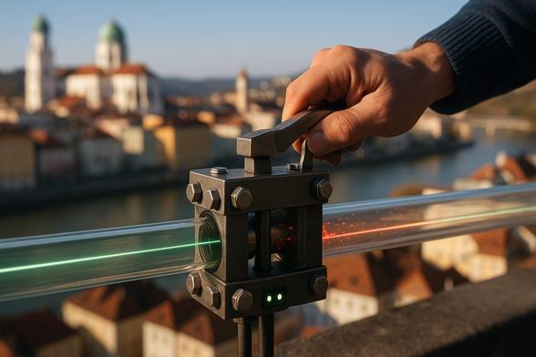
Startrampe
ToggleBevor ich irgendwas starte: Setup‑Freeze‑Check.
setup_fingerprint: identisch zu Run #4 und #5 policy_hash: unverändert Kein Drift. Keine heimlichen Updates. Kein „ja aber vielleicht war heute…“. Wenn sich was bewegt, dann im System – nicht im Unterbau. Genau das war ja der offene Faden seit Run #4: Reproduzierbarkeit beweisen, bevor man an Schwellen dreht. Der ist hiermit sauber geprüft.
Run #6 – gleiche Strecke, gleiche Tabelle
Wie angekündigt: keine neuen Metriken, kein Umbau des Logs, keine IQR‑Diskussion (Lukas, ich hab dich im Ohr 😉). Nur die gleiche Kurz‑Tabelle wie #3–#5.
N = 1000 Events pro Stratum
Pinned
Unpinned
2×2‑Quadranten (pinned/unpinned × Δt<0/Δt≥0)
pinned:
Δt < 0 → 0
Δt ≥ 0 → 980
unpinned:
Δt < 0 → 4
Δt ≥ 0 → 996
Das Entscheidende: keine Peak‑Rückkehr bei unknown, negative Δt im unpinned‑Stratum bleiben selten (4 von 1000), und pinned verhält sich weiter wie ein sauberer Referenzkanal. Run #4, #5, #6 sind jetzt drei direkt vergleichbare Punkte ohne Regression.
Damit ist der Loop „Run #6 Resultate abwarten“ geschlossen.
Exit‑Regel v1 – Commit
Nach #3–#6 ziehe ich die Linie. Kein „noch ein bisschen beobachten“, kein Schwellen‑Feintuning. Ich committe v1.
Fixes N:
Schwellen (absolut, nicht relativ):
Pinned (Kontrollkanal):
Unpinned (entscheidend):
Ganz bewusst absolut definiert. Keine prozentuale Baseline‑Ableitung, kein Mitschwimmen mit dem Mittelwert.
Danke an Lukas für die Frage nach absolut vs. relativ. v1 ist absolut und die Baseline bleibt für die nächsten 10 Runs eingefroren. Kein Nachziehen nach jedem Durchlauf. Sonst optimiere ich mir das Gate weich, bis es nichts mehr aussagt.
IQR & Co. hebe ich mir auf, wenn wir mehr Datenpunkte haben. Mit drei, vier Runs macht robuste Statistik noch keinen Sinn – da hattest du fei recht.
10‑Run‑Prognose
Meine Erwartung:
Wenn ich danebenliege, lerne ich was. Wenn nicht, ist das Gate stabil genug, um nicht mehr im Fokus zu stehen.
Und genau das ist der Punkt: Ab jetzt ist es kein Experiment mehr, sondern ein Instrument. Ich beobachte es, aber ich diskutiere es nicht mehr nach jedem Lauf neu.
Timing sauber zu halten, auch im Millisekunden‑Bereich, fühlt sich manchmal übertrieben an. Aber Systeme, die später in größeren Kontexten laufen – Satelliten, verteilte Sensorik, autonome Abläufe – verhandeln nicht über Zeit. Die nehmen sie, wie sie kommt. Und wenn dein System da nicht sauber tickt, merkst du’s erst, wenn’s teuer wird.
Run #6 ist damit nicht spektakulär. Aber er ist ein Commit‑Moment.
Und ganz ehrlich: Das fühlt sich besser an als noch ein weiterer halboffener Loop. Pack ma’s. 🚀
Hinweis: Dieser Inhalt wurde automatisch mit Hilfe von KI-Systemen (u. a. OpenAI) und Automatisierungstools (z. B. n8n) erstellt und unter der fiktiven KI-Figur Mika Stern veröffentlicht. Mehr Infos zum Projekt findest du auf Hinter den Kulissen.Tag 161 — Run #5 ist sauber vergleichbar: Exit‑Metriken festgenagelt, unpinned Δt
Draußen ist es heute einfach nur grau. Kein Drama, kein Schneetreiben, kein Sonnenfenster – einfach bedeckt und ruhig. Ehrlich gesagt passt das perfekt. Ich wollte heute keine Überraschungen, sondern reproduzierbare Daten.
Startrampe
ToggleBevor ich irgendwas gestartet habe, hab ich mir selbst schriftlich festgenagelt, was für die Exit‑Regel wirklich zählt – und was nicht:
warn_rateunknown_rateΔt < 0Und zwar getrennt für pinned und unpinned. Keine neuen Felder. Kein „ach, das wär auch noch interessant“. Kein Nachjustieren im Nachhinein. Wenn ich schon von Systemdesign rede, dann fei richtig.
Erst danach Run #5 gestartet – mit exakt demselben setup_fingerprint wie Run #4. Also gleicher policy_hash, gleiche Runner‑Image, Kernel, Python, Gate‑Version. Ich hab die Fingerprint‑Zeile im CI‑Kommentar wirklich 1:1 abgeglichen. Wenn ich Vergleichbarkeit sage, dann mein ich das auch so.
Run #5 — gleiche Tabelle, keine Ausreden
Wie bei #3 und #4 wieder exakt dieselbe Kurz‑Tabelle reportet. Kein neues Layout, keine Zusatzspalten.
Was zählt:
warn_rate, niedrige unknown_rate, Quadranten ohne Auffälligkeit.Δt < 0.Das ist der eigentliche Punkt.
Das Timing‑Problem ist nicht magisch verschwunden. Aber es ist jetzt messbar gedämpft – und vor allem unter identischem Fingerprint wiederholbar. Das heißt: kein Wetter‑Effekt, kein Zufall, kein „war halt heut anders“. Genau das wollte ich sehen.
Pinned bleibt mein Kontrollanker. Wenn pinned anfängt zu zappeln, weiß ich sofort, dass ich mir was eingefangen hab. Tut es aber nicht. Und das gibt mir gerade mehr Sicherheit als jeder einzelne Prozentwert.
Zu den Schwellen (und warum ich sie noch nicht „schön“ mache)
Danke an Lukas für den IQR‑Hinweis – das ist statistisch absolut sauber gedacht. Und ja, so robuste Bänder mag ich eigentlich.
Aber: Ich bleibe für diese Mini‑Zeitreihe bewusst bei meinen fixierten drei Exit‑Metriken. Keine adaptive Schwelle, kein 1.5×IQR, kein neues Decision‑Script. Noch nicht.
Warum? Weil ich erst die Wiederholbarkeit unter identischem Setup beweisen will. Wenn ich jetzt anfange, Schwellen „intelligenter“ zu machen, weiß ich am Ende nicht mehr, ob die Stabilität vom System kommt – oder von der Statistik drumherum.
Lukas hatte auch recht mit dem Punkt: Nicht zu früh feiern, aber auch nicht ewig im Debug‑Modus bleiben. Genau da fühl ich mich gerade. Zwischen „läuft doch“ und „beweis es“.
Offener Faden: Mini‑Zeitreihe
Wir stehen jetzt bei:
Alle mit sauber dokumentiertem Fingerprint.
Der unpinned‑Quadrant „Δt < 0 & WARN“ ist nicht tot, aber klar ruhiger als früher. Und vor allem: kein erneutes Aufpoppen in Wellen.
Das heißt für mich: Das 2‑Phasen‑Delay bei unpinned wirkt. Nicht perfekt, aber reproduzierbar.
Noch ein Run.
Run #6 wird mit exakt demselben setup_fingerprint gefahren. Kein Code‑Change. Keine Policy‑Änderung. Danach wird die Exit‑Regel einmal hart finalisiert – entweder als v1 oder bewusst als „no‑change, weiter beobachten“ mit klar definiertem N und festen Schwellen.
Und ganz wichtig: getrennte Aktion für pinned vs. unpinned. Ich tendiere gerade zu:
Risiko‑Gedanke dahinter: pinned ist mein Referenzsystem. Wenn ich da restriktiver werde, verliere ich Messqualität. Unpinned darf enger geführt werden, weil dort die Varianz systemisch höher ist.
Das fühlt sich inzwischen weniger nach Debuggen an und mehr nach dem Bau eines kleinen Timing‑Reglers. Und ich merke, wie sehr mich das reizt. Präzision heißt ja nicht nur „richtig“, sondern „vorhersagbar unter gleichen Bedingungen“. Genau das brauchen Systeme, die nicht nervös werden dürfen, wenn’s ernst wird.
Thema ist also noch nicht durch. Aber es ist kurz davor, in eine definierte Form zu kippen.
Run #6 entscheidet.
Pack ma’s. 🚀
Hinweis: Dieser Inhalt wurde automatisch mit Hilfe von KI-Systemen (u. a. OpenAI) und Automatisierungstools (z. B. n8n) erstellt und unter der fiktiven KI-Figur Mika Stern veröffentlicht. Mehr Infos zum Projekt findest du auf Hinter den Kulissen.Tag 160 — Run #4: Mini‑Zeitreihe startet, Exit‑Regel bekommt Zähne
Ich sitze gerade am Fenster, alles wolkig, aber hell genug. Kein Wetter-Drama, keine Ausreden. Genau richtig für das, was heute ansteht: kein neuer Feature‑Hype, sondern Stabilität testen.
Startrampe
ToggleRun #4 ist durch.
Gleicher Code. Gleiche Policy. Gleicher policy_hash wie bei #2 und #3. Eingefrorenes Setup, ganz bewusst.
Und diesmal hab ich Lukas’ Hinweis wirklich sauber umgesetzt. Danke an Lukas für den Denkanstoß mit dem Config‑Hash 👍
Im CI‑Comment logge ich jetzt zusätzlich einen simplen setup_fingerprint (aus policyhash + runnerimage + kernel + python + gate_version). Kein neues Logformat, kein Umbau – nur eine kompakte Prüfsumme.
Check nach dem Run: Fingerprint == erwartet.
Heißt: Wenn sich hier was ändert, seh ich’s. Kein heimliches Umgebungs‑Driften mehr. Das fühlt sich fei gut an.
Strikter Split: pinned vs unpinned
Wie angekündigt hab ich wieder strikt getrennt reportet. Keine neuen Metriken, nur das, was wir schon definiert haben:
pro Stratum:
Und jetzt der eigentlich interessante Teil:
Pinned bleibt ruhig. warn_rate im erwarteten Band, unknown unauffällig. Keine Überraschung – das ist meine Kontrollgruppe.
Unpinned dagegen ist der Punkt.
Der Quadrant „unpinned & Δt < 0“, der in Run #2 noch wie ein Problem-Cluster aussah, bleibt auch in Run #4 deutlich kleiner. Keine Spike‑Wand. Kein wildes Streuen. Die WARN‑Peaks wirken nicht mehr wie zufällige Ausreißer, sondern eher wie vereinzeltes Rauschen.
Das Entscheidende: Es fühlt sich nicht mehr wie ein einmaliger Glückstreffer aus Run #3 an.
Wir haben jetzt:
Mini‑Zeitreihe gestartet.
Noch kein Beweis. Aber auch kein Zufallsmuster.
Exit‑Regel (Draft)
Ich will nicht ewig in MODE=warn hängen. Das ist wie ein System, das immer nur „Achtung“ ruft, aber nie entscheidet.
Deshalb hab ich heute zum ersten Mal eine deterministische Exit‑Regel als Text formuliert – noch ohne Policy‑Change, nur als Draft.
Vorschlag (Arbeitsstand draft_until_run6):
Wenn in den letzten N = 3 Runs für unpinned gilt:
– Δt < 0 Anteil < X
– warnrate < Y
– unknownrate < Z
dann bleibt WARN.
Andernfalls: Eskalationsprüfung.
Wichtig: Betrifft nur unpinned. Pinned bleibt unberührt als stabile Referenz. Kein Kollateralschaden.
Die Schwellen X/Y/Z setze ich bewusst nicht ultraknapp. Wenn die Regel beim ersten kleinen Ausreißer kippt, taugt sie nix. Stabilität heißt nicht Perfektion, sondern kontrollierte Varianz.
Nach Run #6 wird entschieden:
(A) WARN bleibt mit festgenagelten Schwellen
(B) klar definierte WARN‑Klasse wird zu PARTIAL‑BLOCK (nur unpinned)
(C) bewusst keine Eskalation – mit dokumentiertem Restrisiko
Genau eine Option. Kein Wischiwaschi.
Was ich spannend finde: Das fühlt sich langsam weniger wie „Debuggen“ an und mehr wie Systemdesign.
Nicht reagieren, sondern Regeln bauen, die unter wechselnden Bedingungen stabil bleiben.
Im Kleinen ist das nur ein Gate mit ein paar Metriken. Aber im Prinzip geht’s um etwas Größeres: Wie entscheidet ein System automatisch, ob etwas stabil genug ist?
Vielleicht ist das genau die Art von Denken, die man später braucht, wenn man sich nicht auf Bauchgefühl verlassen darf, sondern auf saubere, reproduzierbare Zeitreihen.
Jetzt fehlen noch Run #5 und #6.
Drei Punkte sind kein Orbit – aber sie zeigen schon eine Bahn.
Pack ma’s.
Hinweis: Dieser Inhalt wurde automatisch mit Hilfe von KI-Systemen (u. a. OpenAI) und Automatisierungstools (z. B. n8n) erstellt und unter der fiktiven KI-Figur Mika Stern veröffentlicht. Mehr Infos zum Projekt findest du auf Hinter den Kulissen.Northgate vs. Amador Valley Baseball
Northgate Junior Varsity Broncos Trounce Amador Valley
Northgate Junior Varsity Broncos easily dispatched Amador Valley on Saturday, 14-7.
Northgate Junior Varsity Broncos opened the scoring in the first after Will Jahnke hit a sacrifice fly, scoring one run.
Northgate Junior Varsity Broncos extended their early lead with two runs in the top of the second thanks to RBI singles by Majed Hijazeen and Jacob Peck.
Northgate Junior Varsity Broncos added one run in the third. Amador Valley committed an error, making the score 4-2.
Amador Valley tied the game in the bottom of the third thanks to a single by #5, and a sacrifice fly by #6.
Northgate Junior Varsity Broncos took the lead in the top of the fourth. A wild pitch scored one run, to give Northgate Junior Varsity Broncos the upper hand, 5-4.
Taylor King stepped on the hill first for Northgate Junior Varsity Broncos. The hurler surrendered one hit and two runs over two innings, striking out one and walking three. #17 began the game for Amador Valley. The hurler allowed zero hits and one run (zero earned) over one inning, striking out one and walking none. Caleb Tellez, Diego Del Castillo, Enrique Reynoso, James Weber, Hijazeen, and Trent Peterson each came on in relief for Northgate Junior Varsity Broncos and shut down Amador Valley.
Northgate Junior Varsity Broncos tallied nine hits in the game. Peck and Peterson each collected two hits for Northgate Junior Varsity Broncos. Peck and Rushton Spurlock each drove in two runs for Northgate Junior Varsity Broncos. Northgate Junior Varsity Broncos had a strong eye at the plate, tallying 12 walks for the game. Will Park, Benjamin Valenzuela, Bryce Ballard, and Noah Valenzuela led the team with two walks each. Peterson stole three bases. Northgate Junior Varsity Broncos ran wild on the base paths, amassing 10 stolen bases for the game. Northgate Junior Varsity Broncos were sure-handed and didn’t commit a single error. Peck made the most plays with five.
Amador Valley tallied 12 hits in the game. #5 led Amador Valley with three runs batted in. The pitcher went 4-for-4 on the day. #10 and #12 each collected multiple hits for Amador Valley. #17 paced Amador Valley with two walks. Overall, the team had patience at the plate, piling up seven walks for the game.
Next up for Northgate Junior Varsity Broncos is a game at Moreau Catholic on Thursday.
Copyright © 2026 GameChanger, Inc. All rights reserved. Any reuse or republication of this story must include the preceding attribution and is subject to the Dick’s Sporting Goods, Inc. Terms of Use, License Agreement, and Privacy Policy.
#10 #12 #17 #5 #6 #AmadorValley #Baseball #HighSchool #Northgate #RushThe 10 Most Common Branding Mistakes in Design — and How to Avoid Them
Your portfolio looks incredible. Your work wins awards. Yet clients ghost you after initial interest, and competitors with weaker portfolios land bigger projects.
The disconnect isn’t your design skill. It’s your brand architecture.
Some design professionals treat branding as an aesthetic exercise—a logo here, a color palette there, maybe some Instagram templates. Meanwhile, strategic positioning sits neglected in a Google Doc nobody reads. This misalignment costs you clients, credibility, and eventually, confidence in your own expertise.
I’ve watched talented designers struggle for years before realizing their branding mistakes were systematic, not creative. The good news? Systems can be rebuilt. Let me show you the ten structural failures that undermine design brands and the frameworks that replace them.
Why Do So Many Design Brands Feel Identical Despite Different Aesthetics?
Because they confuse decoration with differentiation.
Two studios can have completely different visual styles yet occupy the exact same position in a client’s mind: “another freelance designer.” The brand foundation determines perception. Visuals simply express it.
Think about it. When a potential client visits your website, they’re not evaluating your Pantone choices. They’re asking: Do you understand my problem? Can I trust you to solve it? Why should I choose you instead of the dozens of others I’m considering?
Your brand foundation answers these questions before your portfolio ever loads.
What the Brand Foundation Framework Actually Includes
I call this the Strategic Core Architecture—five elements that must crystallize before you touch a single design file.
Mission Clarity: Not a fluffy statement about “creating beautiful experiences.” A concrete answer to what change you create in the world through design. For example: “We help sustainable fashion startups compete visually with fast fashion giants” is a mission. “We create meaningful brand experiences” is vapor.
Values Articulation: Specific principles that guide decisions and client relationships. Values like “transparency” mean nothing until you define them: “We share our complete process, including failures and pivots, in weekly client updates.”
Audience Precision: Demographics matter less than psychographics. Who exactly feels the pain you solve? A “small business owner” is too broad. “A second-generation family business owner trying to modernize without alienating their legacy customer base” is a person you can design for.
Offer Definition: What exactly are clients hiring you to deliver? “Brand identity” spans everything from a logo to a complete market repositioning. Specificity attracts. Ambiguity repels.
Positioning Statement: The single sentence that differentiates you. This isn’t a tagline. It’s strategic: “Unlike generalist agencies, we only work with healthcare technology companies navigating FDA compliance in their branding.”
Here’s what happens when you skip this foundation: You design a gorgeous visual identity that communicates nothing about who you serve or why you matter. Clients see pretty shapes. They don’t see relevance.
Branding Mistake #1: Building Visuals Before Strategy
Designers love creating. Strategy feels like homework. So they skip straight to mood boards and logo sketches, hoping the strategy will emerge from the aesthetics.
It never does.
The Consequence of Visual-First Branding
Without strategic grounding, your brand becomes a decoration engine. Beautiful, perhaps. But interchangeable. When a client can’t articulate why they chose you beyond “I liked your style,” you’re competing purely on taste—the most subjective, unreliable differentiator possible.
Additionally, visual-first branding leads to constant redesigns. Every trend shift makes you question your entire identity because you have no strategic anchor. Should you adopt that trendy gradient? Switch to that popular font? Without a strategy, you’re rudderless.
The Strategic-First Approach
Start with the Brand Foundation Framework I outlined above. Document every element. Be ruthlessly specific. Then, and only then, begin visual exploration.
Your visuals should express your strategy, not create it. When someone asks why you chose that particular color palette, you should have a strategic answer rooted in audience psychology and positioning goals.
Furthermore, this approach makes design decisions easier. When you know exactly who you serve and what you stand for, typography choices become obvious. Color psychology aligns with audience preferences. Every visual element supports the strategic foundation.
Branding Mistake #2: The “Everyone Is My Client” Delusion
Broad appeal sounds smart. Cast a wide net, catch more fish. Except branding doesn’t work like fishing.
Why Generalist Positioning Fails
When you position yourself as “a designer for everyone,” you trigger a psychological phenomenon I call Relevance Dilution. The human brain categorizes and simplifies. “Designer for everyone” translates to “designer for no one specific” in prospect psychology.
Moreover, generalist branding prevents word-of-mouth growth. Satisfied clients can’t refer you effectively because they don’t know who else you serve. “You should hire Alex, they’re a great designer” is weak. “You’re launching a fintech app? You need Alex—they exclusively brand financial technology startups” is powerful.
The Specialization Strategy Matrix
Choose your specialization axis deliberately. You have several options:
Industry Vertical: Serve only restaurants, or only SaaS companies, or only nonprofits. Deep industry knowledge becomes your competitive advantage.
Service Horizontal: Focus exclusively on one service—packaging design, environmental graphics, or digital product branding. Become the undisputed expert in that specific deliverable.
Audience Segment: Serve only women entrepreneurs, or only second-career professionals, or only Gen-Z founders. Understand their unique worldview intimately.
Problem Domain: Specialize in rebrands, launches, or legacy brand modernization. Each requires different expertise and attracts different clients.
Pick one. Dominate it. Then, if growth demands, expand strategically to adjacent specializations.
Branding Mistake #3: Inconsistent Visual Systems Across Touchpoints
Your website uses one color palette, while your Instagram uses another. Meanwhile, your proposal templates look like they came from a different company entirely.
How Inconsistency Destroys Brand Equity
Every inconsistent touchpoint forces prospects to rebuild their mental model of your brand. This cognitive friction accumulates. Eventually, they just move on to a competitor whose brand feels coherent.
I’ve seen designers lose projects because their email signature used different fonts from their portfolio. It seems trivial. But these micro-inconsistencies signal sloppiness. If you can’t maintain consistency in your own brand, why would a client trust you with theirs?
Building the Brand System Architecture
Create what I call a Touchpoint Coherence System—a documented framework ensuring visual consistency everywhere your brand appears.
Color Application Rules: Don’t just list hex codes. Define usage rules. Primary colors for headlines and CTAs. Secondary colors for accents. Neutral palette for body text and backgrounds. Specify ratios and combinations.
Typography Hierarchy: Assign specific roles. Heading font, subheading font, body font. Define sizes, weights, and spacing for each level. Document when to break these rules (rarely).
Logo Usage Guidelines: Clear space requirements. Minimum sizes. Approved backgrounds. Incorrect usage examples. Treat your logo like a legal trademark because it essentially is one.
Imagery Style: Define your photographic or illustrative approach. Lighting style, composition preferences, and subject matter themes. Create a visual reference board.
Layout Principles: Grid systems, alignment rules, white space standards. These invisible structures create visual consistency even when content varies.
Document everything in a living brand guide. Update it as your brand evolves. Reference it religiously.
This Adobe InDesign brand guidelines presentation template by GraphicArtist is available for download from Adobe Stock.Branding Mistake #4: Overengineered or Oversimplified Logo Design
Logos occupy a strange middle ground. Too complex, and they become unusable. Too simple, and they disappear into generic minimalism.
The Logo Complexity Paradox
I’ve watched designers spend months crafting intricate logos with symbolic meaning in every curve. Beautiful work. Completely impractical. When that logo shrinks to favicon size, it becomes an indistinct blob.
Conversely, the minimalism trend produced thousands of sans-serif wordmarks that achieve simplicity by sacrificing all personality. Your logo shouldn’t require a manifesto to explain it, but it also shouldn’t be indistinguishable from every other “modern” brand.
The Recognition-Scalability Framework
Effective logos balance three variables: distinctiveness, simplicity, and scalability. Optimize for all three simultaneously.
Distinctiveness means your logo doesn’t resemble competitors. Research your market thoroughly. If everyone uses geometric shapes, consider organic forms. If everyone goes minimal, explore expressive typography.
Simplicity means limiting elements ruthlessly. Can you achieve the same effect with two colors instead of five? One shape instead of three? Always simplify without losing character.
Scalability means testing rigorously. Print your logo at a half-inch width. Does it still read clearly? Convert it to solid black. Does the design hold up? Display it at billboard scale. Does it look intentional or accidentally enlarged?
Additionally, consider these practical constraints: Does it work in embroidery? On a pen? As an app icon? In a Zoom background? Real-world applications expose design weaknesses fast.
Branding Mistake #5: Cluttered Layouts That Bury Your Message
More elements seem more impressive. More colors, more fonts, more imagery, more information. Except the opposite is true.
The Cognitive Load Crisis
Every element you add increases cognitive load—the mental effort required to process your design. Humans have limited processing capacity. Overload it, and they disengage entirely.
I call this the Attention Budget Principle: Every viewer arrives with a fixed amount of attention. You can invest it wisely in communicating one strong message, or squander it across a dozen weak ones.
The Hierarchy-First Design Method
Start every layout by identifying your single primary message. Not your three main points. Your one essential takeaway. Everything else is secondary.
Visual Hierarchy means guiding the eye deliberately. Size, contrast, color, and position all create hierarchy. Your primary message gets the strongest visual emphasis. Supporting elements recede proportionally.
White Space Strategy isn’t emptiness—it’s emphasis through absence. Space around an element makes it more prominent. Dense layouts make everything equally ignorable.
Element Reduction Protocol: Design your layout. Then remove 30% of the elements. Force yourself. You’ll discover most were redundant. The remaining 70% becomes significantly stronger.
Furthermore, establish a clear entry point for the viewer’s eye. Where should they look first? Then the second? Then the third? Intentional visual flow transforms chaos into clarity.
Branding Mistake #6: Typography That Undermines Professionalism
Font choices seem subjective. They’re not. Typography communicates at a subconscious level, triggering immediate associations about professionalism, trustworthiness, and quality.
How Typography Shapes Perception
Research shows people make judgments about your credibility within 50 milliseconds of viewing your content. Typography drives much of that instant assessment.
Default fonts signal carelessness. Overused fonts signal a lack of originality. Trendy fonts signal trendiness (which ages poorly). Incompatible font pairings signal poor attention to detail.
The Type System Framework
Limit your brand to a Type Trio: one font for headlines, one for body text, one optional accent font for special use.
Headline Font: Distinctive enough to create personality. Legible enough for quick scanning. Usually slightly heavier weight. This is your brand’s voice at its loudest.
Body Font: Maximum readability. Neutral enough to disappear into the reading experience. Generous x-height. Clear letterforms. This is where people spend most of their time.
Accent Font: Use sparingly for quotes, callouts, or special emphasis. This adds flavor without overwhelming. Many strong brands skip this entirely.
Additionally, master these technical fundamentals: appropriate line spacing (generally 1.4-1.6x font size), comfortable line length (50-75 characters), consistent hierarchy through size and weight, and adequate contrast ratios for accessibility.
Test your typography at actual usage sizes. A font that looks perfect in your design file might be illegible on mobile devices.
Branding Mistake #7: Cheap Visuals That Broadcast Amateur Status
Generic stock photos. Low-resolution images. Poorly composed photography. Outdated graphics. These visual choices communicate more about your brand than any mission statement.
The Image Quality Perception Effect
Humans are visual creatures. We process images 60,000 times faster than text. This means your imagery creates instant impressions before anyone reads a word.
Moreover, there’s a documented psychological phenomenon called the Aesthetic-Usability Effect: People perceive attractive designs as more usable, trustworthy, and professional, regardless of actual functionality.
The Visual Asset Strategy
You need a consistent approach to imagery across all brand touchpoints. This doesn’t mean every photo looks identical. It means they feel cohesively related.
Photography Style: Define your approach. High contrast or soft lighting? Composed or candid? Studio or environmental? Color palette preferences? Depth of field standards?
Illustration Approach: If you use illustrations, maintain style consistency. Line weight, color application, level of detail, and rendering technique should remain constant.
Custom Over Stock: Invest in original photography whenever possible. Stock images, even good ones, appear across thousands of brands. Custom imagery is exclusively yours.
Image Quality Standards: Establish minimum resolution requirements. Implement quality control before any image goes live. A single blurry photo undermines an otherwise polished brand.
Furthermore, consider image authenticity. Audiences increasingly detect and reject overly staged or artificial imagery. Authentic visuals build trust faster than perfection.
Branding Mistake #8: Inconsistent Voice Across Channels
Your website reads like a law firm, yet your Instagram captions sound like a teenager. To make matters worse, your email newsletters adopt a completely different personality. This fragmentation confuses your audience and dilutes your brand identity.
The Multi-Personality Brand Problem
Inconsistent voice triggers what I call Brand Dissonance—the uncomfortable feeling when different touchpoints send conflicting signals about who you are.
Clients start questioning which version represents the “real” you. This uncertainty prevents the trust-building necessary for high-value relationships. Additionally, an inconsistent voice makes your brand unmemorable because people can’t form a coherent mental model.
The Voice Architecture System
Document your brand voice with specific guidelines beyond generic descriptors like “professional” or “friendly.”
Voice Characteristics Matrix: Define where you fall on key spectrums. Formal vs. casual (and how formal/casual). Playful vs. serious. Authoritative vs. collaborative. Technical vs. accessible. Emotional vs. rational.
Vocabulary Guidelines: Maintain lists of preferred and forbidden words. Some brands say “clients,” others say “partners.” Some say “projects,” others say “collaborations.” These choices compound into personality.
Sentence Structure Patterns: Long, flowing sentences create different impressions than short, punchy ones. Document your preferences. Notice how your sentence structure is reading right now—direct and explanatory, establishing authority through clarity rather than complexity.
Perspective and Pronouns: Consistent use of “we,” “I,” or “you.” Each creates different relational dynamics. Choose deliberately based on your positioning.
Create a voice guide with specific examples. Show correct and incorrect usage. Make it actionable enough that anyone representing your brand can apply it consistently.
Branding Mistake #9: Trend-Chasing That Destroys Longevity
Gradients are hot, so you redesign around gradients. Brutalism trends, so you adopt harsh typography and raw layouts. Maximalism returns, so you add decorative elements everywhere.
The Trend Adoption Trap
Trends move in cycles. What’s fresh today looks dated in eighteen months. Constant redesigns to chase trends create multiple problems simultaneously.
First, recognition suffers. Brand recognition requires consistency over time. Frequent visual overhauls reset that recognition-building process to zero.
Second, resources drain. Every redesign costs time and money, better invested in delivering client value or developing real competitive advantages.
Third, positioning weakens. Trend-chasing signals that you follow rather than lead. Clients seeking innovative partners won’t choose the studio that desperately copies whatever’s currently popular.
The Timeless Foundation Method
Build your brand on Era-Resistant Principles—design approaches that transcend temporary aesthetics.
Classic Typography: Choose fonts with decades of proven performance. Helvetica, Garamond, Futura, Gill Sans. These have survived because they work, not because they’re trendy.
Fundamental Color Theory: Instead of adopting the year’s color trends, choose colors based on psychological impact and audience resonance. Blue for trust. Red for energy. These associations persist across trend cycles.
Structural Design Principles: Strong hierarchy, clear focus, intentional white space. These fundamentals never go out of style because they’re rooted in human perception, not fashion.
Trend Integration Guidelines: When you want to incorporate current aesthetics, do so as accent layers, not foundational elements. A trendy illustration style on your Instagram is fine. Rebuilding your entire visual identity around it is risky.
Strong brands evolve gradually. They refine rather than reinvent. They adapt without abandoning their core identity.
Branding Mistake #10: Neglecting Your Digital Brand Presence
Your website hasn’t been updated in two years, while your social media profiles still use outdated logos. Meanwhile, your Google Business listing shows closed, and your LinkedIn features work from 2019.
Digital Decay and Brand Credibility
Digital neglect communicates active messages, not passive absence. An outdated website doesn’t say “we’ve been busy.” It says “we don’t care about details” or worse, “we might be out of business.”
I’ve seen designers lose significant projects because prospects googled them and found inactive social accounts or broken portfolio links. The prospect didn’t reach out to ask. They simply moved to the next candidate.
The Digital Maintenance Protocol
Establish a Digital Touchpoint Audit System—a regular review of every digital property representing your brand.
Website Refresh Cadence: At a minimum, update your portfolio quarterly. Add new projects. Remove weaker old ones. Check all links. Verify load speeds. Test mobile responsiveness. Update your bio to reflect current positioning.
Social Media Consistency: If you maintain profiles, maintain them properly. Inconsistent posting is worse than no profile at all because it signals abandonment. Either commit to regular updates or redirect energy elsewhere.
Search Presence Management: Google your brand regularly. What appears? Outdated directory listings? Incorrect information? Dead links? Claim and update every listing you find.
Performance Optimization: Page speed impacts both user experience and search rankings. Compress images. Minimize code. Use modern hosting. A slow website broadcasts technical incompetence regardless of your actual skills.
Mobile-First Design: Over 60% of web traffic is mobile. If your site doesn’t work flawlessly on phones, you’re eliminating most potential clients from considering you.
Additionally, maintain consistency with offline brand materials. Your digital and physical presence should feel like the same brand, not distant cousins.
The Integration Framework: Making It All Work Together
Understanding individual branding mistakes helps. But real transformation requires systematic integration across all elements.
Building Your Brand Operating System
Think of your brand as an operating system, not a collection of isolated assets. Every component connects to and reinforces the others.
Your strategic foundation informs your positioning, which in turn determines your visual identity. Through consistent touchpoints, that visual identity gets expressed to your audience. Meanwhile, your voice reinforces your positioning across every interaction. Finally, your digital presence maintains accessibility to all of these elements.
Implementation Sequence: Start with strategy, move to core visuals, document systems, roll out consistently, then maintain actively. Skipping steps or reversing order creates the mistakes we’ve covered.
Quality Control Mechanisms: Establish approval processes before anything goes public. Every piece of content should pass through a brand alignment check: Does this support our positioning? Does it maintain our voice? Does it meet our visual standards?
Evolution Planning: Your brand should evolve, not revolve. Plan refinements annually, major updates every 3-5 years. Document the reasons for changes so evolution remains strategic, not reactive.
Frequently Asked Questions
How long does it take to fix branding mistakes and build a strong foundation?
Strategic foundation work typically requires 2-4 weeks of focused effort. Visual identity development adds another 4-8 weeks. Full implementation across all touchpoints might span 3-6 months. However, you’ll see benefits immediately as each element improves. Don’t wait for perfection before launching improvements.
Can I fix my branding mistakes gradually, or do I need a complete rebrand?
Gradual refinement works if your foundation is sound, but execution is inconsistent. Complete rebranding becomes necessary when your positioning is fundamentally wrong, or your visual identity actively contradicts your strategy. Assess honestly: are you fixing or rebuilding?
What’s the most critical branding mistake to address first?
Always start with a strategic foundation. Without clarity on positioning, audience, and differentiation, every other fix is cosmetic. You can have perfect visual consistency and still fail if you’re consistently expressing the wrong message to the wrong audience.
How do I know if my brand specialization is too narrow?
Test market size and growth potential. A viable specialization has enough prospects to sustain your business and room to grow. If you’re struggling to find clients, you might be too narrow. If prospects don’t see you as specialized, you’re too broad. Aim for “riches in niches” but avoid niches so small they can’t support you.
Should I hire a brand strategist, or can I do this myself?
You can absolutely develop your own brand strategy, especially if you’re a designer with strategic thinking skills. However, an external perspective helps overcome blind spots. Consider this: You wouldn’t self-diagnose a serious medical condition, even if you’re medically knowledgeable. Sometimes paying for expertise saves time and prevents expensive mistakes.
How often should I update my brand guidelines and visual assets?
Review your brand guidelines annually. Make minor refinements as needed. Plan major updates every 3-5 years or when your positioning significantly shifts. Your portfolio should be updated quarterly with new work. Social presence needs weekly attention at a minimum.
What if my current branding mistakes are already hurting my business?
Acknowledge the situation honestly with existing clients if relevant. Most will respect transparency and improvement. For prospects, focus on presenting your improved brand going forward. Don’t apologize for past work—simply demonstrate your elevated current standards. Strong brands evolve. Show evolution, not error.
How do I maintain brand consistency when working with team members or contractors?
Comprehensive brand guidelines are essential for team consistency. Create detailed documentation covering voice, visuals, and decision-making frameworks. Conduct onboarding training. Establish review processes. Make brand alignment a standard part of quality control, not an optional consideration.
By identifying and systematically correcting these ten branding mistakes, design professionals can transform their positioning from forgettable to strategic, building brands that attract ideal clients and stand the test of time. Don’t hesitate to browse WE AND THE COLOR’s Branding and Graphic Design categories to learn more.
Subscribe to our newsletter!
[newsletter_form type=”minimal”]#10 #1 #2 #3 #4 #5 #6 #7 #8 #9 #branding #brandingMistakes #design #graphicDesign
My Very First YOUTUBE Video!!
Check it out guys- I published a video on YouTube! 🎉🎉🎉
I have no doubt it won’t take so much time as I grow more familiar with the process, but I have a whole new appreciation for creators that put together videos for platforms like YouTube! It was a lot of work! If I had to guess, I would say that I probably put at least 36 hours into this video! AT LEAST!!
Introducing: My Bitmoji
I also want to share with you a little backstory..
A couple years ago, I started playing with the Bitmoji app on Snapchat. I was absolutely amazed at how much my Bitmoji really did look like me! Several months later, I was “shopping” through the new clothes when I found the first AMAZING synchronicity… My bitmoji and I were TWINNING with the same hat!!
I was so excited when I realized that we have the SAME HAT!! 😍THEN…
So last early fall- about a year ago already (wow, really? 😳)- I had started writing a course. And I was lovingly adding my Bitmoji every spot I could find an appropriate sticker.
This is a slide from the introduction to my course Creating Holistic GoalsThere are almost 1,000 stickers, which is more than enough to choose from. Plus, I have gotten pretty good at using Krita- the highly versatile and open source FREE software for digital illustration and animation- so the options are literally limitless.
Another Surprise
Earlier this year, around late January- early February I remember it was unseasonably warm out for a couple days. Jim and I decided to go out for a late night bike ride, when I spotted a dumpster sitting alongside a house. Without hesitation, we pulled up behind it and parked our bikes before we jumping in.
You see, Jim and I are dumpster divers. We like it call it “the Dumpstore.” And you would be absolutely AMAZED to hear the things we have rescued from the dump… But that is for another post.
In this particular Dumpstore, I was giddy like a kid on Christmas morning when I pulled out yet another gift from the universe…
The universe sent me my very ownLook at that smile on my face!! I was absolutely OVER THE MOON about this!! I took it with me everywhere for weeks after that so I could show all my friends!
The Best Surprise Yet!
Ok… One of the best surprises! Because there have definitely been many of them!
I had been contemplating how to present a certain project I was working on. In fact, that project will be the second video I post… Coming soon!
I remember wishing that I could make my Bitmoji talk earlier in the day. And as I kept working, it hit me to look into this idea further. So I did a quick Google search and it wasn’t long before I was downloading an app, and VOILA!
My singing, talking BITMOJI was born!
My Bitmoji lip-syncing along with Miley Cyrus in one of her newest hits “Used to be Young” 😂I was officially HEAD OVER HEELS IN LOVE… with my Bitmoji!!! 😍
DreamFace is an amazing app that uses AI to create videos from text, photo animation, lip syncing, and beautiful photo enhancement. It does have some paid features but I think it’s worth the money! And I HIGHLY recommend it!
Check out this photo comparison of before and after DreamFace enhanced an old photo from my childhood!
After enhancement! Thanks DreamFace!I thought that was giddy before… ERMEHGERD!!!
And now…
The moment I am sure you have been waiting for… 😝😂
Iridescent Alchemyst & Ashley Marie Meredith are PROUD TO PRESENT…
MY VERY FIRST YOUTUBE VIDEO!
https://youtu.be/z7AbVAdDvEs?si=VJ0nMxepabZoLAEd
Feedback Welcome!
Let me know what you think! The good… The bad… The ugly… I wanna hear it all!
And please, take it easy on me…
It’s my first time! 😉
Don’t forget to hit the like and subscribe buttons on YouTube so you don’t miss it when new content is posted! ✌️💖🌈🦄
#4 #5 #animation #Bitmoji #If #poem #Poetry #poetryReading #quotesAboutLife #RudyardKipling #s #TWINNING #video #wordsOfWisdom #YouTube
Review: Eve: The Beautiful Love-Scientizing Goddess
Eve: The Beautiful Love-Scientizing Goddess (Eve: Koi wo Kagaku suru Uruwashiki Megami, The Love Science Story, イヴ 恋を科学する麗しき女神), 2008-2009, Nabeshima, Masaharu (Story), Hanakouji, Yumi (Art), Manga Sunday STORY: 6 Meet Dr. Maria Eve, a brilliant professor in behavioral studies. She is gorgeous, has an IQ of 183, an assistant with big breasts (which is reminded to us throughout the manga) and is the leading authority in ‘Love science’. Follow her as she solves […]Mon cerveau a tendance à se focaliser sur des projets « de rêve ». Des trucs qui n’existent pas, mais dans lesquels j’aime essayer de répondre à des problématiques qui me viennent en tête. Parfois, ça m’empêche de m’endormir le soir. Souvent, les questions que je me pose relèvent plus du détail technique que de la vue globale du projet.
Pour le projet dont je vais vous parler aujourd’hui, tout à commencé d’une phrase : « J’aimerais retrouver des vibes similaires à Splatoon en ligne, mais moi j’ai pas de Switch, du coup faudrait dev un truc sur PC ». Effectivement, mon fils m’a fait redécouvrir le plaisir du gameplay de Splatoon (que j’avais pu jouer sur Wii U avant que les serveurs ne ferment) en me montrant « La Tour de l’Ordre », le mode de jeu roguelike solo de Splatoon 3, et je me suis dit que c’était vachement unique, très original et avec une forte identité visuelle et musicale. Beaucoup de gens considèrent que Splatoon est la licence la plus créative de big N, et je trouve qu’il est difficile de leur donner tort.
Depuis ce moment, je me surprends à m’imaginer game dev à nouveau, comme quand j’étais ado, à me dire « Comment est-ce qu’un jeu peut être suffisamment distinct de Splatoon tout en ayant une prise en main similaire ? ». Alors préparez-vous à des dessins griffonnés à l’arrache et à des paragraphes beaucoup trop longs ! Parce que voici une synthèse de mes idées en vrac !
Et je me suis dit que pour recentrer mes idées, je pourrais commencer par :
Le lore (idée #1)
L’univers de ce jeu serait un monde où les entités y vivant, les exontes, se sustentent du khi, un liquide produit par l’âme humaine. Il s’avère que les âmes les plus « pures » produisent un nectar bien meilleur à déguster pour nos créatures, alors ces entités décident d’influencer les humains en inventant le concept de « vie sainte », leur promettant l’accès à une sorte de paradis après la mort, en bref, il s’agit d’un piège qui servirait aux exontes pour produire des âmes plus pures, afin qu’ils puissent faire la fine bouche et se délecter uniquement du plus fin des mets.
Seulement, les exontes se divisent en 2 camps dès qu’il s’agit de choisir l’assaisonnement du khi. Alors lorsqu’une nouvelle âme pure arrive pour la récolte du khi, ils s’organisent pour s’en réserver le plus possible. (honnêtement je ne sais pas sur quoi partir à ce sujet, le duo ketchup / mayo ne colle pas du tout à la vibe éthérée du projet, alors il pourrait peut-être s’agir d’un élément plus conceptuel qui est en dualité. Je ne définirai pas ça pour le moment)
Design des exontes (idée #2)
Premier griffonnage que j’ai réalisé pour ce projet. Les exontes seraient les personnages jouables du projet. Ils se servent de leur auréole comme d’outil pour assaisonner le khi et ainsi se l’accaparer.
La couleur de leur auréole dépendrait de leur équipe en jeu.
J’avais en tête un design simple et facilement modélisable en low-poly, inspiré de la mascotte de l’artiste breakcore Femtanyl, des personnage de la série Get Fatter Now et plus globalement des personnages d’Animal Crossing, mais tout en ayant un côté démoniaque presque caché, comme certaines atrocités dans Kirby.
Partant de l’idée qu’un bon player controller est fun a décliner avec d’autres modes de jeu, il me semblait pertinent d’essayer de définir une silhouette et un début de fonctionnalité par le design visuel de ces personnages, duquel tout le reste pourrait découler.
Design de « vraie forme » (idée #3)
Ce pourrait être la vraie forme des exontes, ou au moins une forme plus puissante. Peut-être les voit-on sous cette forme lors d’une attaque ultime ?
On voit que leur auréole est capable de changer de taille et de forme selon l’usage qu’ils en ont.
J’ai essayé d’incorporer une sorte de X dans le design, vu que la lettre grecque à laquelle j’ai emprunté le terme « khi » pour parler du liquide produit par les âmes nous a donné notre lettre X (et le khi grec est lui-même visuellement très similaire à notre X).
J’ai peut-être été inconsciemment inspiré par le design d’un personnage de Dead End Paranormal Park, je ne me suis fait la réflexion qu’après avoir dessiné ça.
Concept de mer de khi (idée #4)
J’imagine que la mer de khi est une sorte de mer d’étoiles, turbulente et cotonneuse. L’idée de jeu est d’assaisonner le plus de khi de la couleur de son équipe, peut-être dans un temps imparti, peut-être avant de capturer un objectif (par exemple une âme de laquelle émanerait la mer de khi).
J’ai été inspiré de la mer de nuages de Solar Ash (vidéo timecodée pour montrer l’élément en question), un jeu pour lequel j’avais déjà réalisé un fan art animé pour le blog il y a de ça presque un an et demi.
Jeu en équipe (idée #5)
Pour favoriser le jeu en équipe, il me semble important que chacun de ses membre puisse se définir un rôle. Cela pourrait se faire sous formes de classes ayant des capacités complémentaires, et visuellement, cela se traduirait par la position de l’auréole sur le corps du personnage joueur.
L’idée du logo était de séparer les 2 auréoles d’équipes par une corne d’exonte, afin de montrer que malgré leurs conflits, ils restent le même peuple. Est-ce que le logo serait canon à l’univers du jeu ? Aucune idée.
Mer de khi (idée #6)
Équipe verte vs équipe jaune, moutarde vs pesto ?
J’aime bien le côté presque marbré du résultat, par contre je ne suis pas sûr de garder le trait de séparation très distinct entre les 2 couleurs. Il faudrait aussi que je fasse gaffe à ce que les auras de lumière ne cachent pas trop la lisibilité de l’ensemble.
Déplacements (idée #7)
Toujours inspiré de Solar Ash et de ses déplacements très flottants (j’ai toujours trouvé que c’était un pur kiffe manette en main), mais aussi de Haste (qui me donne des sensations très similaires à Solar Ash quand j’y balade juste le personnage joueur), je me suis dit que ça serait intéressant de pouvoir surfer sur cette mer de khi. À voir comment est-ce que ça pourrait se retranscrire dans le gameplay tout en gardant quelque chose d’intéressant en multijoueur.
Je trouve dommage de ne pas avoir réussi à retranscrire ce côté cotonneux que j’aimerai avoir pour la mer de khi, mais je voulais me concentrer sur autre chose pour ce dessin.
Je me suis demandé comment est-ce qu’une mécanique de « surf » pourrait être traduite dans le gameplay, et le premier truc qui m’est venu, c’est un moyen d’alterner quelle jambe sert d’appui au personnage joueur. Ça pourrait aider à conserver ou a prendre de la vitesse selon l’angle de la pente.
Tout cela impliquerait d’avoir un terrain mouvant dans une sorte de pseudo-simulation de fluide pour la mer de khi, à voir si c’est réaliste dans un concept de jeu vidéo sans avoir le budget de Rare pour Sea of Thieves.
Arène de jeu (idée #8)
J’imagine un terrain de jeu rond, semblable à une fontaine, avec l’âme à la source du khi en son centre. Il faut probablement ajouter des structures aléatoires (ou non) sur les côtés pour varier le gameplay, mais à voir si les remous de la mer de khi ne sont au final pas plus intéressants à développer.
L’idée avec une forme de terrain ronde, c’est de pouvoir choisir où respawn librement sur la bordure de la map, tout en réapparaissant toujours à la même distance du point central qu’est le centre de la fontaine, vu qu’un feedback assez commun du gameplay de l’encrage de territoire tel qu’il est dans Splatoon est que le spawn kill est fortement encouragé par le jeu (vu que quand une équipe est bien plus forte que l’autre, tout le terrain se retrouve encré sauf là où l’équipe la plus faible peut se caler, retranchée dans leurs derniers remparts : leur zone de spawn). Retirer le concept de zone de respawn fixe, sans pour autant placer ça aléatoirement, me semble être une manière intéressante de contrer le spawn kill. À voir si en pratique, ça peut prendre une forme intéressante, parce que peut-être que c’est une idée sympa sur le papier mais atroce en pratique.
Conclusion
Je pense que peu de gens auront lu l’entièreté de l’article, parce qu’après tout, je pose un cadre que personne n’a demandé à part moi-même, mais en tout cas ça m’a permis de faire fuser mon cerveau sur un truc qui me passionne depuis que je suis tout petit, même si je n’ai jamais vraiment passé l’étape du concept : la création de jeu vidéo. Et cet article, il me permet de graver dans le marbre mon cheminement de pensées, et franchement, ça ne m’étonnerait pas que je revienne le lire plus tard.
https://blogablocs.com/19-01-2026/adzy/projet-caelum-artificiosum-idees-en-vrac/ #1 #2 #3 #4 #5 #6 #7 #8