@charliemchapman I think the solution is simple to add a pop of color and distinctify you app. I would replace the white background you have in your first photos with the yellow of a legal pad. I use a little one everyday. Your app reminds me just of it. This should* be a simple SwiftUI fix that honors the almighty cleanliness of liquid glass.
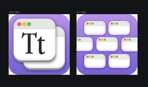
@refactoredd I like the colors, but I feel like you can play around a little more with the tab idea. I hope you dont mind, but as an evening project I made a few mockups of my own 🥰
@heysupratim I appreciate the mock up, it’s funny how two designers can come up with something so similar, but so different. Stacking the dates is a really clever solution. I will certainly be adding a few of these tweaks
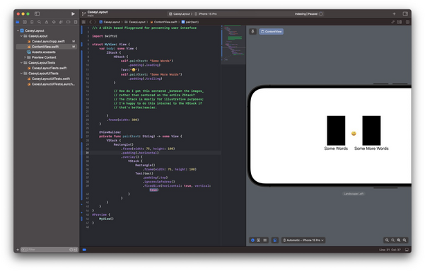
@caseyliss hooray! I deleted my first comment bc I thought you wanted the views to be different widths. If thats still the case, you can do something like this