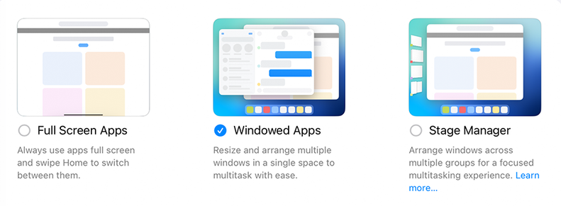
One amazing thing about 2025 is that, if you start up an Apple product, it forces you to choose between _three different_ window mangers, but if you start up a clean install of a current version of Linux, it just chooses good defaults for you.

If you're in YouTube on AppleTV, you can hit the Siri button twice, and it'll start an in-app search.
I like this feature very much.
Alan Dye doesn’t design UI.
He hides it.
https://mastodon.macstories.net/@viticci/114829148037318202

Attached: 1 image The more time I spend with Liquid Glass, the more I don't understand Alan Dye's and the design team's obsession with minimizing UI chrome and "prioritizing content" instead. With collapsed tab bars in iOS 26, it now takes me two taps to switch between Library and Music. Is that…better? The animations are gorgeous, sure. But does it actually *work* better? 🤔
The more time I spend with Liquid Glass, the more I don't understand Alan Dye's and the design team's obsession with minimizing UI chrome and "prioritizing content" instead.
With collapsed tab bars in iOS 26, it now takes me two taps to switch between Library and Music.
Is that…better? The animations are gorgeous, sure. But does it actually *work* better? 🤔

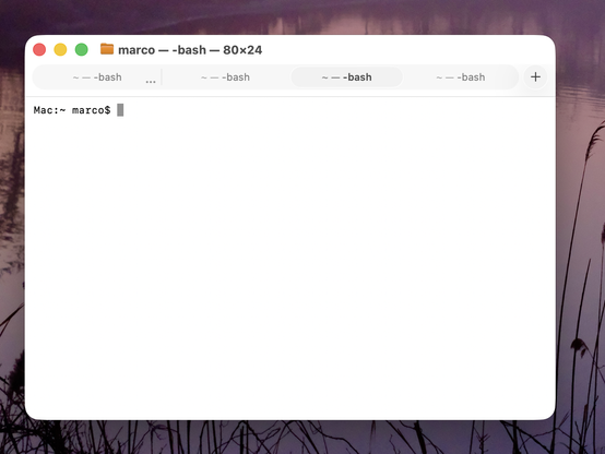
Honestly, this is making Terminal (and Safari) in Tahoe VERY hard for me to use.
Tabs in Tahoe are extremely difficult to distinguish from each other and from the active tab.
I've never switched away from Safari, and I've never investigated third-party terminal apps, but if this ships in the fall, I'll most likely need to do both. And I really, really don't want to.
Please, Apple, fix your design. Computers aren't passive "content" viewers — they're tools.
https://www.manton.org/2025/07/05/minor-nitpick-in-macos-tahoe.html