since blogs are trendy
https://koronkevi.ch/posts/humanity.html
https://koronkevi.ch/posts/humanity.html

| Website | https://seinmastudios.com |
This was many years ago but i once worked with this front end dev, guy named Jake. He was a kind of an odd fellow. Real lanky dude, didn't talk much. And normally he wasn't the greatest programmer, a bit sloppy.
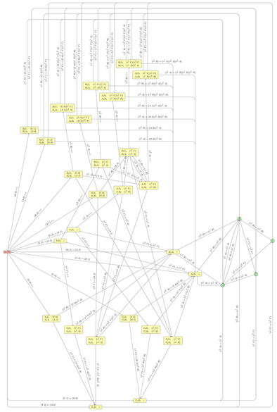
Last month I asked for recommendations for graph layout tools. Thanks to everyone who suggested something! I've now finished the task I wanted them for, so have some pretty (ish) pictures.
In the end, I didn't use anything more complicated than Dotty, and I didn't even use Dotty on the _full_ version of either of my graphs. I was able to condense each graph to a simpler one by merging sets of vertices that had some semantic properties in common; then I used Dotty to lay out _those_ graphs (essentially using it like Untangle, but easier to remember which vertex was which), and then I did the manual layout of the full graph by re-expanding each vertex into a cluster of nearby ones and moving things about until everything fitted. So in the final layout, related vertices are grouped together, which shows something of the structure of each diagram.
That wasn't at all what I'd _expected_ to do. I had hoped to illustrate the relations between vertices by giving the whole graph symmetry, so that related vertices were images of each other in two reflective axes, or something similar. Clustering the related things together was a fallback option after that didn't go anywhere. But I think it ended up legible.
Just to show the difference, the third image in this post is essentially the same state machine as the second image – both are finite-state transducers for the Penrose P2 tiling using Robinson triangles. But the third image is how Graphviz laid it out when I let it do the whole job itself, for my 2024 blog post. However complicated you find my new hand-drawn version, I hope you'll at least agree that it's clearer than that!