Mark Simonson

@marksimonson@typo.social
312 Followers
19 Following
86 Posts
Type designer and founder of Mark Simonson Studio.
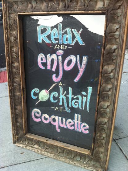
Coquette rendered in chalk, for the Coquette Bistro Wine Bar. Spotted in New Orleans by @marksimonson himself.
https://www.flickr.com/photos/62468024@N00/5921446377/
#LTypI
The growth and popularity of Proxima Nova in the last twenty years is beyond my wildest, most optimistic expectations when I released it in 2005. I feel incredibly lucky and grateful to everyone who has helped along the way, and especially to all the designers who decided that it was the best font for the job. https://www.marksimonson.com/notebook/view/proxima-nova-turns-20/
I'm happy to see that WB Animation is still using the lettering I did for them (by way of Funny Garbage) in 2008 (the part below the WB shield). Seen on the trailer for their latest feature, "The Day the Earth Blew Up," which I hear is good.
The story of my latest typeface, Synergy, goes back to a couple of sketches in 1981. Read more here: https://bit.ly/41KcKAY
Notebook - Mark Simonson

Mark Simonson
I've been rewatching season 1 of Severance and spotted my Acme Gothic on a band poster. It's only there for a split second, but it caught my eye, of course. The name is obscured, but thanks to a little research, I discovered that it's "ABRUMPO" (latin for "separated"), fronting for "Fissureman."
I just posted a new video about FONTastic and FONTastic Plus, two bitmap font editors I used on the Mac in the pre-PostScript days: https://youtu.be/pfoF73F73Hc
- YouTube

Enjoy the videos and music you love, upload original content, and share it all with friends, family, and the world on YouTube.

The story behind the Mac Plus I used for my Type Tuesday talk: https://www.youtube.com/watch?v=WGHW9zMhc_A
Macintosh Plus Story

YouTube
Last week I did a talk for Type Tuesday in Minneapolis where I did a live demo of early font editors on a real Macintosh Plus. I've uploaded a video recording of it here: https://www.youtube.com/watch?v=Cqbnocp7j_A
Type Design Like It’s 1987

YouTube
Watching and listening to the great and genuine master #type #designer @marksimonson demo building type on a #Macintosh from the 1980s:

   
https://youtu.be/Cqbnocp7j_A
Type Design Like It’s 1987

YouTube

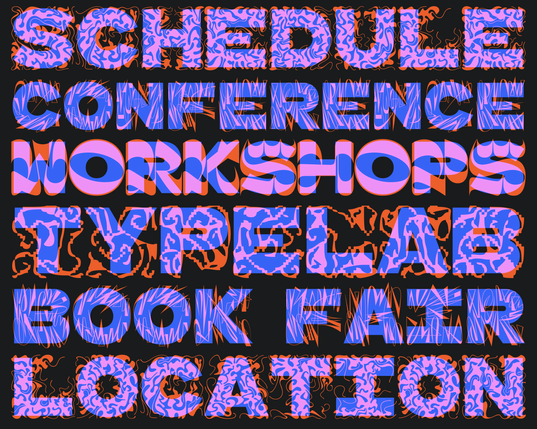
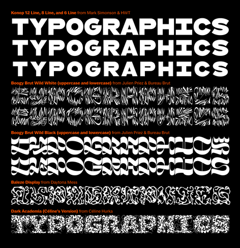
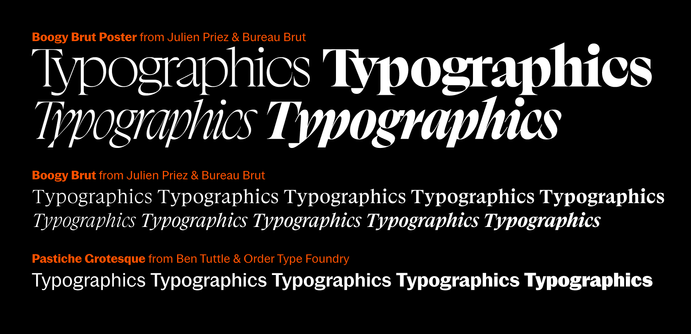
The identity design for this year’s Typographics festival uses a variety of fonts from multiple designers that weren’t intended to be used together, but their squarish proportions allow for fun mix-and-match effects.

Thanks to @boogypaper & Bureau Brut, @daytonamess, Céline Hurka, and @marksimonson & @thetypefounders for allowing us to tweak their fonts for easy overlapping at the same font size.

Also thanks to @btuttle & @otf and @boogypaper & Bureau Brut for additional accompanying fonts.