About five weeks ago, I posted a mockup screenshot to my forum thread at https://discuss.python.org/t/improving-the-user-experience-of-psfmember-org/69714/9. I think this would vastly reduce the amount of frustration I've heard from prospective PSF Contributing Members who have had trouble finding the correct self certification form. I try not to be a "smash that bell youtube" person, but if you'd also like to see that change, I think a heart or a reply to the post might help move the needle.

Improving the user experience of psfmember.org
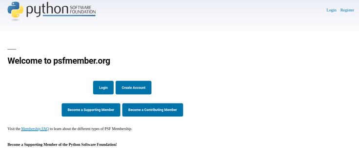
I’m attaching a screenshot of a modified page here for a more concrete example of how I think we could reduce a lot of confusion here. This is not a visual design suggestion, just an option to make links more discoverable and to link back to the membership info hosted on python.org’s Membership FAQ.