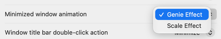
every few OSes, i can't help but to check if they added more to this list. alas, not in GG. imagine how fun it could be if they allowed us to create more.

| Blog | http://blog.hyperjeff.net/ |
| GitHub | https://github.com/hyperjeff |
| BookHabit | http://itunes.apple.com/us/app/bookhabit/id426618325?mt=8 |
| Reggy Bear | https://apps.apple.com/us/app/reggy-bear/id1481784692?mt=12 |
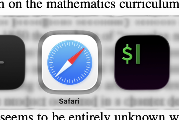


I've tried for at least a year and have never become accustomed to looking at the bottom of a screen for a search field. I just don't think to look there ever.
And with LG, it's much worse. Unless you are looking down already (which i never am by default, my eyes are looking up top usually), there doesn't seem to be anything down there. The eye just doesn't see it in your periphery. LG's content blending makes it basically disappear.