Look at that: Wilco the band selling a font! A friendly thing by @simplebits
https://wilcostore.com/products/loft-sans-font?_pos=2&_sid=d1abfb316&_ss=r

| Typeface | https://type-together.com/lektorat |
| Languages | DE, EN, FR, learning RU |
Look at that: Wilco the band selling a font! A friendly thing by @simplebits
https://wilcostore.com/products/loft-sans-font?_pos=2&_sid=d1abfb316&_ss=r
$380 → $20,500


Of course, $5 is far too little to pay for regularly using a library of fonts. I believe, like many of you, that type is already devalued these days. This option might be sustainable only if it’s limited to folks who need Adobe Fonts occasionally.
As always, if you want a font for frequent or long term use, get it direct from the foundry.
Want to use the Adobe Fonts service but don’t want to pay $70/month for Creative Cloud? You can subscribe to InCopy for $5/month (which includes Adobe Fonts): https://www.adobe.com/plans/creativecloud.html#miniplans-buy-incopy
Just learned this from @tphinney: https://typedrawers.com/discussion/comment/70606/#Comment_70606
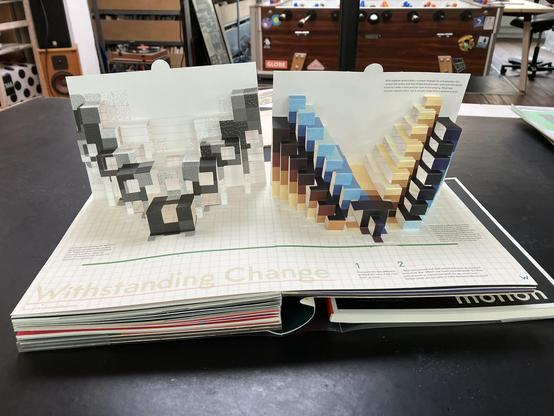
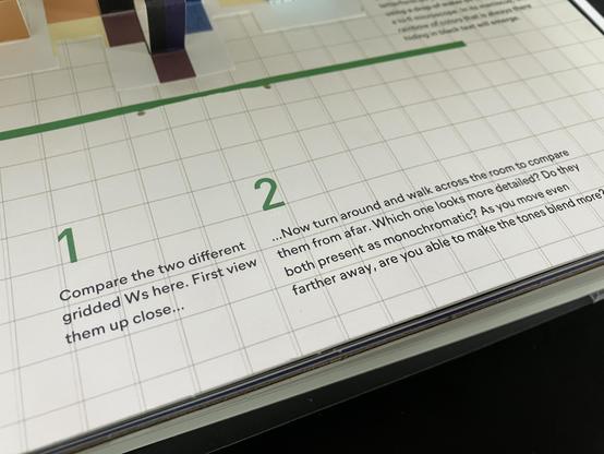
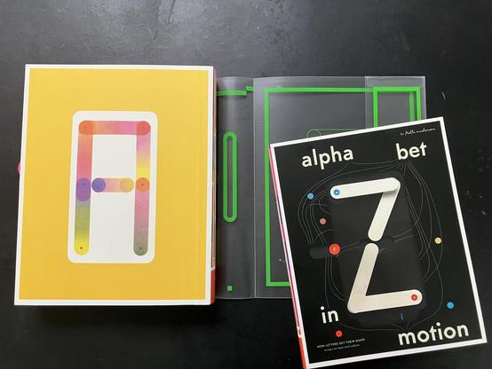
W is for Wednesday and ... rasterization. Spread for W in Kelli Anderson’s fantastic Alphabet in Motion. The entire book is an inncredibly impressive effort in many ways – creativity, design, production – and on top of that Anderson manages to keep everything practical and understandable for type newbies and accurate for seasoned type folks.
Did you know the typeface Gotham turns 25 years old next year?
Did you know the inspiration for Gotham started from a single sign on the Port Authority Bus Terminal in NYC?
Did you know Gotham was nearly named “Equator” or that Tobias Frere-Jones was concerned that the name “Gotham” was too connected with Batman comic books to be taken seriously?
Grab a coffee and spend 20 minutes reading my article over three years in the making:
“This article was amended on 10 December 2025 to refer more correctly to Times New Roman and Calibri as typefaces, rather than fonts.” My type of humour.
#Calibri #TimesNewRoman
https://www.theguardian.com/us-news/2025/dec/10/trump-times-new-roman-font-return-state-department


