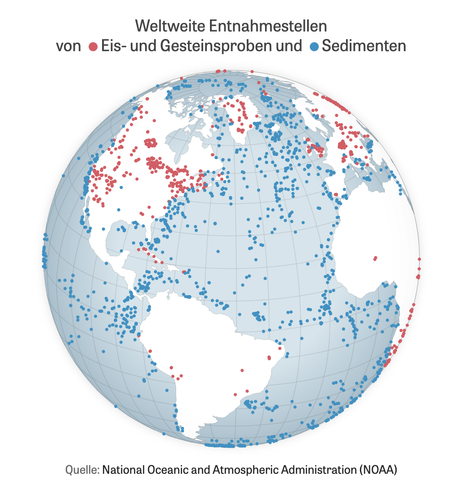
It's crazy to think about where this data is coming from. To recover temperatures over such long time periods, samples where taken from over 5,100 trees, 2,300 ocean sediments, 800 boreholes, 351 coral reefs, and 170 ice cores, historical paper records, and more. You can access the raw data at NOAA/NCEI
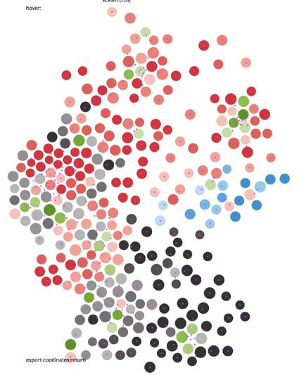
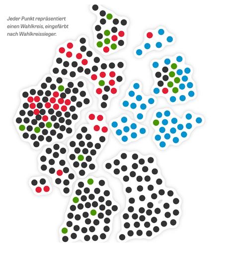
https://www.ncei.noaa.gov/products/paleoclimatologyOf course, no cartogram comes without distortion. The western states like North-Rhine-Westphalia are heavily populated and push the lesser populated districts to the East. But the final layout worked well during election night, I think.
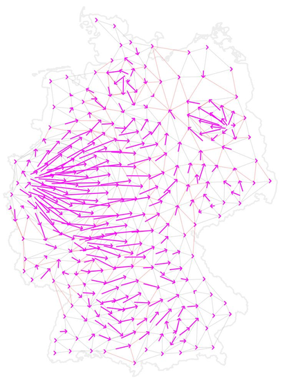
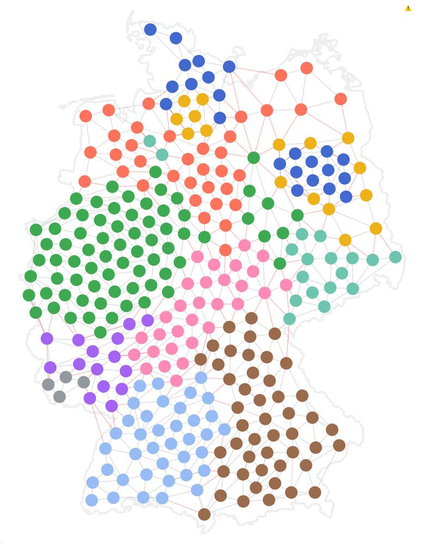
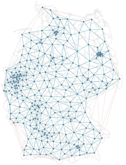
To compute the final layout we use a force simulation with 3 forces: one of them keeps neighboring districts together while another pushes districts away from each other if they are too close. Coloring the nodes helped to identify problems during the process.
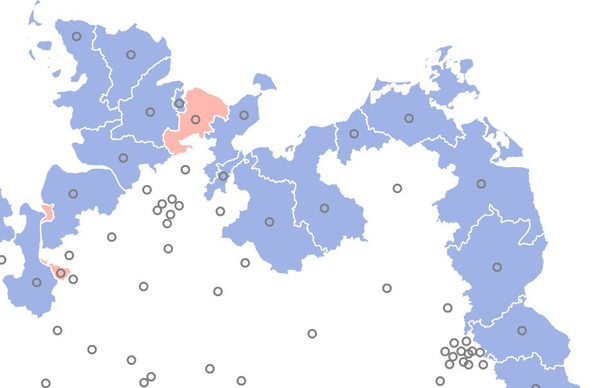
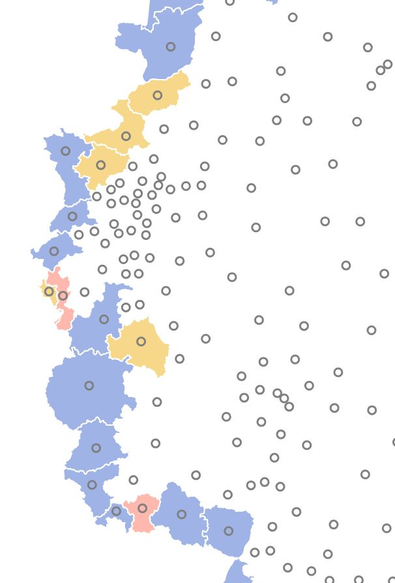
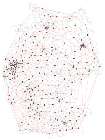
Some of these fixed districts turned out to be too close to each other, so we defined a few exceptions for border districts we want to be free, and also a few custom positions that prevent the nodes to "leave" the country.
Before running the network layout simulation on this, we marked all the outer districts as fixed. This allows the final layout to stay "in shape" of the country as a whole, which is important for readers to recognize their country.
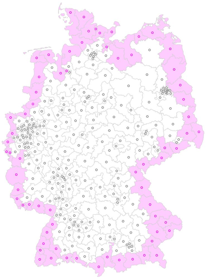
We used the TopoJSON arcs to automatically find these districts.
Due to Germany's convex outer shape we removed edges longer than a certain threshold and ended up with this final "network" of nodes and links.
Then we used a Delaunay tessellation of the district centroids. This later helps the districts to stay close to their geographical neighbors.
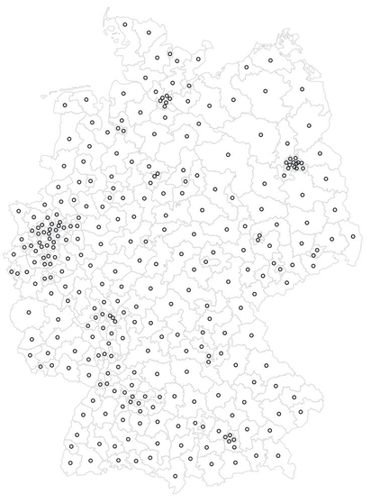
As input for the cartogram we use a pre-projected TopoJSON basemap of election districts with baked-in centroids (inner points). We used Mapshaper to generate the file.
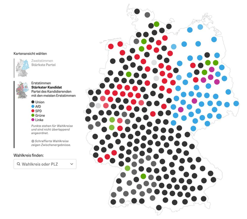
For the German election we wanted to use a cartogram of election districts but didn't find anything good, so we created our own. Here's a little nerd thread how the final algorithm worked 🤓 🧵
#gis #cartogram #election #datavis #cartographyOh, and the thread may sound a bit like we went straight for the solution, but of course there were a lot of uglier versions before that. One big leap forward was the decision to include the outer country shape, which is often missing in cartograms.