Frank Grießhammer

@frankrolf@typo.social
387 Followers
150 Following
266 Posts
HBKSaar → FontFont → TypeMedia → Adobe
@slye It’s fun to read it in a voice that describes the side-effects of a questionable weight-loss drug
@monokrom I absolutely agree with you – however, let’s keep in mind that many outlets (The Verge, Wired, etc.) are basically all advertorials. Also, the Red Dot Award is a similar affair – you pay for winning. So, let’s take those awards/publications for what they are – vanity plates for whoever feels the need to afford them.
@colinmford Unless I’m missing something, I see branches (with sources) for `v1.2.2` and `next` (among others)
@colinmford The branches?
@Cykelero @db I can’t 😩
@Cykelero @db case in point:

My role in Momochidori was designing the Latin part, which now has been released as “Chidori”. There’s a bit more flexibility in drawing the Latin (since I don’t have to deal with heavy ideographs), so the axes are more extreme. In Chidori, it’s possible to go heavier, lighter, and tighter. The variable axes makes the family fun to use – I enjoyed making these samples, in which I reproduced signs seen in my surroundings.

https://fonts.adobe.com/fonts/chidori-variable

As expected, questioning something as fundamental as the Japanese baseline grid could not be achieved without the solid technical skills of Masataka Hattori and @zacharyquinnscheuren 😎🧰

And as with every typeface family, many more people were involved behind the scenes.

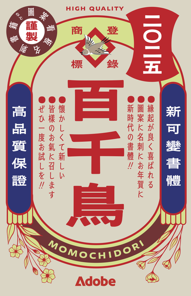
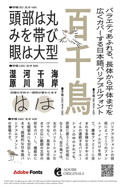
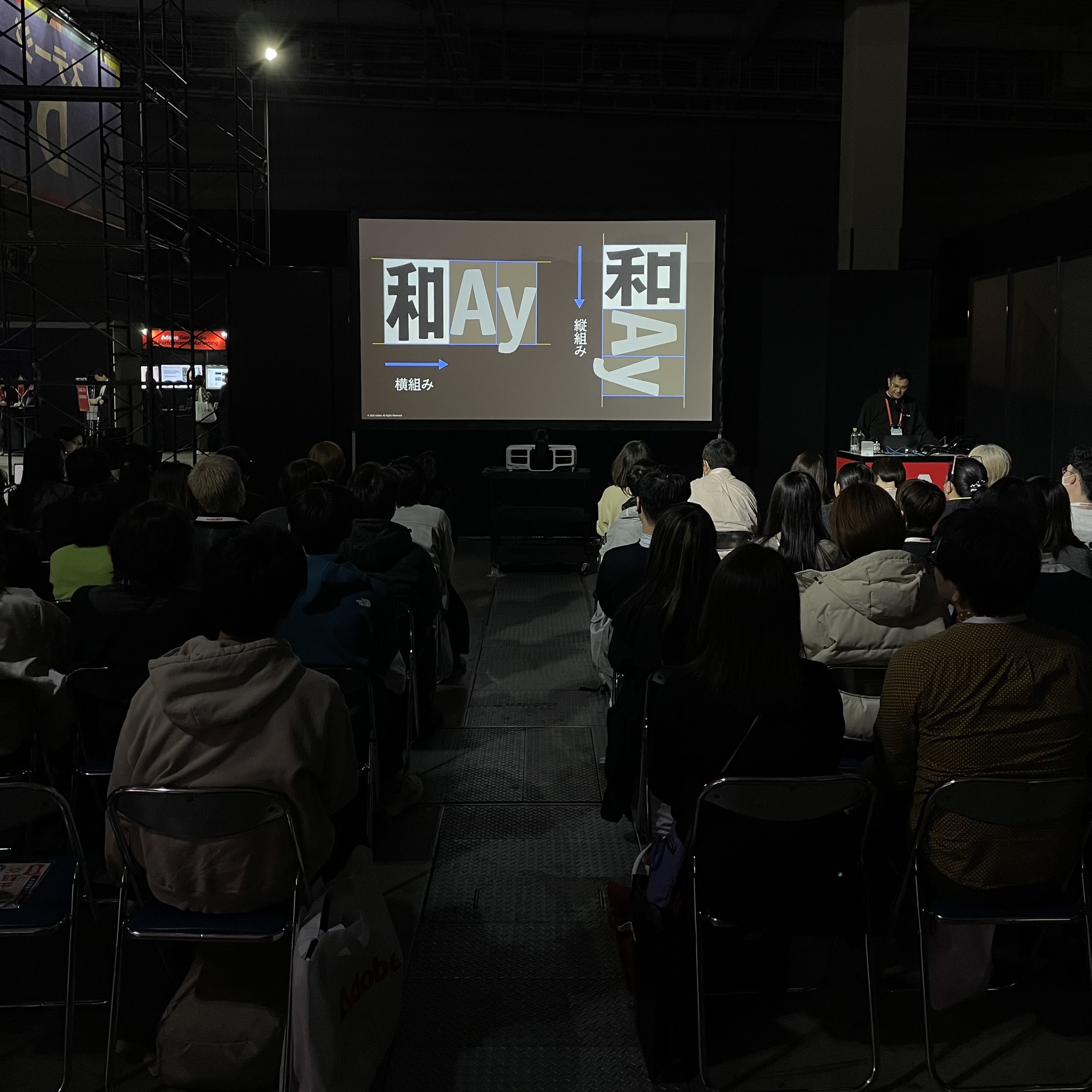
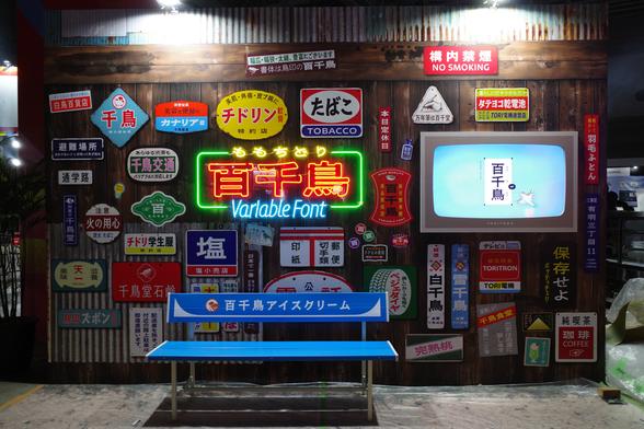
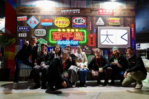
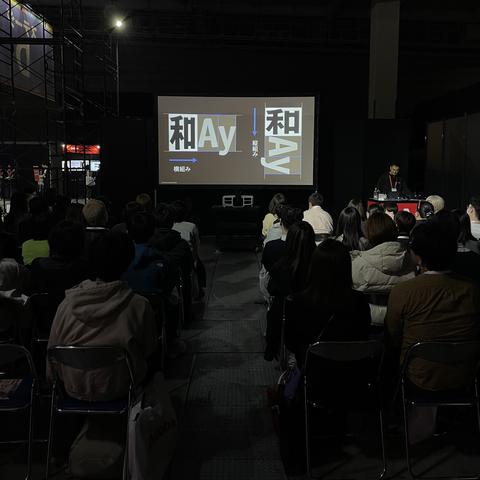
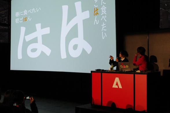
Momochidori (designed by Ryoko Nishizuka and Taisei Yoshida) is a Japanese Variable Font which breaks the notion of the square body: weight- and width axes translate to “short” and “tall” in vertical typesetting.

Momochidori aims to be useful and approachable while recalling the quaintness of the Showa Era – which it does very well! Congratulations Ryoko and Taisei on this remarkable family!
https://fonts.adobe.com/fonts/momochidori-variable

More about Momochidori (in Japanese):
https://main--blog--adobecom.hlx.page/jp/drafts/takada-drafts/iwamoto/cc-design-adobefonts-2502

#ad, I think?

×

As expected, questioning something as fundamental as the Japanese baseline grid could not be achieved without the solid technical skills of Masataka Hattori and @zacharyquinnscheuren 😎🧰

And as with every typeface family, many more people were involved behind the scenes.