Francis Gagnon | Voilà

@francis@vis.social
139 Followers
1,001 Following
98 Posts
Information designer in Montreal | Français/English | chezVoila.com
Tweets more at @chezvoila
DatavizInformation design
Sustainable development
I propose to use the golden ratio when deciding where the scale of a line chart should start (when not zero).
https://www.chezvoila.com/blog/yaxis
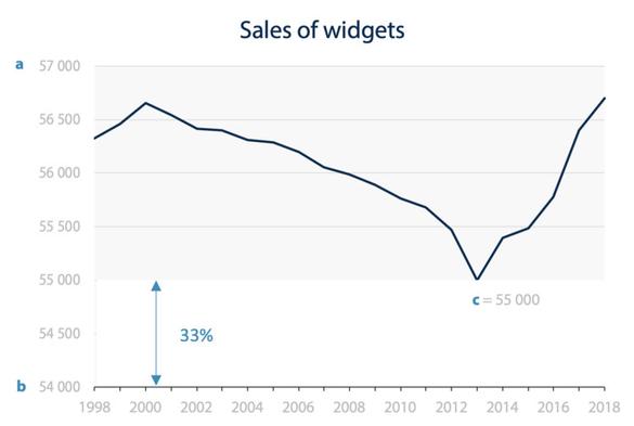
A golden ratio for line charts with truncated y-axis

While we hold that bar charts should start at zero, there is no such expectation for line charts . But you’ll always find someone on social media to denounce a “dishonest” line chart that enhances the variations by truncating the y-axis. There is usually ample pushback, but it often leads to the qu

Any research on smoothed lines?

Some people take issues with them, but they seem to improve legibility when I apply them in Excel.

The case against is that they distort the data which isn't entirely true. 1) smoothed lines preserve the marker positions. 2) we can't assume that what happens between two points is linear.

S.O.S. What's the name of a chart like this? I just made one because I've seen them before, but the client is reluctant and I can't find other examples. It's a scatterplot with a line connecting to the zero points. Do they have a name? Examples? https://vis.social/media/r2KpCEz7xH2ihTn7TVE