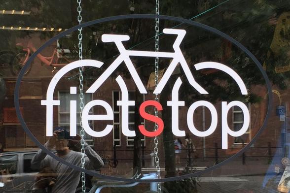
Starting with the sign that inspired to look for similar attempts.
Fietstop
C. van Eesterenlaan 31, 1019 JK Amsterdam
Pro: The logo looks professional and type is well readable
Fail: Combining the letters with the bike feels forced and messes up the spacing
Rating: 🚲🚲🚲☆☆