Dutch Standard Alphabets

19 Followers
25 Following
19 Posts

Preserving the Dutch Standard Alphabets âœđŸŒ by Jan van Krimpen and Sem Hartz, driven by the story of Dutch and British typographic designers around the Second World War. Starring Stanley Morison, Beatrice Warde, John Dreyfus and Willem Ovink. Featuring Monotype, Joh. EnschedĂ© and Lettergieterij Amsterdam.

A forthcoming non-fiction book by Gerben Dollen.

Instahttps://www.instagram.com/dutchstandardalphabets/

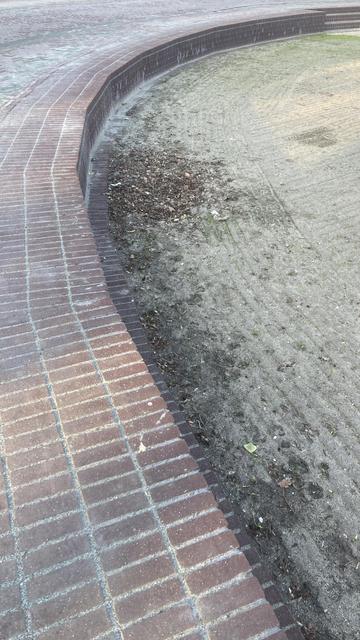
This brand-new brickwork irritates me immensely. Why simulate a curve with straight segments when you could make it truly round?

It brings me back to the early days of digital printing, when @eWalthert complained about how awful printed type looked: curves rendered as polygons instead of smooth outlines.

Taking note of one thing and another.

Research at the National Monument on Dam Square, Amsterdam.

#janvankrimpen

Jan de Jong (74!) of publisher De Buitenkant in the local newspaper today. About ‘koppermaandag’.

https://archive.ph/M3pAT

As a (now former) employee of Monotype, and someone who has been around the type industry for 20 years, I have been having many of the same thoughts that @flaviazim expresses here.

I can feel something changing, but what is it?

https://contraforma.substack.com/p/can-we-still-build-a-future-in-type

Can We Still Build a Future in Type?

An insider's look at the future of type design amid corporate consolidation, AI, and cultural volatility—and why collaboration and shared infrastructure might be the only path forward.

Contraforma