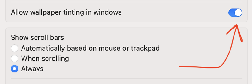
The use of these fade outs at the tops and bottoms of windows is another thing that I feel is a bad decision in Tahoe and iOS 26.
A really messy look for window title bars

The use of these fade outs at the tops and bottoms of windows is another thing that I feel is a bad decision in Tahoe and iOS 26.
A really messy look for window title bars
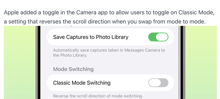
An interesting thing about recent iOS releases is that more UI interactions are becoming configurable in Settings
Previous wisdom was that if you were going to do this then "you didn't do enough user research" or "you need to be more opinionated" or "our job is to make this choice unnecessary"
Maybe a different story at Apple's scale, but interesting nonetheless, esp from a company that prides itself on UX