Alphabettes

615 Followers
95 Following
84 Posts

Supporting work by women in type, typography, and the lettering arts since 2015

Image: Women’s Auxiliary Typographical Union at Labor Day 1909, Lib. of Congress

Websitehttp://Alphabettes.org

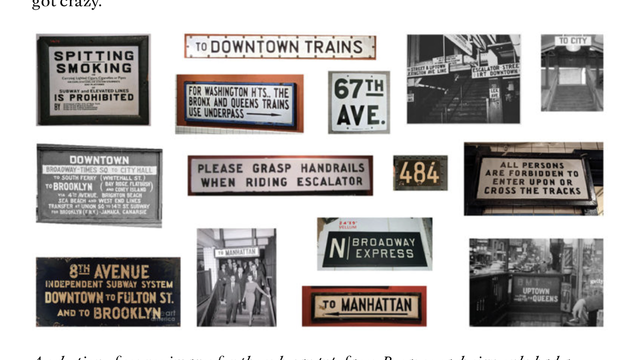
Read all about the challenges of forgery and period typography in this marvelous article by Leah Spencer on working as a designer for film and TV!

A feast for friends of #signage, #transit, old grots and Mrs #Maisel https://www.alphabettes.org/type-revival-for-film-tv/

Type Revival for Film & TV | Alphabettes

First great day of TypeLab at @Typographics done! You can rewatch the presentations and chatter for a few days still (YouTube links in the #TypeLab schedule). And get ready for another instalment of our legendary Variety Show facilitated by equally legendary #IndustryLeader @Fontnerd tomorrow, 15 June!
https://2023.typographics.com/typelab/#1906
TypeLab – Typographics 2023

The TypeLab at Typographics 2023 will host a series of informal work­shops, demos, inter­views, experiments, and more. TypeLab events will be a split across multiple days and platforms, with a combination of in-person events in New York and online events around the globe.

@boom just a few examples of wild mixtures of scripts and letters

Best stories about the central lettering record with @graphicgirl right now! Come join

https://meet.jit.si/alphabettes24hrhangout

Jitsi Meet

Join a WebRTC video conference powered by the Jitsi Videobridge

Oops, sorry, that was released end of December but while you have already been in cookie dough mode, you may have also missed Crushual by @boom
https://www.futurefonts.xyz/boom/crushual

#FontsByWomen #Advertising

Crushual by BOOM - Future Fonts

Crushual is a Thai-Latin typeface. It is Boom–Promphans’s graduation project from Type Media 2021-2022. The typeface was started from wanting to explore the possibilities of both scripts at its extreme of Condensed Black. Working on the limitation of Latin Low contrast slab serif and Looped Thai while keeping the style and texture consistency between the two is a big challenge. Crushual is a chubby typeface designed to be used in big and casual sizes, like its name, which combines the words Crushed and Casual.

Future Fonts

Also from Tien-Min Liao / Typeji comes Looklyn, an unusual, expressive Slab.

https://www.futurefonts.xyz/typeji/looklyn

#FontsByWomen #Advertising

Looklyn by Typeji - Future Fonts

Looklyn is an affable slab with a non-tradition serif weight distribution. Its extra-thin vertical serifs balance the weight of the body stroke, which creates a nice thick-and-thin rhythm that some other slab typefaces don’t usually have. The skeleton is geometric and structural, while the open diagonals, such as A, K, V, W, Y, etc are based on handwritten strokes. This hybrid of an architectural skeleton and humanist characteristic gives the typeface a contemporary yet approachable quality. Looklyn is available in five weights—Light, Book, Medium, Bold, and Black. The corresponding italics are currently under development and will be released in the next update.

Future Fonts

Fantasia Type / Franziska Weitgruber added fun and bubbly Baustraße to Futurefonts.

https://www.futurefonts.xyz/fantasia-type/baustrasse

#FontsByWomen #Advertising

Baustraße by FANTASIA Type - Future Fonts

Baustraße is a typeface in dialogue with the history of the production and dissemination of the Bauhaus typography. Rather than being conceived as a revival project linked to the experiments conducted in particular by Herbert Bayer in the Dessau school in the mid-Twenties, the typeface is
 a hybrid of the numerous Bauhaus style designs that emerged between the Sixties and Nineties, in the years of photocomposition and early desktop publishing. A century after the birth of Bauhaus, Baustraße attempts to reflect on the birth of a style, its canonization and its diffusion into the real world. Therefore, Baustraße is a design that seeks the spirit of Bauhaus outside the ‘haus’ and in the ‘straße’.

Future Fonts

Tien-Min Liao (Typeji) added a stencil version to her already quite progressed Min Sans to Futurefonts. https://www.futurefonts.xyz/typeji/min-sans-stencil
https://www.futurefonts.xyz/typeji/min-sans

#FontsByWomen #Advertising?

Min Sans Stencil by Typeji - Future Fonts

Min Sans is a modern high-contrast sans serif typeface. The typeface's sharp notch and clean contour exude a strong personality and a contemporary look, while its calligraphy-inspired aesthetic adds a touch of warmth and elegance. It’s designed to be used as titles and headlines. The stencil version is introduced in 2023 and released as a new family on FufureFonts. It brings an urban and industrial look to Min Sans.

Future Fonts

Joana Correia has released a display companion to her typefamily Loretta at her own foundry Novatype https://novatypefoundry.com/fonts/loretta-display/

#FontsByWomen #Advertising?

Loretta Display – Nova Type Foundry

Loretta Display is a version of Loretta designed to bring it to bigger sizes. Loretta Display is elegant and sharp. Expand your universe of editorial …