Tianmeng

@XUETianmeng@typo.social
17 Followers
18 Following
25 Posts
Independent type designer
📧xuetianmeng@gmail.com
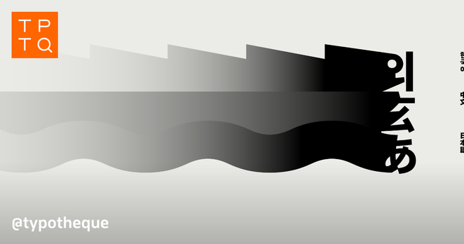
An article worth reading every year or so. https://www.typotheque.com/articles/originality-in-type-design
Typotheque: Originality and inspiration in Type Design

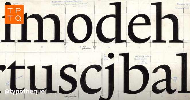
The article was triggered by the discussions with the late Gerard Unger about the nature of originality in the type design industry, highlighting the importance of historical continuity in creating new works while examining the notions of originality and the boundaries between interpretation and plagiarism.

Terrassa Display and Gradient both contain five variable axes. We considered providing traditional static fonts as well, but the five axes would produce over 10,000 variations, which would overwhelm your font menu. Instead, we deliver Terrassa Display and Terrassa Gradient as variable fonts, allowing you to adjust the sliders rather than scrolling endlessly. https://www.typotheque.com/fonts/terrassa
Characters with Water(水)
Something interesting from the recent past. An illustrator who sells persimmons bought four-character for my ShiziLishu柿子隶书(柿子:persimmon. 隶书: a kind of script from ancient China), and we wished each other persimmon sales.☺️
#typedesign #柿子隸書 #chinesecharacters
Designing dense Chinese characters presents a paradox: increasing the weight of the strokes can compromise legibility, yet insufficient weight fails to harmonise with the visual weight of Latin letters. Read more about creating very dark Chinese characters: https://www.typotheque.com/articles/chinese-character-weight
Typotheque: The Weight of Chinese Characters: Designing an Ultra-Bold Typeface

This article explores how stroke thickness affects perceived weight in Chinese characters, explaining the complexity of designing balanced, readable type across various weights and styles.

Using CJK fonts is not simple, so we prepared an article on the typesetting principles of Chinese, Japanese, and Korean (CJK) text

https://www.typotheque.com/articles/typesetting-cjk-text

Typotheque: Typesetting principles of Chinese, Japanese, and Korean (CJK) text

This article highlights the typographic differences between Latin and CJK (Chinese, Japanese and Korean) typography. It covers vertical and horizontal text orientation, line height requirements, text alignment and hyphenation practices, and distinct rules for line breaks and punctuation placement.

We’ve worked with large character sets before, but this is a completely different level of complexity — after five years of work, we are pleased to present our CJK font collection. https://www.typotheque.com/blog/collection-of-new-original-cjk-fonts
Typotheque: A collection of new, original CJK fonts from Typotheque

Explore Typotheque’s CJK font collection—meticulously crafted to support the GB 18030-2022 standard, including Simplified Chinese, Traditional Chinese, Japanese, and Korean. Discover how these award-winning typefaces seamlessly integrate with 13 Latin font families, offering region-specific variants for authentic East Asian typography.​

I spoke with Mint about her beginnings, about Thai and Latin scripts, studying and working far from home, and her typeface Pristine.

https://vimeo.com/1074984420

Type Designer Interviews. Part 6: Mint Tantisuwanna

Vimeo