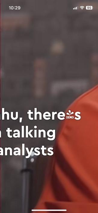
Whose demo font is this?


| sveinbjorn.com | http://www.sveinbjorn.com |
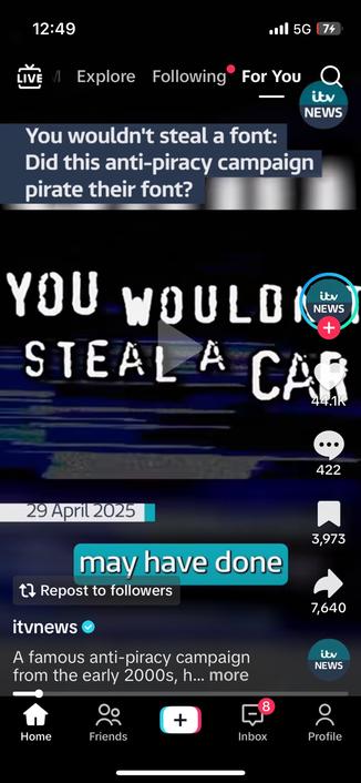
Was @justvanrossum robbed by anti pirate pirates?
I see everything everyone posts on typo.social. Not only the people I follow.
I usually browse the typo.social server live feed, which shows you the total output of the server.
I rarely check my home feed with the people I follow, since it's a subset of the total here, and the total here is pretty great.
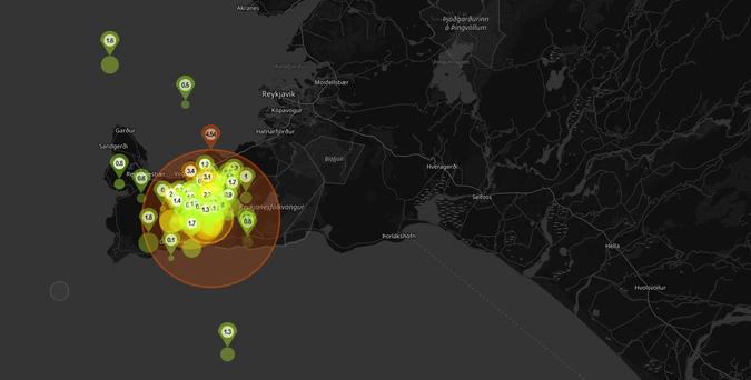
Fun lil’ earthquake map.
You can almost see the country for the quakes!
Waverse by Typoji is gorgeous. This is so my shit. I’d be jealous but I’m too busy being happy that it exists. Can’t find thwm here to tag, maybe @futurefonts can help out?
I don’t know them, so this is not nepotism. All my other posts are, so I felt I had to clarify that.

Waverse is inspired by ocean waves and currents. With its rounded corners and subtle slant, Waverse evokes a gentle, continuous wavy rhythm along the x-height, reminiscent of the undulating waves of the sea. The contrast between the straight stems and the curvilinear rounds gives the typeface a distinct character, as if it's shaped by the movement of the water. It is a reverse contrast typeface that has an open and airy look. The filled-in 'a' and 'e' allows more visual space in the counter, seamlessly integrating with the other letterforms to form an enchanting pattern. The cut-off 'g' and 's' avoid the cramped structure that is commonly seen in reverse contrast typefaces. This feature further enhances the overall airiness of the typeface. Waverse is optimally displayed at both large and medium point sizes.