We just released a new font!
🏄🏄🏄 NaN Serf Sans 🏄🏄🏄
The sans workhorse to NaN Serf's serif
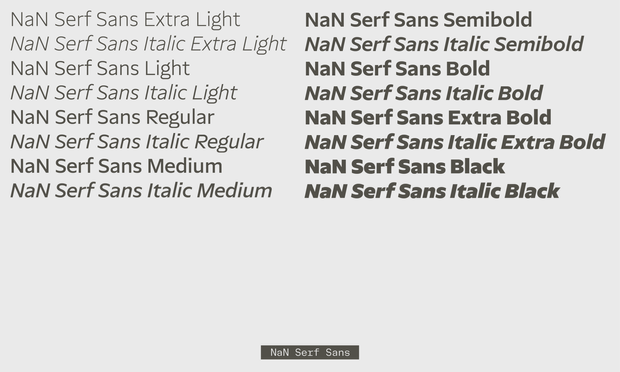
5 scripts in 8 weights and matching italics
🔗 http://nan.xyz/fonts/nan-serf-sans
The Serf Typographic System
✏️ https://www.nan.xyz/txt/the-serf-broke-free/

| Website | http://www.nan.xyz |
| https://www.instagram.com/nan_xyz | |
| https://twitter.com/nan_xyz_ |
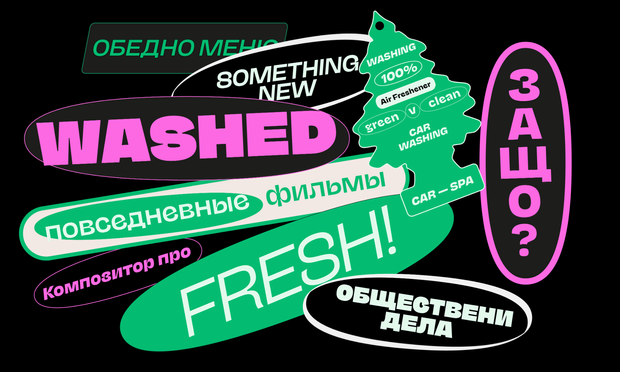
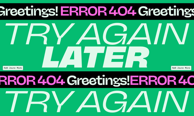
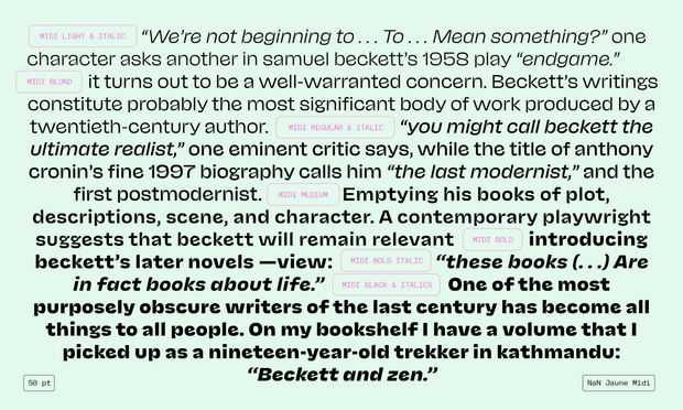
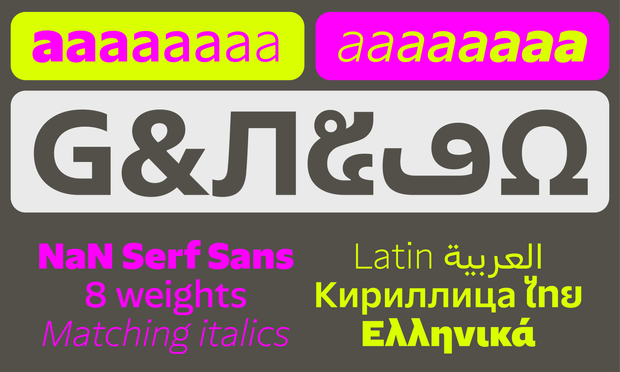
NaN Serf Sans is NaN’s crisp and ultra-legible humanist sans.
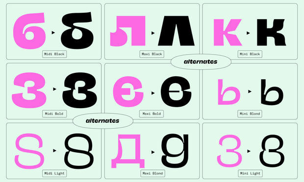
Based on the skeleton of NaN Serf, it keeps some of its distinctive detailing like the flat curves of the /G, /b and /q and replaces Serf’s serifs by clean vertically-cut endings. Most choices in NaN Serf Sans are dictated by clearness, flow and legibility, making it a text-first workhorse designed to thrive on screen.
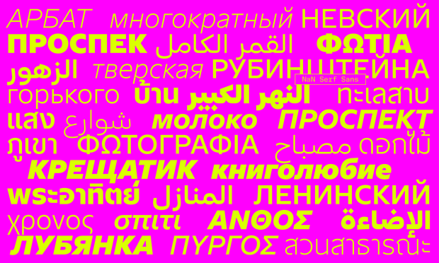
NaN Serf Sans is available in Arabic, Cyrillic, Greek, Latin, Panafrican Latin and Thai.
We just released a new font!
🏄🏄🏄 NaN Serf Sans 🏄🏄🏄
The sans workhorse to NaN Serf's serif
5 scripts in 8 weights and matching italics
🔗 http://nan.xyz/fonts/nan-serf-sans
The Serf Typographic System
✏️ https://www.nan.xyz/txt/the-serf-broke-free/
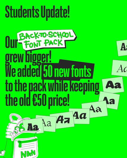
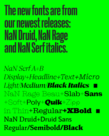
Students of the fediverse, we updated our Back-to-School font pack to include 50 of our newest released fonts.
This bring the total of fonts to 200 for a mere €50 fee for students! You don't even need to show us an ID, we trust you.
https://www.nan.xyz/back-to-school/
As with all our student discounts, you can use the fonts for your school projects and for commercial projects for companies with less than 6 employees, which allows you to smoothly transition from school to professional life.
#ad
😡 NaN Rage member 3/7 😡
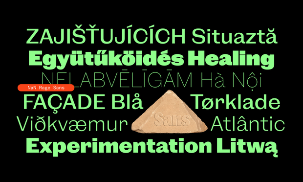
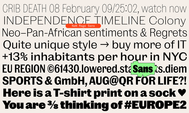
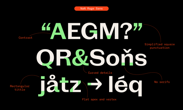
NaN Rage Sans is a subtly contrasted sans serif family inheriting its gentle 1800’s undertones from its Rage Beau and Slab cousins.
Rage Sans mixed together some cold sleek detailing (perfectly horizontal endings, square punctuation…) with a sense of delicacy and warmth.
4 widths * 9 weights = 36 Sanzies

NaN Rage Sans is a subtly contrasted sans serif family inheriting its gentle 1800’s undertones from its Rage Beau and Slab cousins. Rage Sans mixed together some cold sleek detailing (perfectly horizontal endings, square punctuation…) with a sense of delicacy and warmth. Its thinner endings allow fo
😡 NaN Rage member 2/7 😡
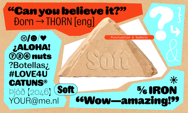
NaN Rage Soft is a modern take on the Slab-Serif genre. It most prominently features bracket-less serifs, simplified non-decorative forms and sharp interruptions.
Applying the “less is more” motto to a slab-serif, Rage Slab has a very sleek and sharp voice, cooler than its sibling Rage Beau.
4 widths * 9 weights = 36 Slabbies

NaN Rage Slab is a modern take on the Slab-Serif genre. It most prominently features bracket-less serifs, simplified non-decorative forms and sharp interruptions. The result is an open character that seems to borrow its perfectly horizontal endings to a neo-grotesque. Applying the “less is more” mot
😡 NaN Rage member 6/7 😡
NaN Rage Quik is an unapologetic script font with roots in Sharpie pen lettering and graffiti.
4 widths * 9 weights = 36 Quikies
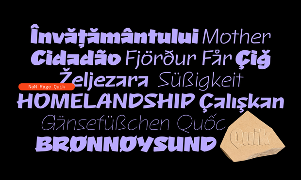
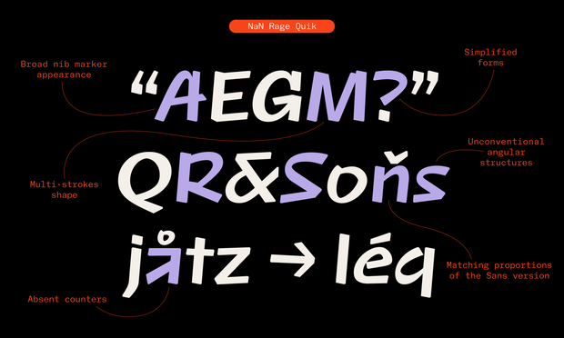
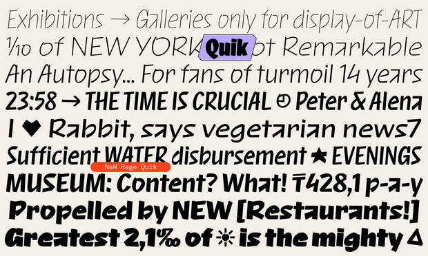

NaN Rage Quik is an unapologetic script font with roots in Sharpie pen lettering and graffiti. Not a true follower of any particular school, it's a free spirit with irregularities. As a script font, it's dynamic, showing broken and angular structures while keeping its flow, albeit with a very small
😡 NaN Rage member 4/7 😡
NaN Rage Soft is the softest member of the Rage Typographical Universe. It is a subtly contrasted sans serif with rounded endings.
It sits between the first ever rounded sans of history drawn by Caslon in 1836 and a more contemporary Arial Rounded.
4 widths * 9 weights = 36 Softies
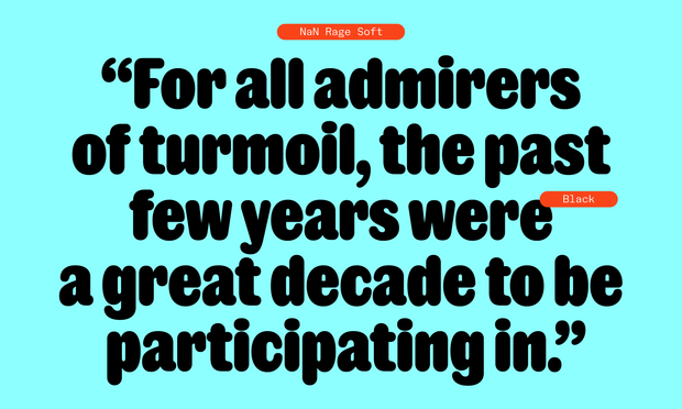
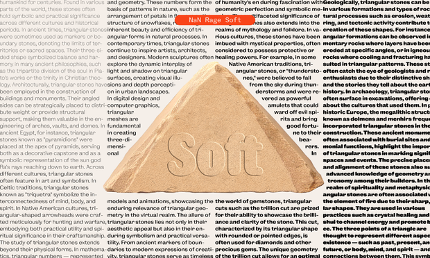
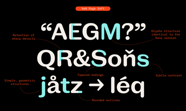

NaN Rage Soft is the softest member of the Rage Typographical Universe. As the rounded counterpart to Rage Sans, it is a subtly contrasted sans serif with rounded endings. It sits between the first ever rounded sans of history drawn by Caslon in 1836 and a more contemporary Arial Rounded. With its f
😡 NaN Rage member 1 😡
NaN Rage Beau is our Clarendon-esque slab-serif family with a sleek and contemporary personality.
4 widths * 9 weights = 36 Beauties

NaN Rage Beau is a Clarendon-esque slab-serif family with a sleek and contemporary personality. It features the iconic ball terminal associated with thick rectangular serifs that give it a sturdy and confident silhouette. NaN's take on the style is a subtle balance between organic (stroke contrast,
<NaN Jaune> by Jérémy Landes @triple received a huge extension today featuring cyrillics and matching italics across all styles.
Trial fonts:
https://www.nan.xyz/fonts/nan-jaune