
- 0 Followers
- 0 Following
- 2 Posts
Some Japanese people swear by adding some chocolate to curry.
After trying it, they’re not wrong.
No they couldn’t.
The US gave $200 billion in tax brand to telcos in the 1990s for them to upgrade everyone to fibre. The telcos did not build the fibre.
$200 & $300 Billion Broadband Scandal – The IRREGULATORS | An Independent, Expert Telecom Team - irregulators.org/200-billion-broadband-scandal/
Maths feels like a first class citizen in latex. The syntax is ugly, but there is some logic through the legacy jank.
Typst makes fundamental design decisions that render it unsuitable beyond extremely simply equations. In LaTeX, curly braces are nearly always reserved for enclosing arguments, to avoid confusion with actual brackets.
Typst uses normal brackets for both its scripting and actual maths.
For example, \frac{n(n+1)}{2} in latex turns into (n(n + 1)) / 2 in typst.
The typst code is incredibly unclear - the first set of brackets with the slash together actually form the fraction operator, so neither end up visible.
You can see how this would start to struggle even with high school level maths, with bracketed terms and possibly fractional terms in exponents, integrals, etc.
For example, it is very difficult for me to work out the difference between the following three in typst. That is specifically not what you want from a typesetting language.
1/2(x + y) 1/x(x + y) 1/2^x(x + y)LaTeX ignores whitespace, so you can just use a formatter to space out your code and ensure the curly braces. This is not even an option in typst, which uses the space as an escape character.
Huh? Both hover to focus and click button in background work in macOS, though hover to focus usually requires an external application. There used to be a focus follows mouse that you could enable via a terminal command, but Apple removed it.
The top menu bar kind of seems to be more of a result of historical happenstance, and maybe some different philosophies regarding Fitts law.
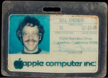
Bill Atkinson, who designed the UX for the Apple Lisa recounts that part of the decision was to avoid the problem of menu items being possibly obscured. If the window of some application is near the bottom or partially off the desktop, the menu bar of individual windows can become obscured and inaccessible.
Historically the menu bar would’ve been easier for normal people to learn due to consistency, and also helped with limited screen estate.
Memories of Lisa - CHM - computerhistory.org/blog/memories-of-lisa/
Kaomoji render correctly across all platforms, whereas emojis looks different across different vendors.
There’s even been proper academic research done confirming the discrepancy.
Emoji Face Renderings: Exploring the Role Emoji Platform Differences have on Emotional Interpretation | Journal of Nonverbal Behavior | Springer Nature Link - link.springer.com/article/…/s10919-019-00330-1
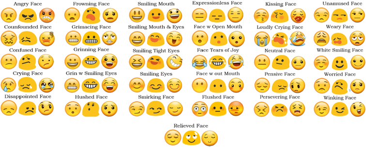
Emoji Face Renderings: Exploring the Role Emoji Platform Differences have on Emotional Interpretation - Journal of Nonverbal Behavior
Emoji faces are ubiquitous and integrated into most people’s everyday (nonverbal) vernacular. Yet, we know little about how people interpret these characters in terms of their emotional content. Do people agree that an emoji face represents an individual emotion and that it is unique to a specific emotion? Are such representations similar across electronic platforms? The present study took a theoretical approach to address these questions by investigating shared agreement between emoji–emotion pairings across three electronic platforms (Apple, Android, and Samsung). Two hundred twenty-eight English-speaking adults completed an online survey that involved picking up to three emoji faces (presented from a common set from one of three platforms) for each of 10 emotions. They then indicated the strength of that relationship. We examined whether the intensities that participants gave to emoji–emotion pairings were specific and consistent across platforms. Our results showed limited shared agreement for the majority of emoji–emotion pairings, and significant variation as to which emotion category a “comparable” emoji belonged depending upon the viewed platform. We highlight the need for future emoji perception research to examine how different platform renderings of the same emoji might lead to miscommunication and interpretation discrepancies.