
✧✦Catherine✦✧ (@[email protected])
Attached: 1 image today in "cursed aliexpress items" × "cursed usb items"
| Pronouns | They/Them |
Attached: 1 image today in "cursed aliexpress items" × "cursed usb items"
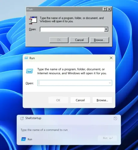
How UI degrades over time.
Top (Windows 95): great contrast, obvious shapes. Instantly readable.
Middle (Windows 11): shapes are still self-explanatory, but contrast is gone.
Bottom (Windows 11 Insiders): what am I even looking at? The only shape I can understand here is the Run button. Barely visible, though.
Then, on the left, there’s another something that says Run and has an icon. What is it? A window title? Another button? Why does it have to say Run twice?
... 1/3
Fuck me... I do not want YouTube's moderation incentive structure applied to the internet infrastructure. Where, ISPs are incentivised to cut connections to "known infringers" at the notice of rights holders, because investigating if it's legitimate is more work than just complying.

Audio UIs are like the seed vault for the Skeuomorphism.
There will be draughts, but eventually the rain season comes and it springs back to life.
